News & updates tagged 'editing'
 Coming up soon: the ability to add and edit the creators and characters lists, in both the CLZ Comic mobile app and the Comic Connect web-based software. And of course, the syncing of these custom lists between the desktop, web-based and mobile editions.
Read more
 Coming up soon: the ability to add and edit the cast and crew lists, in both the CLZ Movies mobile app and the Movie Connect web-based software. And of course, the syncing of these custom lists between the desktop, web-based and mobile editions.
Fixed:
- Adding Albums by CDID didn’t allow you to select multiple results and add them “as multi-disc album” anymore.
- The alphabet bar wasn’t working correctly for albums with multiple artists where the name started with a number.
- Dark Skin: In the Folder panel, we’ve made the barchart color a bit brighter.
- In the Pre-fill popup you could not select an “empty” item for pick lists.
- Sorting your list by date wasn’t always working properly.
- The program will now ask you if you’re sure you want to overwrite an existing file when using “Export to XML” or “Save Database As” (this was already working for other export/save options).
Fixed:
- Add Movies screen: When adding “by IMDb”, the result list always kept the last searched IMDb result.
- Dark Skin: In the Folder panel, we’ve made the barchart color a bit brighter.
- In the Pre-fill popup you could not select an “empty” item for pick lists.
- Sorting your list by date wasn’t always working properly.
- The program will now ask you if you’re sure you want to overwrite an existing file when using “Export to XML” or “Save Database As” (this was already working for other export/save options).
Fixed
- When using “Update Value” on a game, it would sometimes grab the wrong value (e.g. loose+box while you asked for loose+manual)
- Dark Skin: In the Folder panel, we’ve made the barchart color a bit brighter.
- In the Pre-fill popup you could not select an “empty” item for pick lists.
- Sorting your list by date wasn’t always working properly.
- When using “Export to XML” or “Save Database As” the program will check if the file already exists.
Fixed:
- Update from Core Settings: The “Variant Description” field would reset to “leave as is” after restarting the program.
- Edit Screen: The “grader notes” field will now resize in height when you resize the edit screen.
- Edit Screen: when adding “local other files” on Links tab, and selecting multiple files in one go, it would just add multiple copies of the same file.
- Dark Skin: In the Folder panel, we’ve made the barchart color a bit brighter.
- In the Pre-fill popup you could not select an “empty” item for pick lists.
- Sorting your list by date wasn’t always working properly.
- When using “Export to XML” or “Save Database As” the program will check if the file already exists.
Fixed:
- Add Books screen could give an “Access Violation” error in 32-bits mode.
- When searching for a pseudonym of an author using the search (top right) in your main screen, hitting Enter would not produce the right results.
- Edit Screen: The “Signed By” field now grows in height when resizing it.
- Edit Screen: when adding “local other files” on Links tab, and selecting multiple files in one go, it would just add multiple copies of the same file.
- Dark Skin: In the Folder panel, we’ve made the barchart color a bit brighter.
- In the Pre-fill popup you could not select an “empty” item for pick lists.
- Sorting your list by date wasn’t always working properly.
- When using “Export to XML” or “Save Database As” the program will check if the file already exists.
Fixed:
- Edit tracks: the “Add” button to add an artist to a track wasn’t visible
Fixed:
- Crash when opening the camera to take a picture.
- CovrPrice icon was missing from the “Update Values” Action menu.
- Edit Screen: moved the “Cover” tab to the left of the “Links” tab.
- Updated Values Report: could show a wrong “old value” in some cases.
Fixed:
- Various “Access Violation” errors fixed in the Link Comics screen
- Edit Screen: File paths for missing cover images weren’t showing
- Main Screen: filtering on Collection Status “Sold” didn’t show correct filter text in the bottom of the screen
Fixed:
- Edit screen: Pick list popups for certain fields didn’t remember their sort order
- Pre-fill wasn’t working after the “move to other collection status” popup
Fixed:
- Edit screen: Pick list popups for certain fields didn’t remember their sort order
- Pre-fill screen: It wasn’t possible to clear out certain fields (such as Tags)
- Pre-fill wasn’t working after the “move to other collection status” popup
- Print/Export of “Sold Date” field wasn’t working
Fixed:
- Add/Update Movies: Country and Language weren’t downloaded
- Add/Update settings: Download links from MovieMeter checkbox was missing
- Pre-fill screen: It wasn’t possible to clear out certain fields (such as Tags)
- Edit screen: Pick list popups for certain fields didn’t remember their sort order
- Pre-fill wasn’t working after the “move to other collection status” popup
- Add Movies: When adding books to “Sold” the button wasn’t showing text
With so many users switching from the desktop software to the Connect web-based software, we are getting a lot of useful feedback about the things they are missing, or would like to see in Connect.
Today, a small update with 3 new settings to save screen space in the main screen:
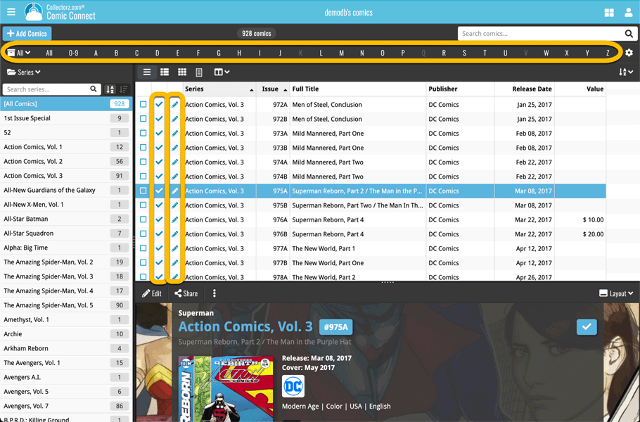
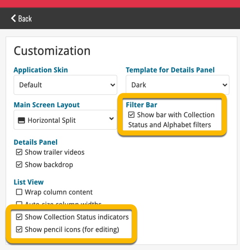
- Show Filter Bar: uncheck this setting to hide the bar at the top with the Collection Status filter and the Alphabet Bar, giving you quite a bit more vertical screen space for your list.
- Show Collection Status indicators: uncheck this to remove the column with the status icons from your List View, giving you more horizontal room for your columns.
- Show pencil icons (for editing): uncheck this to remove the column with the pencil (edit) icons from your List View, again giving you more horizontal list space.
Oh and BTW: we also took this opportunity to complete re-think the layout of the Settings screen, to make the grouping of settings more logical. I recommend to take a good look again, maybe you will find some useful settings you never knew existed 🙂
With so many users switching from the desktop software to the Connect web-based software, we are getting a lot of useful feedback about the things they are missing, or would like to see in Connect.
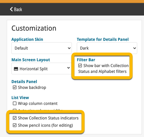
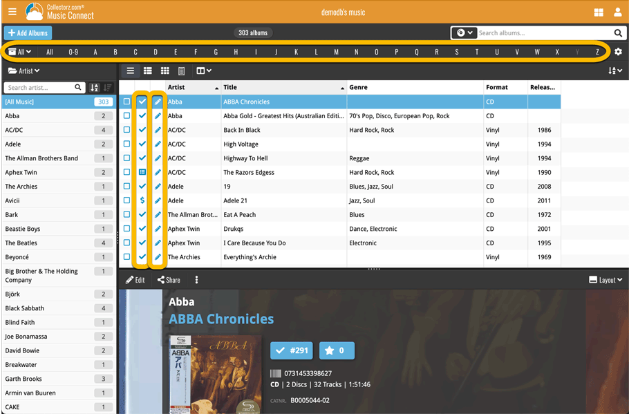
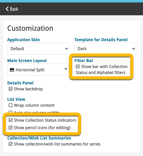
Today, a small update with 4 new settings to save screen space in the main screen:
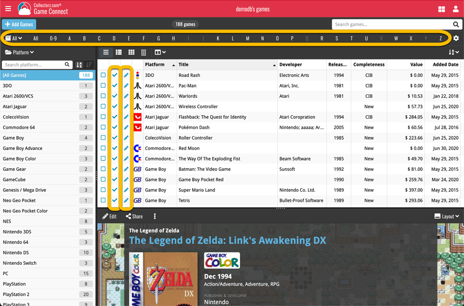
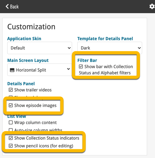
- Show Filter Bar: uncheck this setting to hide the bar at the top with the Collection Status filter and the Alphabet Bar, giving you quite a bit more vertical screen space for your list.
- Show Collection Status indicators: uncheck this to remove the column with the status icons from your List View, giving you more horizontal room for your columns.
- Show pencil icons (for editing): uncheck this to remove the column with the pencil (edit) icons from your List View, again giving you more horizontal list space.
- Show episodes images: uncheck this to hide episode images from the Details Panel, for TV Series.
Also, 2 new Sort settings are now available:
- ignore sort names for Cast and Crew: when sorting by Actor, Director etc… check this sort by their display names, so by firstname, lastname.
- show sort names for Cast and Crew: when sorting by Actor, Director etc.. check this to show the Sort Names, which is a bit “easier on the eye”.
Oh and BTW: we also took this opportunity to complete re-think the layout of the Settings screen, to make the grouping of settings more logical. I recommend to take a good look again, maybe you will find some useful settings you never knew existed 🙂
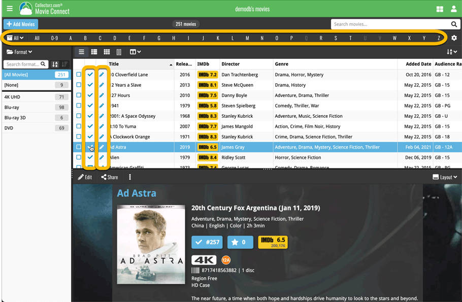
With so many users switching from the desktop software to the Connect web-based software, we are getting a lot of useful feedback about the things they are missing, or would like to see in Connect.
Today, a small update with 3 new settings to save screen space in the main screen:
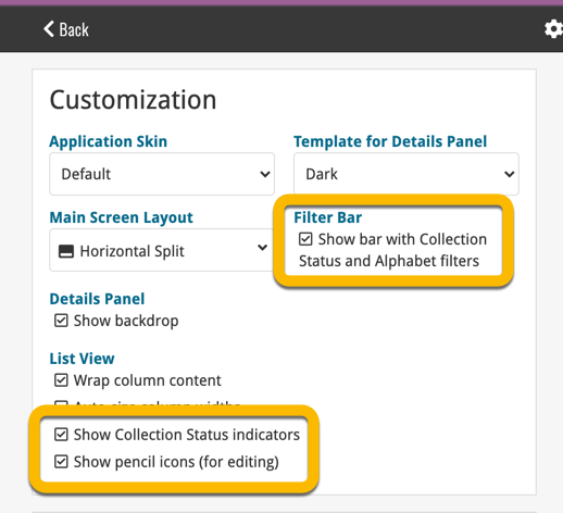
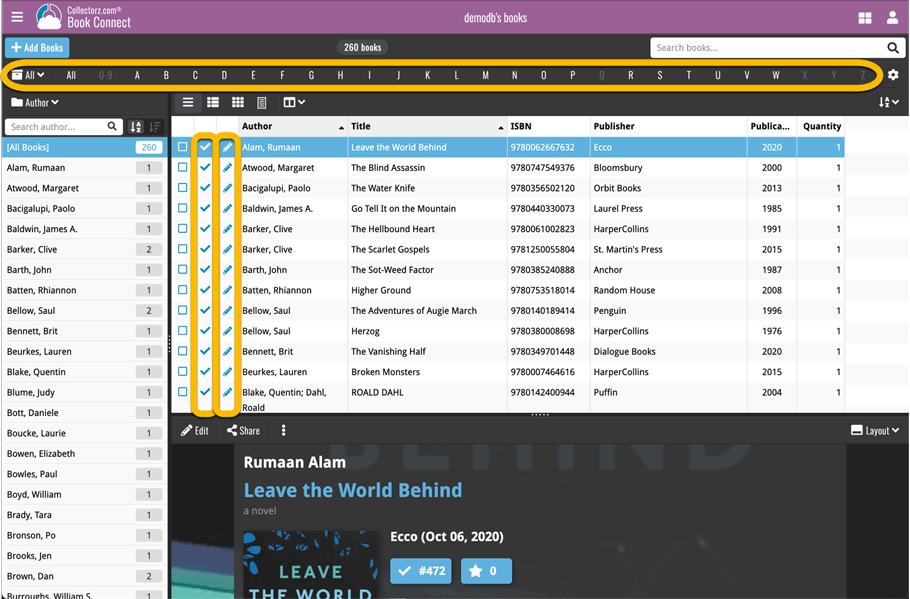
- Show Filter Bar: uncheck this setting to hide the bar at the top with the Collection Status filter and the Alphabet Bar, giving you quite a bit more vertical screen space for your list.
- Show Collection Status indicators: uncheck this to remove the column with the status icons from your List View, giving you more horizontal room for your columns.
- Show pencil icons (for editing): uncheck this to remove the column with the pencil (edit) icons from your List View, again giving you more horizontal list space.
Oh and BTW: we also took this opportunity to complete re-think the layout of the Settings screen, to make the grouping of settings more logical. I recommend to take a good look again, maybe you will find some useful settings you never knew existed 🙂
Fixed:
- Editing books with “content” could throw a “List Index out of Bounds” error
Tweaks to Updated Values report
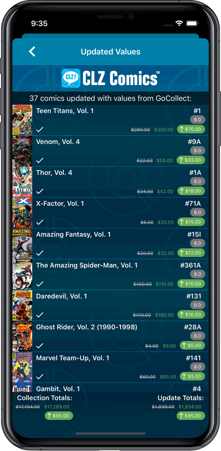
We were not entirely happy with the new Update Values report yet, so here’s a small tweak to the screen to make the actual value *changes* stand out more:
Fixed:
- Currency fields could contain 0.00 when they shouldn’t
- Edit Screen: You can now directly edit existing series title / sort title again
- Field Defaults would override information coming from Core
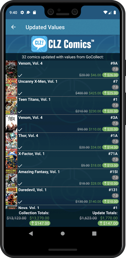
Tweaks to Updated Values report
We were not entirely happy with the new Update Values report yet, so here’s a small tweak to the screen to make the actual value *changes* stand out more:
Fixed:
- Toolbar above the Series folder could disappear on smaller screens
- Edit Screen: You can now directly edit existing series title / sort title again
- Field Defaults would override information coming from Core
Fixed:
- Edit Multiple could give an access violation
- Edit Game could give an access violation
- Edit Multiple would set the Completeness field to N/A
- Edit Hardware: Collection Status field is now a dropdown field
Fixed:
- Edit Screen: Covers: Remove/Crop button could be missing in the edit screen
- Update value report screen: sorting was off
- Edit Multiple: Publisher and Story Arc fields weren’t working
Fixed:
- The sorting was off when sorting on the ‘Value’ and ‘Purchase Price’ fields
- The sorting was off for some values games in the statistics screen
- Certain games could break the layout of the edit screen
Fixed:
- An access violation could occur when editing certain games
- Add Game: “Move to Collection” popup could give an error