News & updates tagged 'alphabet bar'
Fixed:
- Adding Albums by CDID didn’t allow you to select multiple results and add them “as multi-disc album” anymore.
- The alphabet bar wasn’t working correctly for albums with multiple artists where the name started with a number.
- Dark Skin: In the Folder panel, we’ve made the barchart color a bit brighter.
- In the Pre-fill popup you could not select an “empty” item for pick lists.
- Sorting your list by date wasn’t always working properly.
- The program will now ask you if you’re sure you want to overwrite an existing file when using “Export to XML” or “Save Database As” (this was already working for other export/save options).
With so many users switching from the desktop software to the Connect web-based software, we are getting a lot of useful feedback about the things they are missing, or would like to see in Connect.
Today, a small update with 3 new settings to save screen space in the main screen:
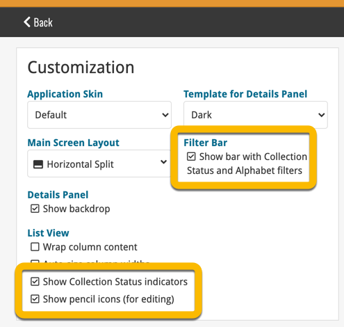
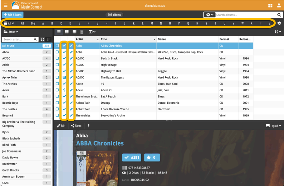
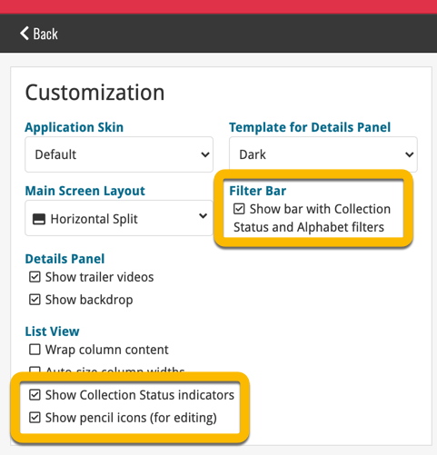
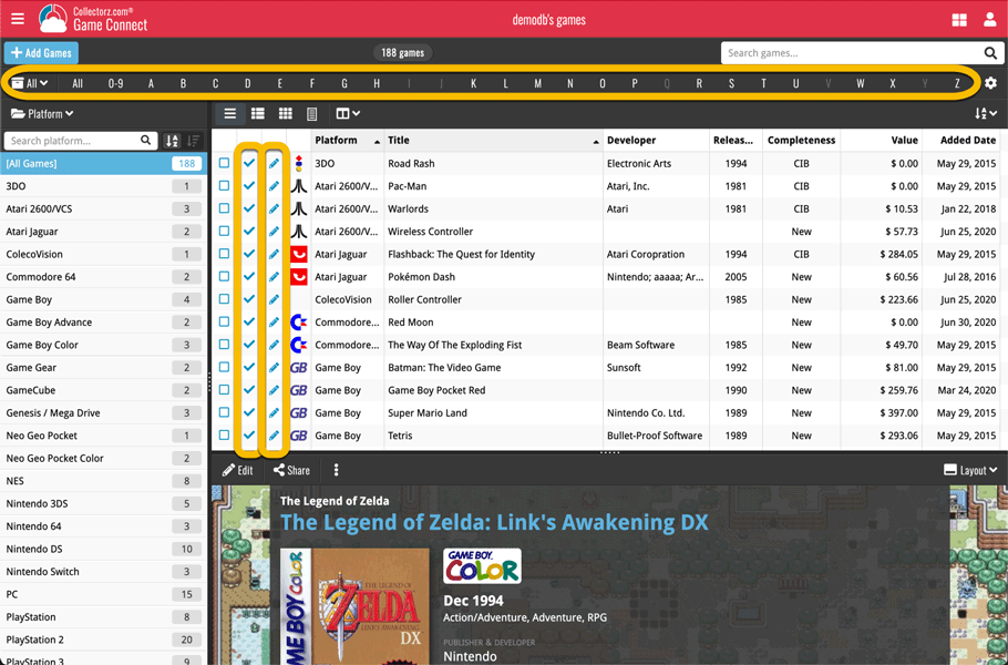
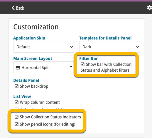
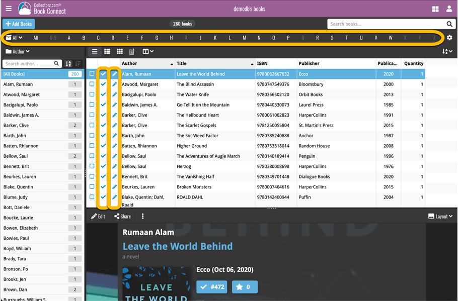
- Show Filter Bar: uncheck this setting to hide the bar at the top with the Collection Status filter and the Alphabet Bar, giving you quite a bit more vertical screen space for your list.
- Show Collection Status indicators: uncheck this to remove the column with the status icons from your List View, giving you more horizontal room for your columns.
- Show pencil icons (for editing): uncheck this to remove the column with the pencil (edit) icons from your List View, again giving you more horizontal list space.
Oh and BTW: we also took this opportunity to complete re-think the layout of the Settings screen, to make the grouping of settings more logical. I recommend to take a good look again, maybe you will find some useful settings you never knew existed 🙂
With so many users switching from the desktop software to the Connect web-based software, we are getting a lot of useful feedback about the things they are missing, or would like to see in Connect.
Today, a small update with 4 new settings to save screen space in the main screen:
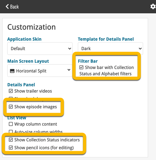
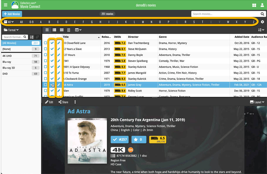
- Show Filter Bar: uncheck this setting to hide the bar at the top with the Collection Status filter and the Alphabet Bar, giving you quite a bit more vertical screen space for your list.
- Show Collection Status indicators: uncheck this to remove the column with the status icons from your List View, giving you more horizontal room for your columns.
- Show pencil icons (for editing): uncheck this to remove the column with the pencil (edit) icons from your List View, again giving you more horizontal list space.
- Show episodes images: uncheck this to hide episode images from the Details Panel, for TV Series.
Also, 2 new Sort settings are now available:
- ignore sort names for Cast and Crew: when sorting by Actor, Director etc… check this sort by their display names, so by firstname, lastname.
- show sort names for Cast and Crew: when sorting by Actor, Director etc.. check this to show the Sort Names, which is a bit “easier on the eye”.
Oh and BTW: we also took this opportunity to complete re-think the layout of the Settings screen, to make the grouping of settings more logical. I recommend to take a good look again, maybe you will find some useful settings you never knew existed 🙂
With so many users switching from the desktop software to the Connect web-based software, we are getting a lot of useful feedback about the things they are missing, or would like to see in Connect.
Today, a small update with 3 new settings to save screen space in the main screen:
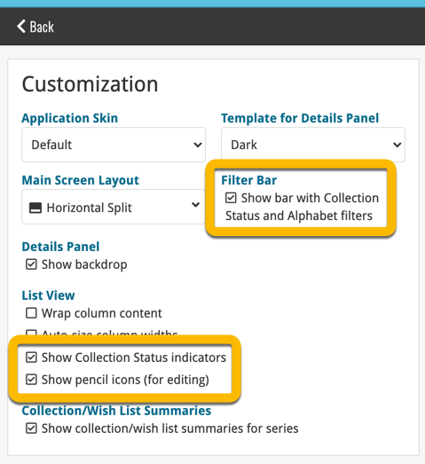
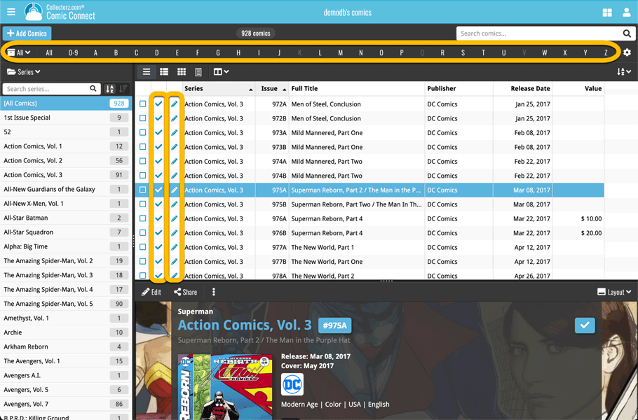
- Show Filter Bar: uncheck this setting to hide the bar at the top with the Collection Status filter and the Alphabet Bar, giving you quite a bit more vertical screen space for your list.
- Show Collection Status indicators: uncheck this to remove the column with the status icons from your List View, giving you more horizontal room for your columns.
- Show pencil icons (for editing): uncheck this to remove the column with the pencil (edit) icons from your List View, again giving you more horizontal list space.
Oh and BTW: we also took this opportunity to complete re-think the layout of the Settings screen, to make the grouping of settings more logical. I recommend to take a good look again, maybe you will find some useful settings you never knew existed 🙂
Small tweak for your Music Connect software today:
The Alphabet Bar can now be used for Composers too!
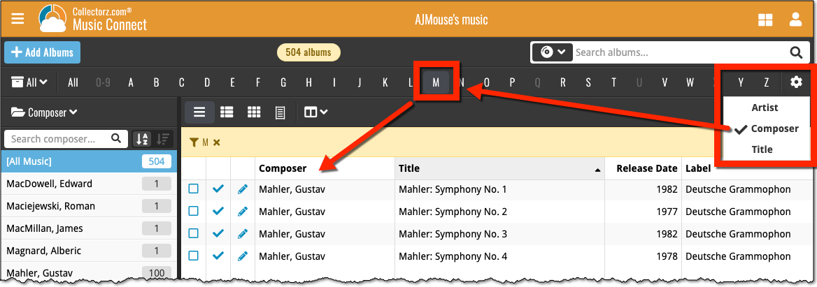
By default, the Alphabet Bars for Music Connect uses the first letter of the Artist. You can now switch it to use the first letter of the album title, just click the little “gears icon” on the right of the Alphabet Bar:
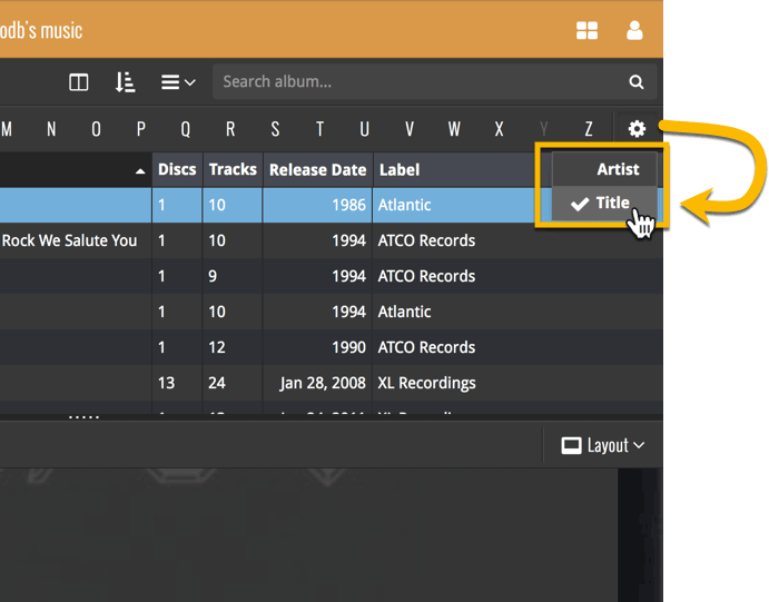
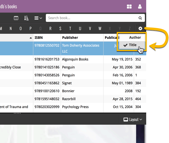
By default, the Alphabet Bars for Book Connect uses the first letter of the Author. You can now switch it to use the first letter of the book title, just click the little “gears icon” on the right of the Alphabet Bar:

New view for the main screen: Card View
Next to List View, Images View and Cover Flow, we have added a Card View, a multi-column view with little info cards for each book, showing the main book details and a small cover thumbnail.

New view for the main screen: Card View
Next to List View, Images View and Cover Flow, we have added a Card View, a multi-column view with little info cards for each movie, showing the main movie details and a small cover thumbnail.
Even though it’s been summer vacation time for several CLZ team members, we’ve been able to push out several huge releases, the most popular of which (by far) was the new Alphabet Bar. But don’t forget the huge book cloud update and CLZ Barry 2.0!
These are the topics of today’s newsletter, discussing all July releases and what’s cooking at the CLZ HQ at this very moment:
- CLZ Cloud 2.1 for Books: Sync your *own* data for 8 extra book fields
- CLZ Barry 2.0 for iOS and Android
- New “Alphabet Bar” in all 15.3 versions for PC & Mac
- Sharper Cover Thumbnails in all v15.3 versions for Windows
- Further improvements to Connect and the CLZ Cloud viewers
- What’s Cooking?
It took a little longer than planned, but the popular Alphabet Bar is now live for Comic Connect and the CLZ Cloud for Comics:
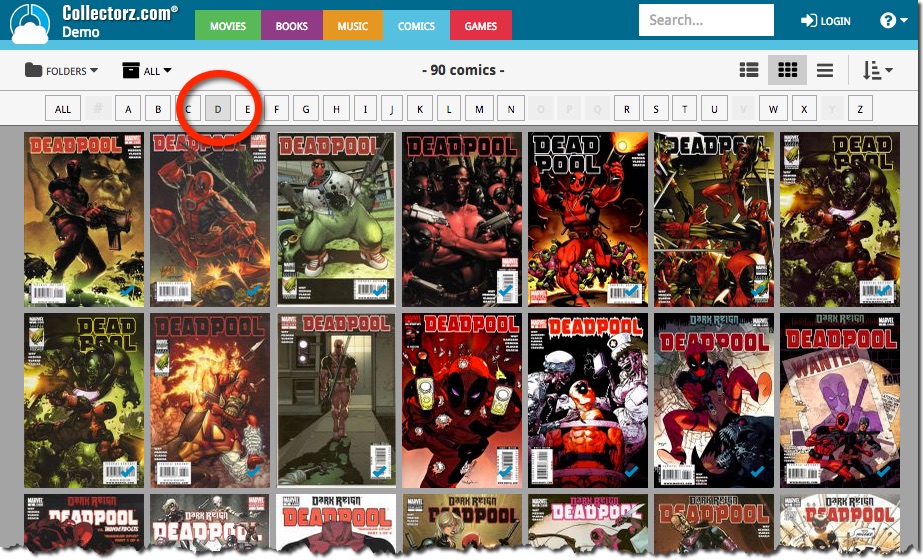
The first version of Connect had a nice A to Z “alphabet bar” at the top, for quickly filtering your list to show only the items starting with a specific letter.
However, in the Two-Point-Oh redesign the wise wizards at the CLZ HQ the alphabet bar was reduced to just a tiny button, with a drop down panel showing all letters. Which of course saves space on the toolbar, in an attempt to make it all fit on smaller tablet and phone screens.
Not a bad idea in itself, but the first letter filtering lost its’ easy of use and accessibility.
So we changed our minds and today we brought back the Alphabet Bar!
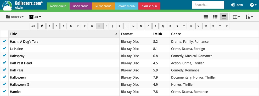
It is now available on both the free CLZ Cloud viewers and the Connect software. But: only on bigger screens where it actually fits. On smaller screens, the Alphabet Bar nicely reduces to the tiny button again 🙂

