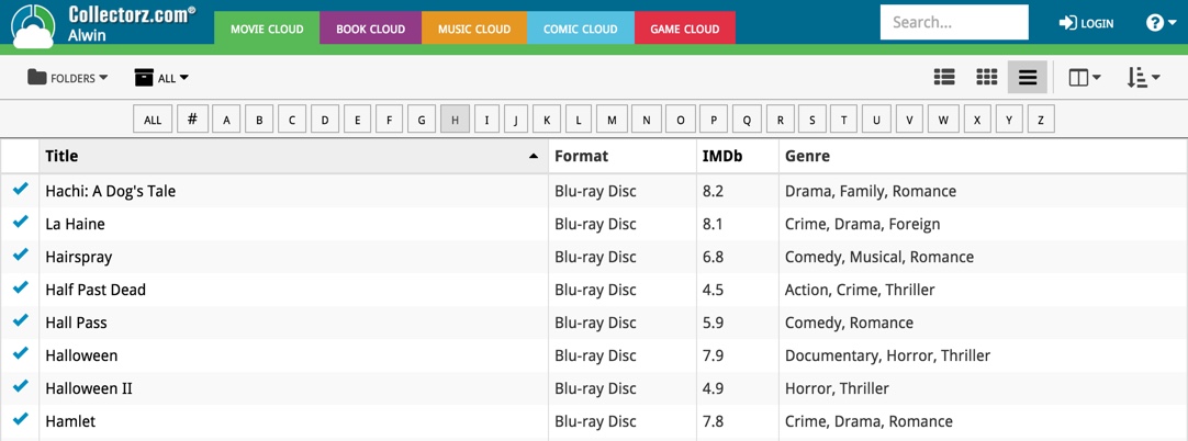
The first version of Connect had a nice A to Z “alphabet bar” at the top, for quickly filtering your list to show only the items starting with a specific letter.
However, in the Two-Point-Oh redesign the wise wizards at the CLZ HQ the alphabet bar was reduced to just a tiny button, with a drop down panel showing all letters. Which of course saves space on the toolbar, in an attempt to make it all fit on smaller tablet and phone screens.
Not a bad idea in itself, but the first letter filtering lost its’ easy of use and accessibility.
So we changed our minds and today we brought back the Alphabet Bar!

It is now available on both the free CLZ Cloud viewers and the Connect software. But: only on bigger screens where it actually fits. On smaller screens, the Alphabet Bar nicely reduces to the tiny button again 🙂