News & updates tagged 'images view'
New:
- Image View: Sadly not everyone likes the new flexible “full cover wall” layout. So we have now made it optional. Tap the button to the left of the size slider to switch between the new “Flex Layout” and old “Grid layout”.
Fixed:
- iOS10: iPad: Images view would crash the app
- iOS10: iPad: After tapping an album and tapping back, the list could disappear
New:
- Image View: Sadly not everyone likes the new flexible “full cover wall” layout. So we have now made it optional. Tap the button to the left of the size slider to switch between the new “Flex Layout” and old “Grid layout”.
Fixed:
- Template: Now only shows the publication year at the top (instead of the full publication date which has been moved to the Details section)
- iOS10: iPad: Images view would crash the app
- iOS10: iPad: After tapping an album and tapping back, the list could disappear
New:
- Image View: Sadly not everyone likes the new flexible “full cover wall” layout. So we have now made it optional. Tap the button to the left of the size slider to switch between the new “Flex Layout” and old “Grid layout”.
Fixed:
- Image View: Position of the size slider wasn’t always remembered correctly
- Template: Some weblinks could not be opened
- Template: Now only shows the publication year at the top (instead of the full publication date which has been moved to the Details section)
Instead of adding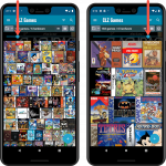 more new features, we decided to take a few weeks to work on the look and feel of the app.
In this 6.4 update, we improved the look and layout of the game list and of the game details pages, in both the main screen and the Add screen preview.
On top of that, we finally acted upon a common request from our users: you can now change the size of the thumbnails in the Images View.
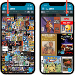 Instead of adding more new features, we decided to take a few weeks to work on the look and feel of the app.
In this 6.4 update, we improved the look and layout of the game list and of the game details pages, in both the main screen and the Add screen preview.
On top of that, we finally acted upon a common request from our users: you can now change the size of the thumbnails in the Images View.
 Instead of adding more new features, we decided to take a few weeks to work on the look and feel of the app.
In this 6.3 update, we improved the look and layout of the album list and of the album details pages, in both the main screen and the Add screen preview.
On top of that, we finally acted upon a common request from our users: you can now change the size of the thumbnails in the Images View!
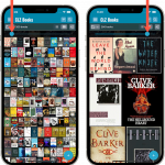 Instead of adding more new features, we decided to take a few weeks to work on the look and feel of the app.
In this 6.4 update, we improved the look and layout of the book list and of the book details pages, in both the main screen and the Add screen preview.
On top of that, we finally acted upon a common request from our users: you can now change the size of the thumbnails in the Images View.
 Instead of adding more new features, we decided to take a few weeks to work on the look and feel of the app.
In this 6.4 update, we improved the look and layout of the book list and of the book details pages, in both the main screen and the Add screen preview.
On top of that, we finally acted upon a common request from our users: you can now change the size of the thumbnails in the Images View.
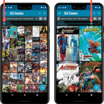 Instead of adding more new features, we decided to take a few weeks to work on the look and feel of the app.
In this 6.6 update, we improved the look and layout of the issue list and of the comic details pages, in both the main screen and the Add screen preview.
On top of that, we finally acted upon a common request from our users: you can now change the size of the thumbnails in the Images View.
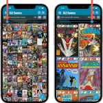 Instead of adding more new features, we decided to take a few weeks to work on the look and feel of the app.
In this 6.6 update, we improved the look and layout of the issue list and of the comic details pages, in both the main screen and the Add screen preview.
On top of that, we finally acted upon a common request from our users: you can now change the size of the thumbnails in the Images View.
 Instead of adding more new features, we decided to take a few weeks to work on the look and feel of the app.
In this 6.4 update, we improved the look and layout of the movie list and of the movie details pages, in both the main screen and the Add screen preview.
On top of that, we finally acted upon a common request from our users: you can now change the size of the thumbnails in the Images View.
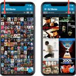 Instead of adding more new features, we decided to take a few weeks to work on the look and feel of the app.
In this 6.4 update, we improved the look and layout of the movie list and of the movie details pages, in both the main screen and the Add screen preview.
On top of that, we finally acted upon a common request from our users: you can now change the size of the thumbnails in the Images View.
Fixed
- Images View: Improved spacing between thumbnails
- Images View: Mouse over on images didn’t show the title of the item
- Cover Flow: Now uses big sharp images instead of the small thumbnails
- Find Cover: Could give an Access Violation when finding GIF images
- Templates: Improved visibility of authors if a book has multiple authors
Fixed
- Images View: Improved spacing between thumbnails
- Images View: Mouse over on images didn’t show the title of the item
- Cover Flow: Now uses big sharp images instead of the small thumbnails
- Find Cover: Could give an Access Violation when finding GIF images
Fixed:
- Images View: Improved spacing between thumbnails
- Images View: Mouse over on images didn’t show the title of the item
- Cover Flow: Now uses big sharp images instead of the small thumbnails
- Find Cover: Could give an Access Violation when finding GIF images
Fixed:
- Images View: Improved spacing between thumbnails
- Images View: Mouse over on images didn’t show the title of the item
- Cover Flow: Now uses big sharp images instead of the small thumbnails
- Find Cover: Could give an Access Violation when finding GIF images
Fixed:
- Images View: Improved spacing between thumbnails
- Images View: Mouse over on images didn’t show the title of the item
- Cover Flow: Now uses big sharp images instead of the small thumbnails
- Find Cover: Could give an Access Violation when finding GIF images
Re-introduced the Images View for Series lists (which can now also searched and sorted!)
Because the version we released yesterday was built with a new Xcode, the program automatically supported Mojave’s “Dark Mode”. Unfortunately, we all run “Light Mode” here, and we didn’t see that the program looked completely wrong in Dark Mode!
We do plan to support Dark Mode on Mojave, but this is a different project and will be addressed later this year.
Fixed:
- Mojave’s Dark Mode made the program look bad so we switched the program to light mode for now.
- Export to XML, Text, and other export functions were broken
- Images Shelves styles were broken.
Two updates for the Book Connect software and the CLZ Cloud viewer today. One a big step forward in usability, the other a nice cosmetic improvement:
Book Details now integrated in main screen
Up till now, when you clicked a book entry to see its’ full details, you were taken to the book details page, that is, a new page in your browser. One had to click “Back” to get back to the book list again. Often resulting in an annoying back and forth clicking, each time causing you to lose your position in the list.
But not anymore! Starting with today’s update, the book details are now integrated in a panel within the main collection view:
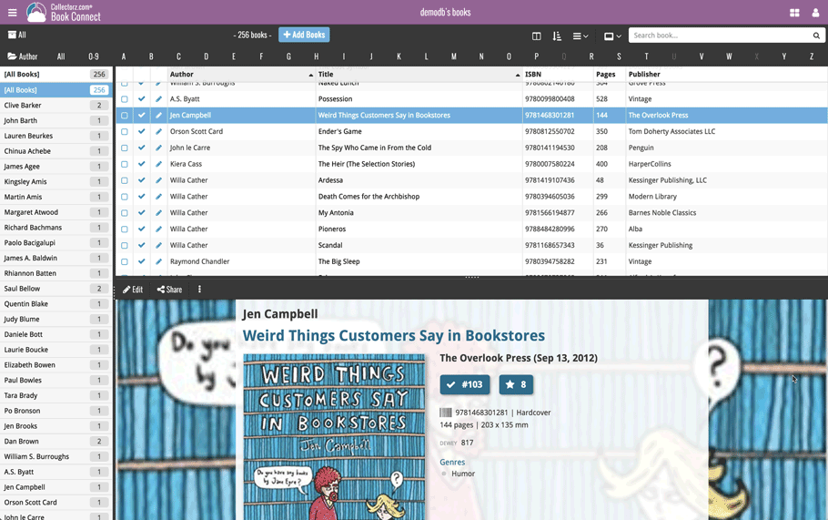
No more back and forth clicking. Just click a book entry to see its’ details, click another one to see that book’s details. Nice and easy, never lose your spot again.
Choose from two Layouts:
- Horizontal Split: folders on the left, list on the top right, details on bottom right
- Vertical Split: 3 panels side by side, folder, list and details
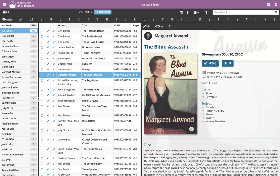
In either layout, the 3 panels are fully resizable by dragging the black “splitter bars” between the panels, so that you can customize the layout to your own liking.
The book details panel comes with its’ own “action bar”, with the main actions you may want to take on the selected book (Edit, Share, Delete, Duplicate, Loan and Link with Core).
Improved Cover View and Card View
At the same time, we made some small tweaks to both the Card View and Cover View, so that they’re making better use of your specific screen width. Both now use a “fully justified” layout, with the Cards auto-resizing to fit your screen width and the Cover distributing over the width, both resulting in a cleaner, less “jagged” view.