Instead of adding more new features, we decided to take a few weeks to work on the look and feel of the app.
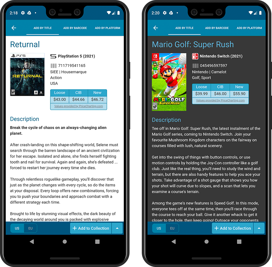
In this 6.4 update, we improved the look and layout of the game list and of the game details pages, in both the main screen and the Add screen preview.
On top of that, we finally acted upon a common request from our users: you can now change the size of the thumbnails in the Images View.
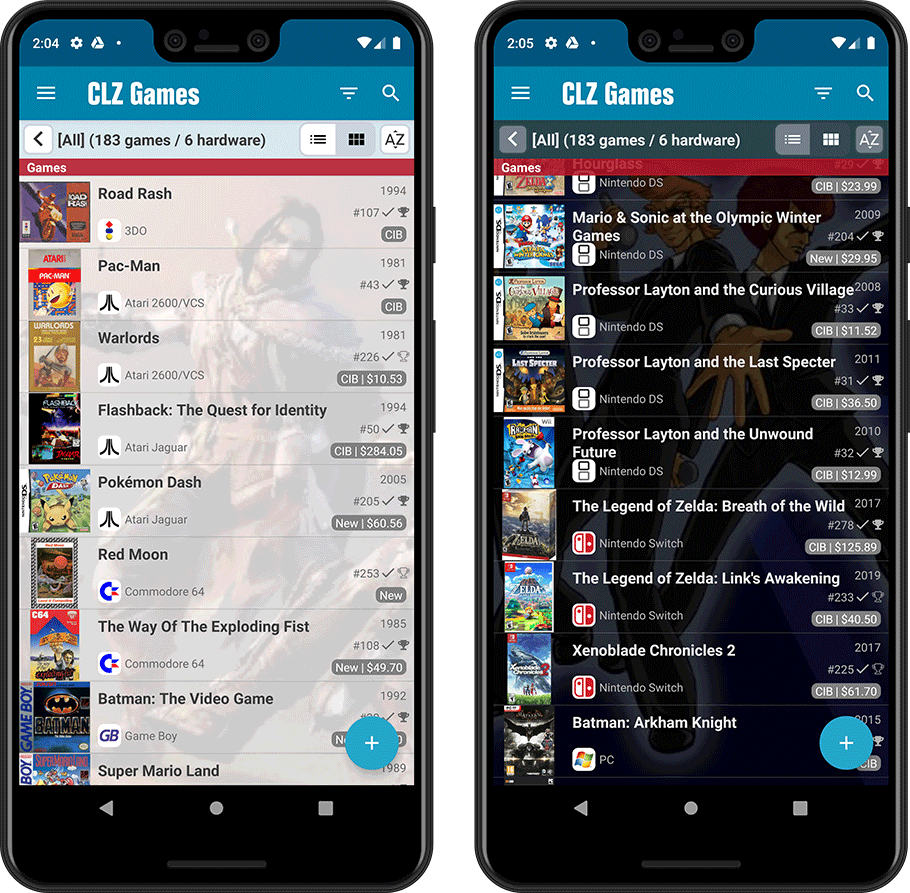
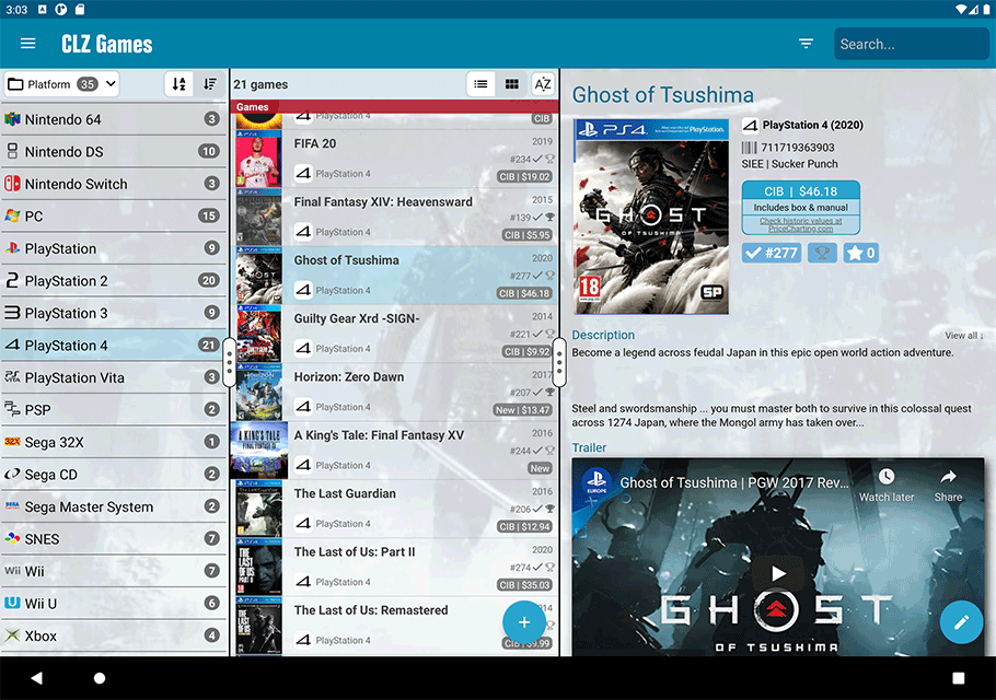
New look for the game list
- Improved size, layout and font size of list entries
- A subtle game backdrop is now shown behind the list
(this is optional, switch it off using Settings) - Tablet: backdrop is now full screen, continuing behind folder list, game list and details
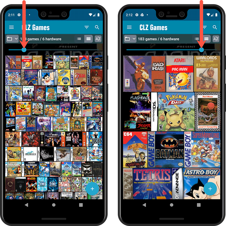
Images View: you can now change thumbnail size
This was a common request for the Images View: “Can I make the thumbnails bigger? (or smaller)”. So we finally made this happen. A new slider is now present at the top, that lets you choose how many covers are shown per row.
Also, the new layout is now a nicely filled cover wall, respecting the different game dimensions.
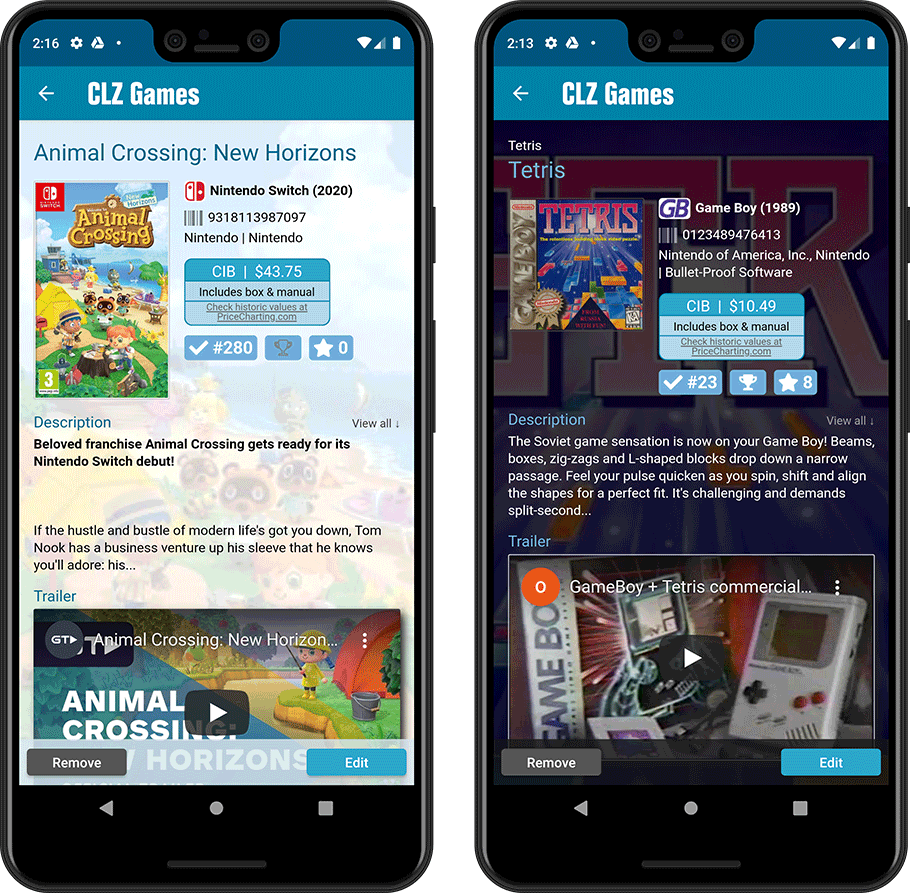
Game details (“Clear” template)
A complete redesign of the Clear template, in both Light and Dark mode, with a better layout of all game/hardware details. Plus, you can now easily change Collection Status, Completed and Rating by tapping their blue display blocks, right from the details page.
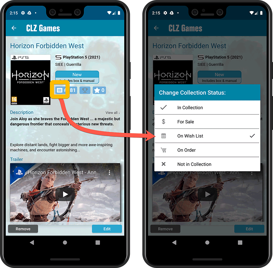
Add Games screen, Preview page
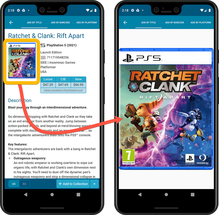
Same here, a complete redesign of the Preview template, to better show the game/hardware details from Core. And, you can now tap the small cover thumbnail to show a full screen cover.
