News & updates tagged 'template'
We’ve added some updates and fixes to the box set area in the details panel:
Updated:
- Added a “show more” button to the Notes section for very long notes
- Added a “show more” button to box sets with more than 3 albums
- You can now click an album title to directly select and show it
Fixed:
- Current Value was missing its label
- The Cat. number field was missing
New:
- Image View: Sadly not everyone likes the new flexible “full cover wall” layout. So we have now made it optional. Tap the button to the left of the size slider to switch between the new “Flex Layout” and old “Grid layout”.
Fixed:
- Template: Now only shows the publication year at the top (instead of the full publication date which has been moved to the Details section)
- iOS10: iPad: Images view would crash the app
- iOS10: iPad: After tapping an album and tapping back, the list could disappear
New:
- Image View: Sadly not everyone likes the new flexible “full cover wall” layout. So we have now made it optional. Tap the button to the left of the size slider to switch between the new “Flex Layout” and old “Grid layout”.
Fixed:
- Image View: Position of the size slider wasn’t always remembered correctly
- Template: Some weblinks could not be opened
- Template: Now only shows the publication year at the top (instead of the full publication date which has been moved to the Details section)
Fixed:
- Some layout issues with the IMDb rating/votes, index, my rating and episode number fields
- Audience rating NL-12 would show an HD-DVD icon
- Light template on Dark skin would not work correctly (and vice versa)
Fixed:
- Add album manually: crash when the ‘+’ button was pushed.
- Template: removed dollar currency symbol from ‘current value’ and ‘purchase price’ fields.
Fixed:
- Folder counters weren’t always visible
- Grade couldn’t be set to N/A for single comics
- Template could show a random “a” near the Value Details
- Updated the about screen
- Updated the installer image
New:
- Group by “Purchase year” and “Reading year”
Fixed:
- Details panel showed “publication date” where it should show “original publication date”
- Grouping on “publisher” didn’t always work correctly
Small bug fix build today for your Comic Collector on macOS:
Fixed:
- Editing the personal rating in the template and edit screens missed the star images
- Better handling of the filename in the export screens
Small bug fix build today for your Music Collector on macOS:
Fixed:
- Editing the personal rating in the template and edit screens missed the star images
- Better handling of the filename in the export screens
- Drag/Drop of discs into other albums wasn’t working sometimes
Small bug fix build today for your Book Collector on macOS:
Fixed:
- Syncing the Read It field wasn’t always working correctly.
- Export to XML: Some issues with export of characters
- Editing the personal rating in the template and edit screens missed the star images
- Better handling of the filename in the export screens
Based on user feedback we’ve updated the “Read It” flag and connected it to the “Times Read”, fixed a bug in the conversion from v18 to v19 and some other new things and fixes:
New:
- When setting “Read It” to yes/no, the “Times Read” field will update accordingly
- The Flex template is set as default for new installations
- More intuitive interface for the “Remove Collection” popup
Fixed
- Fixed a crash in v18 to v19 database conversion
- XML import could lead to duplicate images
Fixed:
- Some fields weren’t entirely visible
- The old Vee Eight template was missing the IMDb logo
(tip: try the NEW Flex template via menu View > Details View Template > Flex!!) - Submitting a movie to Core could give an error
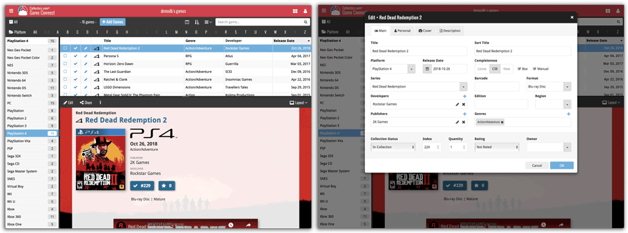
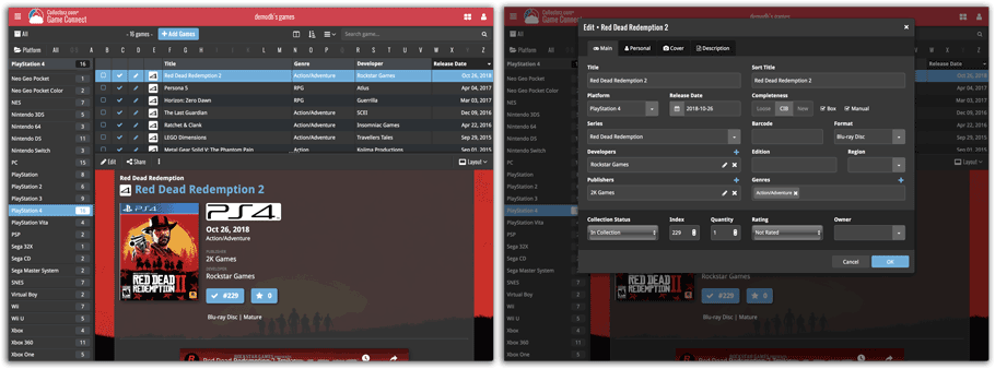
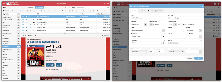
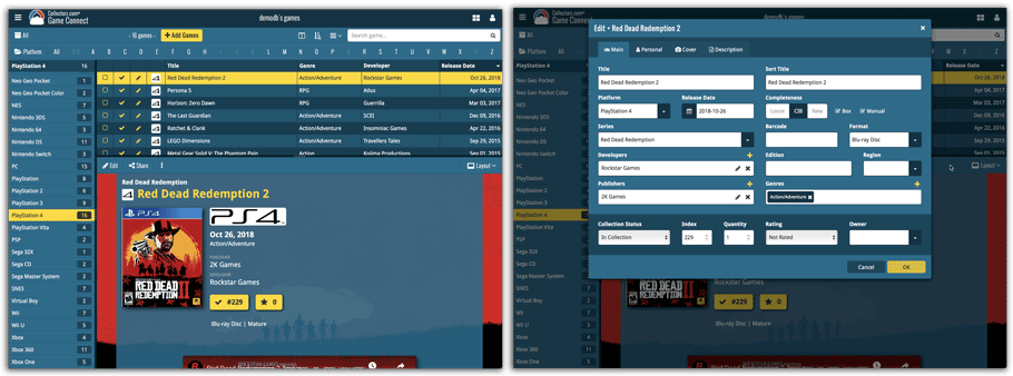
Do you like to customize your software to suit your needs or just your personal taste? Then we have big news for you today, as we have just introduced four “Skin” choices in your Game Connect software:
- Default (the standard look, as it was before, so dark toolbars, light content)
- Dark (dark toolbars, dark content)
- Light (light toolbars, light content)
- Blue (shades of blue, with yellow highlights)
On top of that, we have given you 3 template style choices for the Game Details area: Dark, Light and Blue. Either to match your Skin choice, or to mix to up, it’s up to you.
Both the Skin and Template selectors can be found in the Settings screen, under Customization.
Screen shots:
Default Skin:
Dark Skin:
Light Skin:
Blue Skin:
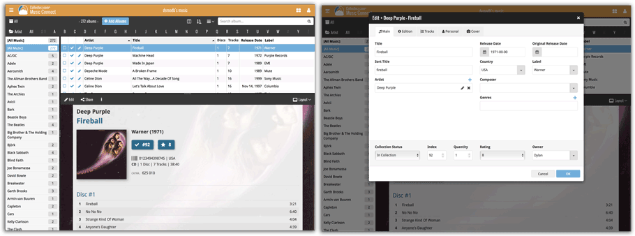
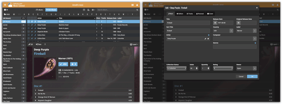
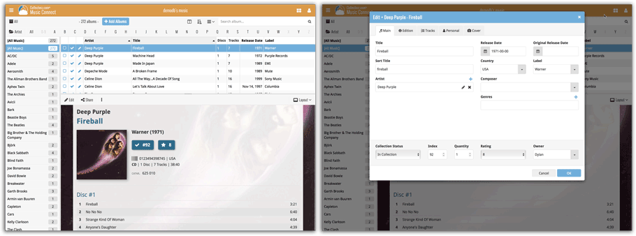
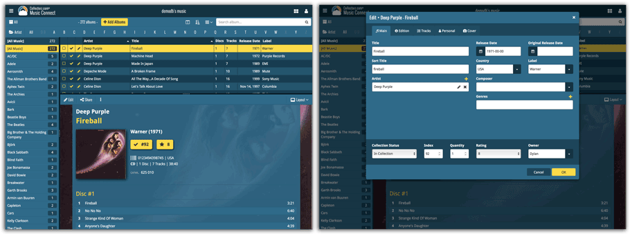
Do you like to customize your software to suit your needs or just your personal taste? Then we have big news for you today, as we have just introduced four “Skin” choices in your Music Connect software:
- Default (the standard look, as it was before, so dark toolbars, light content)
- Dark (dark toolbars, dark content)
- Light (light toolbars, light content)
- Blue (shades of blue, with yellow highlights)
On top of that, we have given you 3 template style choices for the Album Details area: Dark, Light and Blue. Either to match your Skin choice, or to mix to up, it’s up to you.
Both the Skin and Template selectors can be found in the Settings screen, under Customization.
Screen shots:
Default Skin:
Dark Skin:
Light Skin:
Blue Skin:
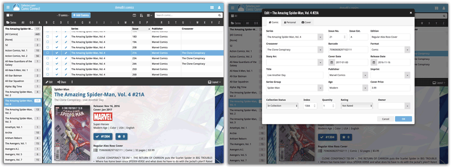
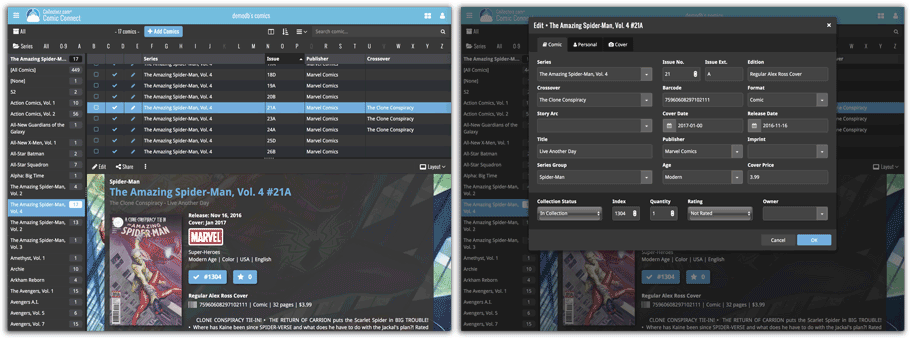
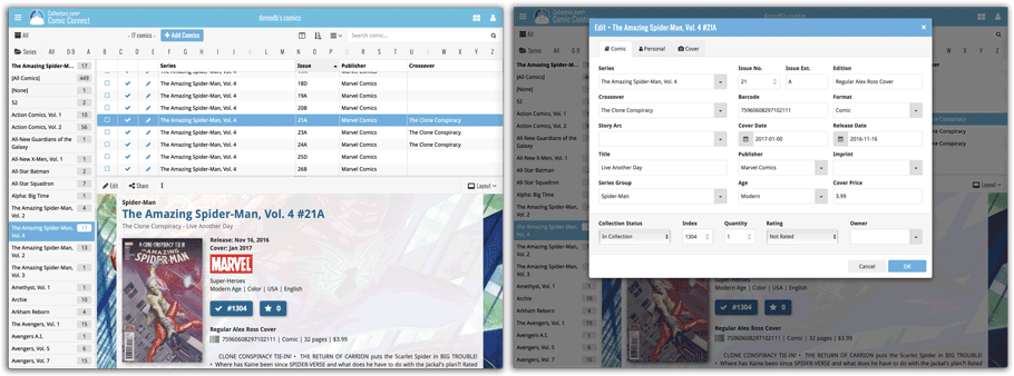
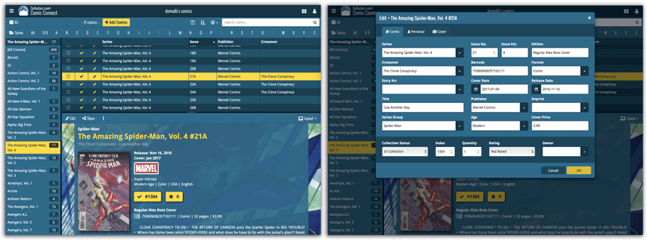
Do you like to customize your software to suit your needs or just your personal taste? Then we have big news for you today, as we have just introduced four “Skin” choices in your Comic Connect software:
- Default (the standard look, as it was before, so dark toolbars, light content)
- Dark (dark toolbars, dark content)
- Light (light toolbars, light content)
- Blue (shades of blue, with yellow highlights)
On top of that, we have given you 3 template style choices for the Comic Details area: Dark, Light and Blue. Either to match your Skin choice, or to mix to up, it’s up to you.
Both the Skin and Template selectors can be found in the Settings screen, under Customization.
Screen shots:
Default Skin:
Dark Skin:
Light Skin:
Blue Skin:
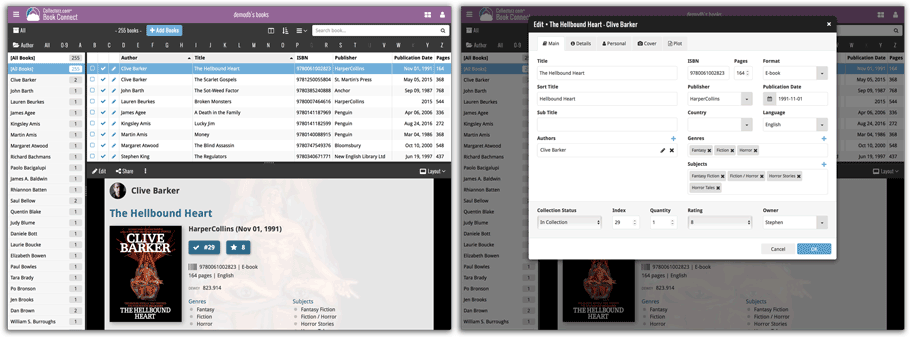
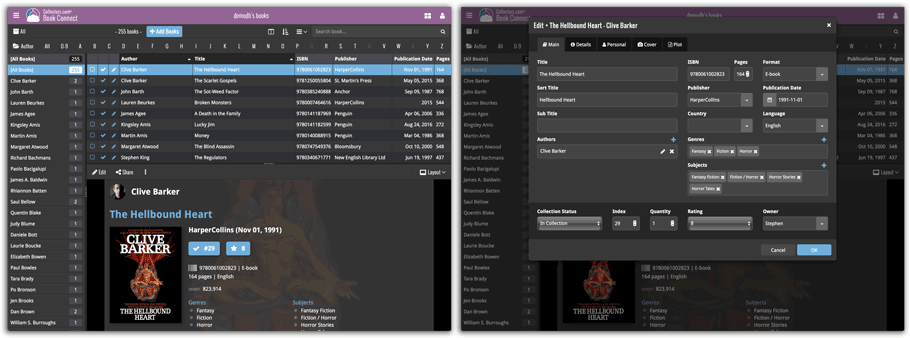
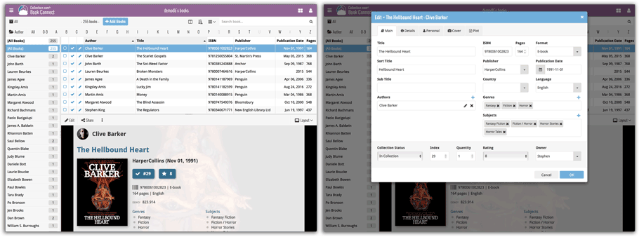
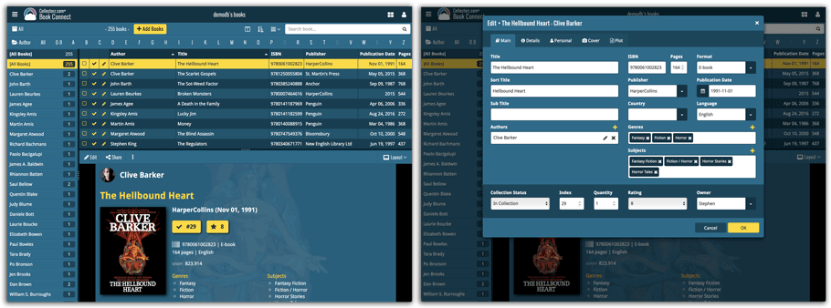
Do you like to customize your software to suit your needs or just your personal taste? Then we have big news for you today, as we have just introduced four “Skin” choices in your Book Connect software:
- Default (the standard look, as it was before, so dark toolbars, light content)
- Dark (dark toolbars, dark content)
- Light (light toolbars, light content)
- Blue (shades of blue, with yellow highlights)
On top of that, we have given you 3 template style choices for the Book Details area: Dark, Light and Blue. Either to match your Skin choice, or to mix to up, it’s up to you.
Both the Skin and Template selectors can be found in the Settings screen, under Customization.
Screen shots:
Default Skin:
Dark Skin:
Light Skin:
Blue Skin:
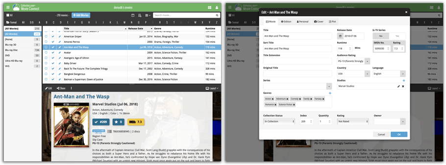
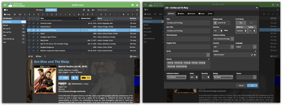
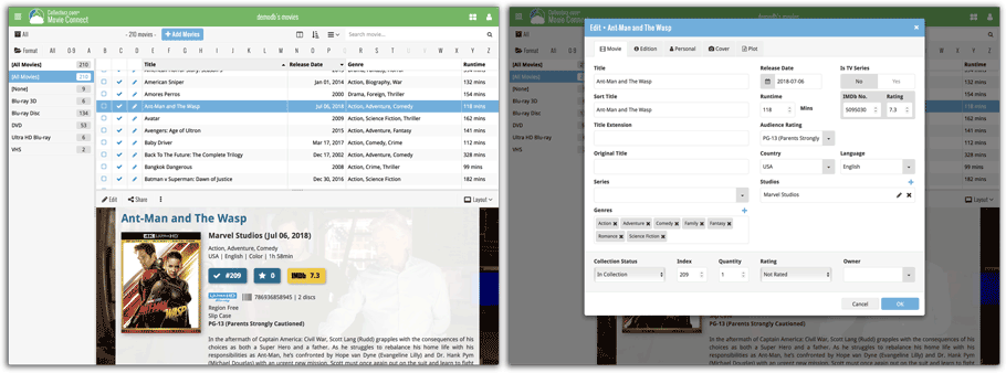
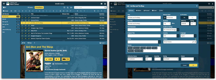
Do you like to customize your software to suit your needs or just your personal taste? Then we have big news for you today, as we have just introduced four “Skin” choices in your Movie Connect software:
- Default (the standard look, as it was before, so dark toolbars, light content)
- Dark (dark toolbars, dark content)
- Light (light toolbars, light content)
- Blue (shades of blue, with yellow highlights)
On top of that, we have given you 3 template style choices for the Movie Details area: Dark, Light and Blue. Either to match your Skin choice, or to mix to up, it’s up to you.
Both the Skin and Template selectors can be found in the Settings screen, under Customization.
Screen shots:
Default Skin:
Dark Skin:
Light Skin:
Blue Skin:
v18: Auto-Cloud-Syncing, revamped Edit screen, new “Clean” template and more!

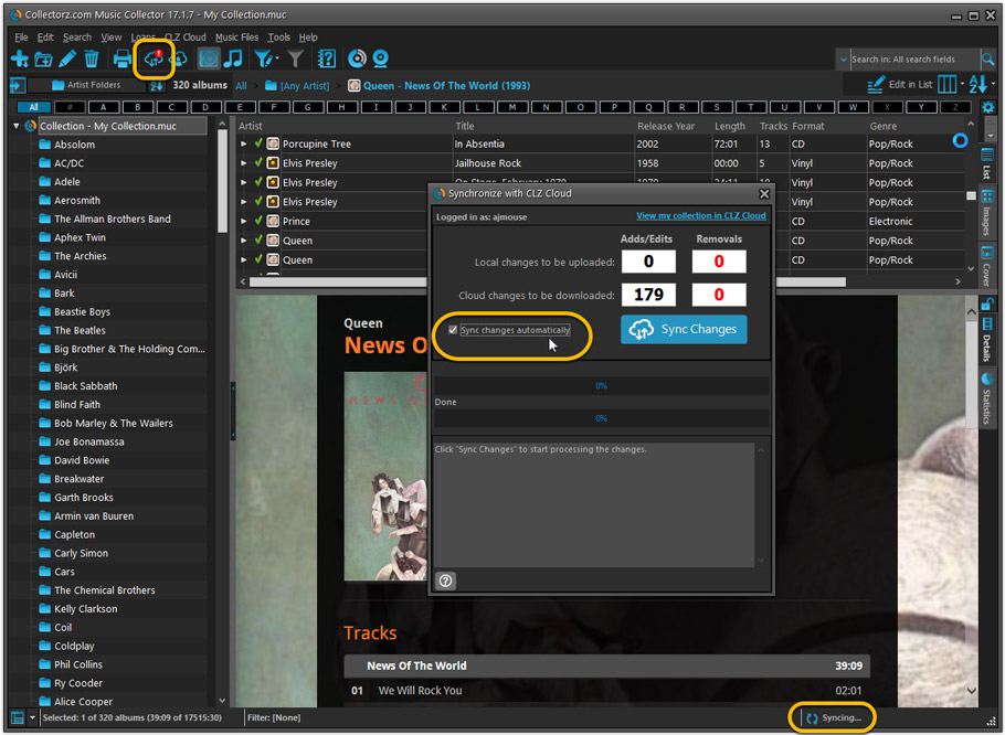
NEW: Fully Automatic CLZ Cloud Syncing!
The free CLZ Cloud service is at the center of all our cataloging solutions (desktop, mobile and web), the glue that binds them all together.
Tens of thousands of users are using the CLZ Cloud syncing every day, to transfer data between their desktop, Connect and mobile software, to update their online collection list, or simply for keeping an online backup of their precious database.
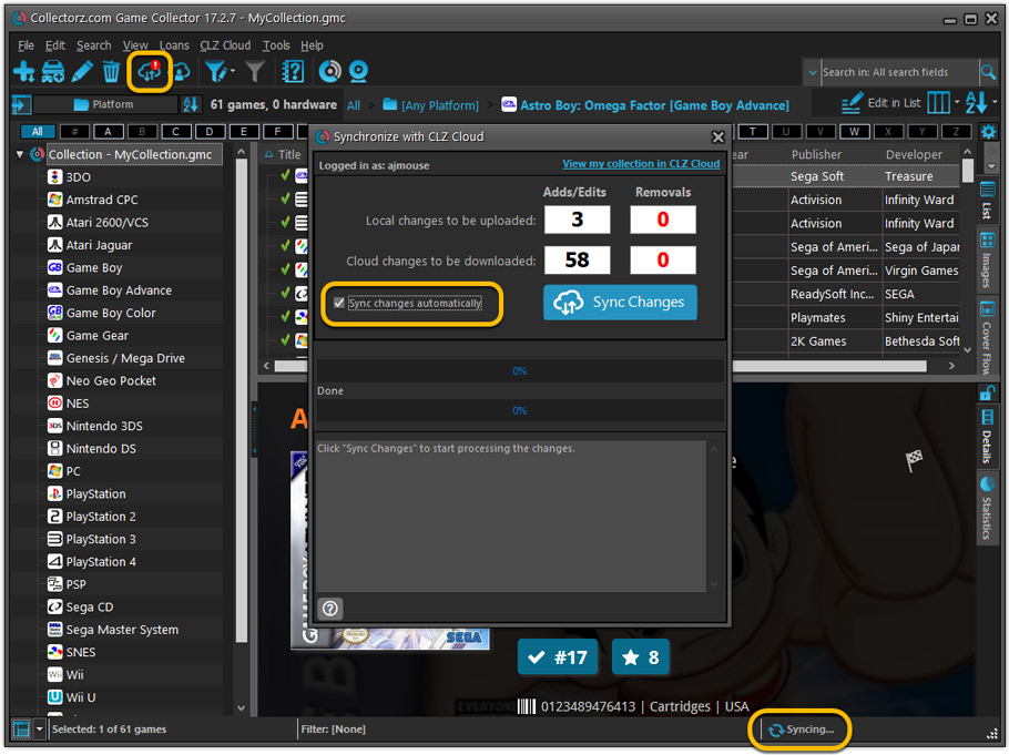
Now, it is time to take the CLZ Cloud to the next level, with automatic syncing:
Add or edit albums in Music Collector and these changes will auto-upload to the CLZ Cloud instantly. Did you make changes using the CLZ Music mobile app or directly in Music Connect? Just start your software and changes will download automatically.
No more need to go to the Sync with CLZ Cloud screen, ever.
With “Sync Automatically” switched on…
- Your online cloud backup is always up-to-date.
- Your cloud viewer always shows the current state of your collection.
- All your CLZ tools (desktop, mobile and Connect) will always be in-sync.
Automatic Cloud Syncing is an optional feature, switched OFF by default. If you don’t want to auto-sync, or don’t want to sync with the CLZ Cloud at all, just leave it switched OFF.
Revamped Edit Album and Edit Disc/Track screens
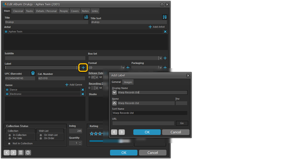
A huge refresh of the Edit screens, bringing the look and feel more in line with the recent Add Albums from Core screen.
- Button bar is now at the bottom of the screen
With OK button high-lighted in blue, nice Next/Prev arrow buttons, etc… - Clearer blue “+” buttons for checkbox list fields (like Sound, Extras)
- Same blue + buttons for dropdown fields (like Format, Label, Packaging)
- Revamped Edit screen for pick list items
Button bar at the bottom with blue OK button, smaller generate buttons, etc..
But it’s not all just cosmetic changes:
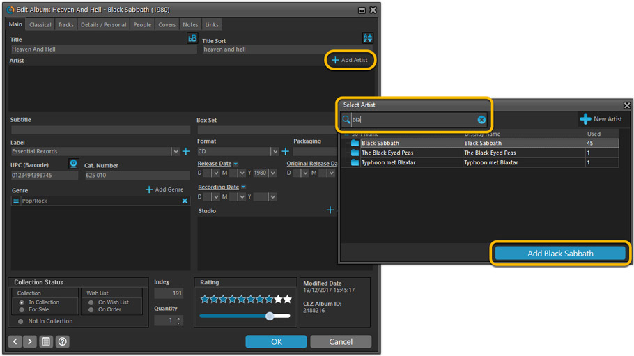
Improved interface for adding Artists, Musicians, Credits
The new interface helps you make better use of your existing person pick lists:
- Cleaner lists, showing just Display Name and Instrument/Role.
- Right-click to Modify the name and sort name of a person in the list.
- Drag the icon in the first column to change the order.
- Click the “x” in the last column to remove entries.
- 1. click the “+ Add Artist” button, or hit Insert on your keyboard
- 2. A new screen appears, showing your existing Person pick list.
- 4. Type a few letters in the search box to find the artist you want to add, e.g. enter “spri” to find Bruce Springsteen.
- 5. Hit the down arrow on your keyboard a few times to select the person from the search results
- 6. Hit Enter to return to the Edit Album screen with the artist added to the list.
ONLY when the artist is not in your pick list yet, there’s 3 extra steps:
- 4a: click the New Artist button top right
- 4b. enter/paste the display name
- 4c. click OK
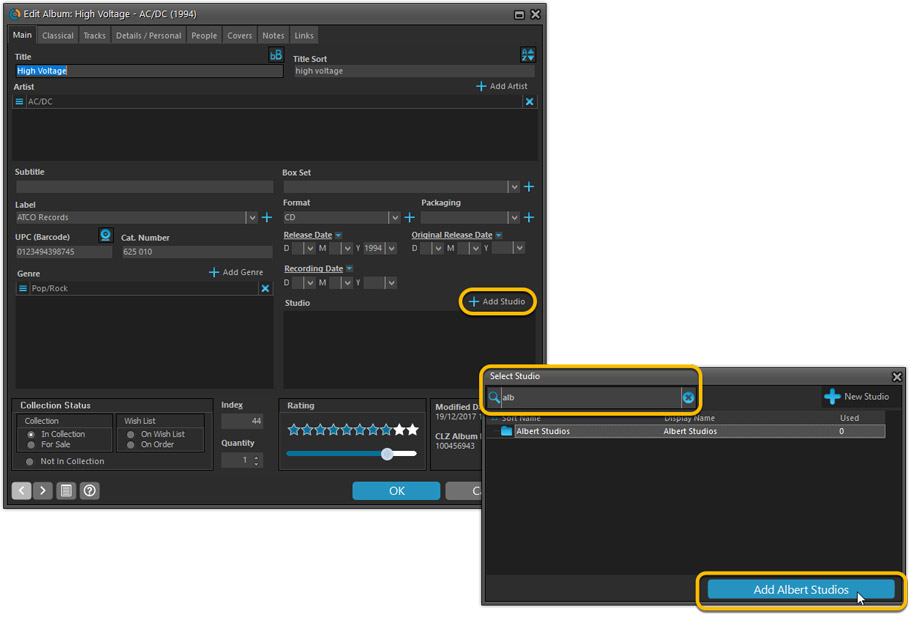
A similar interface is now also used for the Genre and Studio fields.
No more endless scrolling in a small check-box list to find the Genre or Studio you’d like to add. Instead, just click the Add button and making your pick from your pick list, using the convenient search feature if necessary.
Improved: Edit Multiple screens
- Now use checkboxes to explicitly indicate which field(s) you want set.
Safer and clearer, no more unexpected changes. - To clear a field, just click the checkbox and leave the box empty.
The box will highlight in red to indicate the CLEAR action. No more hidden F8 keys.
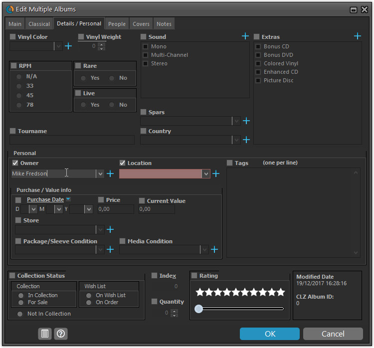
New screens for selecting Column, Sort and Folder fields.
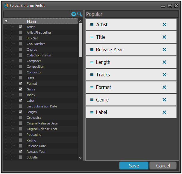
The ability to select your own Columns for the List View is an important customization feature of our Music Collector software. The same holds for selecting the sort order and the folder fields for the folder panel.
However, the “field selection” screens for doing these customizations have always been an area of confusion. So for v18 we decided to re-imagine both the field selection screens and the system for creating/managing your own presets.
- New Field Selection screen:
- Available fields are now grouped, like the tabs in the Edit Album screen.
- Easily find the field you want with the search box top left.
- Use checkboxes on the left to select fields.
- Use the “x” button on the right to remove fields.
- Drag and drop fields on the right side to change the order.
- Rename the field set at the top right.
- New interface for selecting and managing your field presets:
- Just click the Columns or Sort Order button to EDIT the current preset.
- Click the little arrow to the right of the Columns or Sort Order button to open the preset menu and switch to a different preset.
- Choose Manage Presets from the preset menu to edit your presets and create new ones.
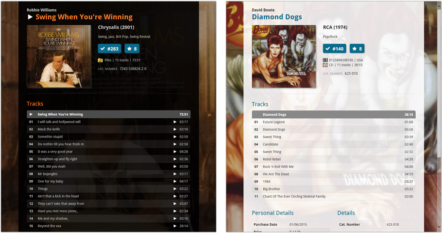
NEW: “Clean” template for the details panel, in Light and Dark styles
A complete refresh, based on the recent Connect/Cloud details page updates. Clean, clear and modern, with some fresh layout ideas:
- Cleaner look, in both Light and Dark styles.
- Larger cover image.
- New look of the track list.
No more Standard edition: Pro-only features now available for everyone!
Since last week, we stopped selling the Standard edition of Music Collector. From now on, the Pro edition is the only edition we sell, and will just be called “Music Collector” now.
Our gift to all users on the Standard edition who have a valid Update Plan:
Starting with v18, you now get access to all Pro-only features:
- Batch editing with the Edit Multiple feature:
Save time by editing multiple items in batch, e.g. to fill in a field value for many items in one go. - Customizable pre-sets for sorting, columns and folders:
Create your own pre-set field combination for sorting and columns. Define your own folder options, even multi-level folder combinations. - User Defined Fields:
Create your own fields (text, number, pick list, checkbox or date) and rename pre-defined fields. - Export features:
Export your database to a CSV or XML file.
v18: Auto-Cloud-Syncing, revamped Edit screen, new “Clean” template and more!

NEW: Fully Automatic CLZ Cloud Syncing!
The free CLZ Cloud service is at the center of all our cataloging solutions (desktop, mobile and web), the glue that binds them all together.
Tens of thousands of users are using the CLZ Cloud syncing every day, to transfer data between their desktop, Connect and mobile software, to update their online collection list, or simply for keeping an online backup of their precious database.
Now, it is time to take the CLZ Cloud to the next level, with automatic syncing:
Add or edit games in Game Collector and these changes will auto-upload to the CLZ Cloud instantly. Did you make changes using CLZ Games or directly in Game Connect? Just start your software and changes will download automatically.
No more need to go to the Sync with CLZ Cloud screen, ever.
With “Sync Automatically” switched on…
- Your online cloud backup is always up-to-date.
- Your cloud viewer always shows the current state of your collection.
- All your CLZ tools (desktop, mobile and Connect) will always be in-sync.
Automatic Cloud Syncing is an optional feature, switched OFF by default. If you don’t want to auto-sync, or don’t want to sync with the CLZ Cloud at all, just leave it switched OFF.
Revamped Edit Game screen
A huge refresh of the Edit Game screen, bringing the look and feel more in line with the recent Add Games from Core screen.
- Button bar is now at the bottom of the screen
With OK button high-lighted in blue, nice Next/Prev arrow buttons, etc… - Clearer blue + buttons for checkbox list fields (like Genres)
- Same blue + buttons for dropdown fields (like Platform and Format)
- Revamped Edit screen for pick list items
Button bar at the bottom with blue OK button, smaller generate buttons, etc..
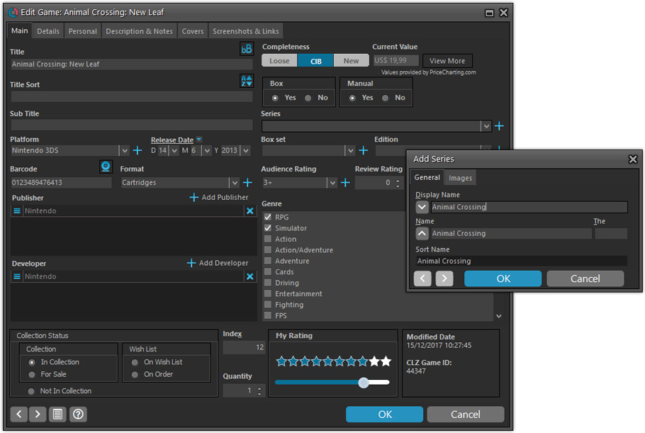
But it’s not all just cosmetic changes:
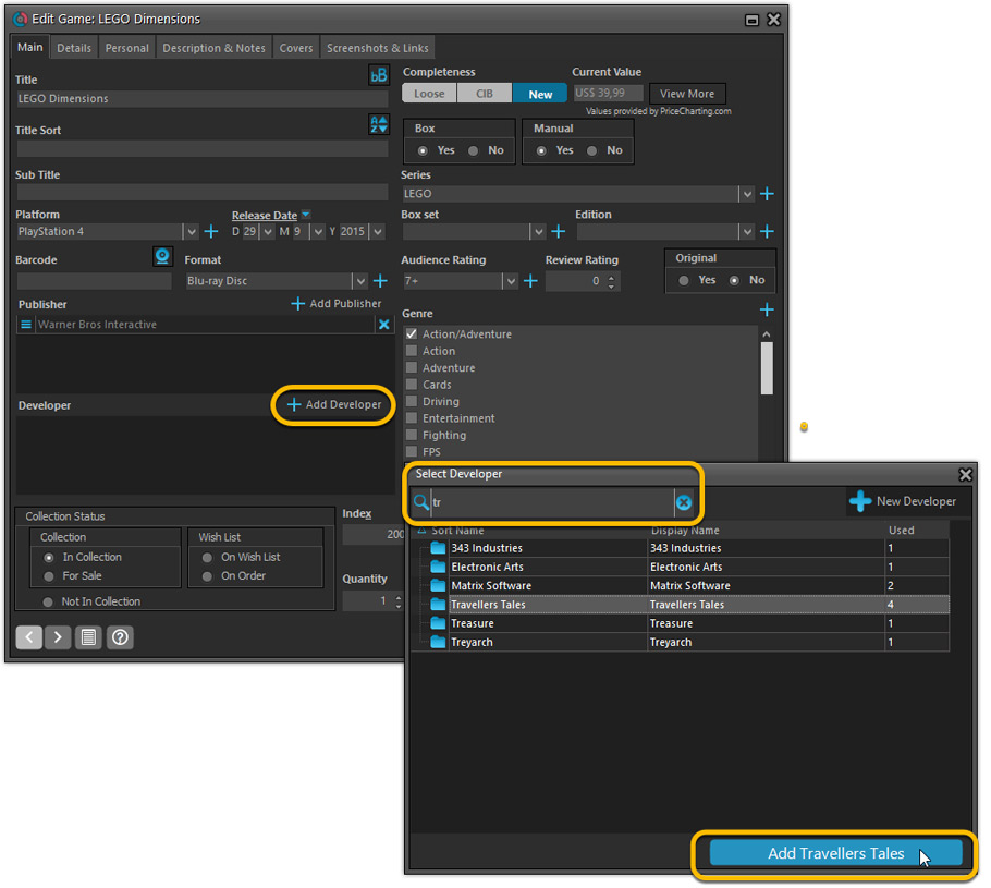
Improved interface for adding Publishers and Developers
The new interface helps you make better use of your existing publisher and developer pick lists:
- Drag the icon in the first column to change the order.
- Click the “x” in the last column to remove entries.
- Right-click to Modify the name and sort name of a company in the list.
- 1. click the “+ Add Developer” button, or hit Insert on your keyboard
- 2. A new screen appears, showing your existing creator pick list.
- 3. Type a few letters in the search box to find the creator you want to add, e.g. enter “id” to find id Software.
- 5. Hit the down arrow on your keyboard a few times to select the actor from the search results
- 6. Hit Enter to return to the Edit Game screen with the developer added to list.
ONLY when the developer is not in your pick list yet, there’s 3 extra steps:
- 4a: click the New Developer button top right
- 4b. enter/paste the display name
- 4c. click OK
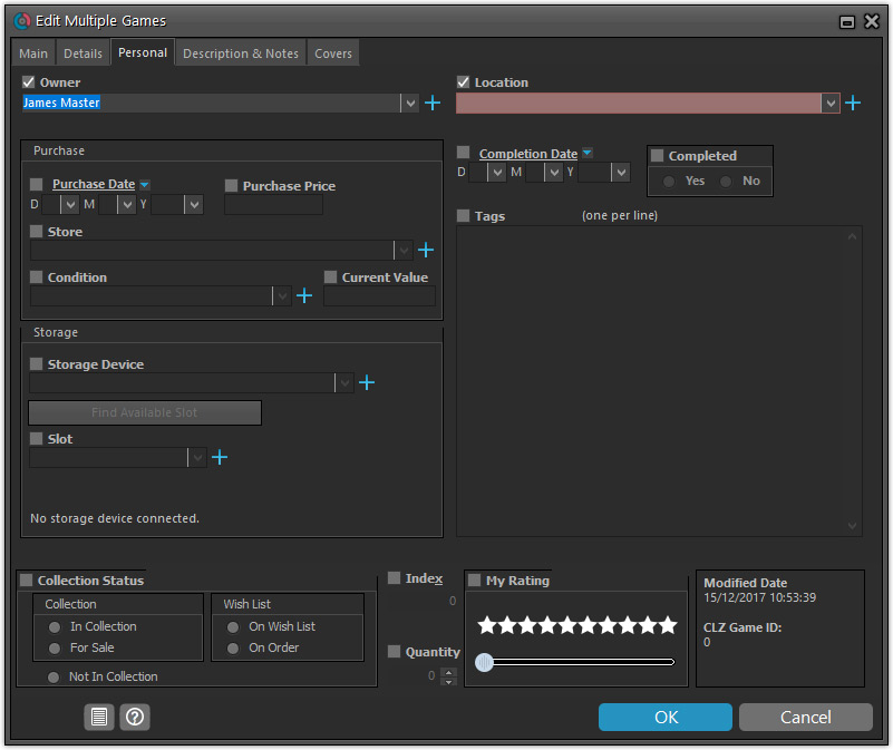
Simplified: Edit Multiple Games screen
- Now use checkboxes to explicitly indicate which field(s) you want set.
Safer and clearer, no more unexpected changes. - To clear a field, just click the checkbox and leave the box empty.
The box will highlight in red to indicate the CLEAR action. No more hidden F8 keys.
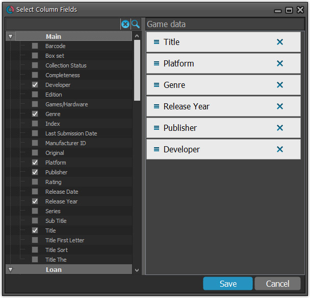
Simplified screens for selecting Column, Sort and Folder fields.
The ability to select your own Columns for the List View is an important customization feature of our Game Collector software. The same holds for selecting the sort order and the folder fields for the folder panel.
However, the “field selection” screens for doing these customizations have always been an area of confusion. So for v18 we decided to re-imagine both the field selection screens and the system for creating/managing your own presets.
- Simplified Field Selection screen:
- Available fields are now grouped, like the tabs in the Edit Game screen.
- Easily find the field you want with the search box top left.
- Use checkboxes on the left to select fields.
- Use the “x” button on the right to remove fields.
- Drag and drop fields on the right side to change the order.
- Rename the field set at the top right.
- Simplified system for managing your field presets:
- Just click the Columns or Sort Order button to EDIT the current preset.
- Click the little arrow to the right of the Columns or Sort Order button to open the preset menu and switch to a different preset.
- Choose Manage Presets from the preset menu to edit your presets and create new ones.
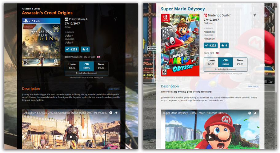
NEW: “Clean” template for the details panel, in Light and Dark styles
A complete refresh, based on the recent Connect/Cloud details page updates. Clean, clear and modern, with some fresh layout ideas:
- Cleaner look, in both Light and Dark styles.
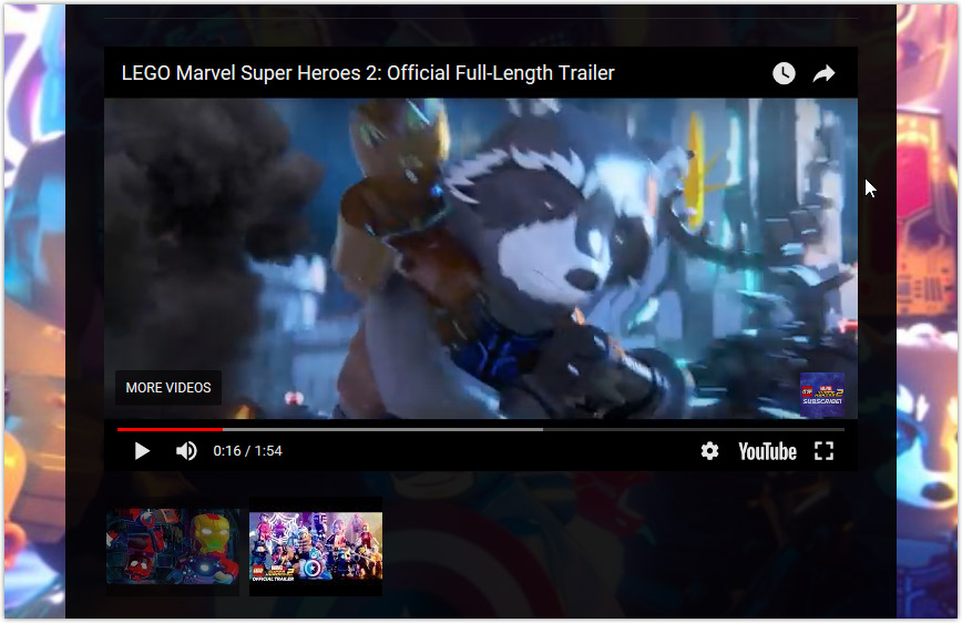
- Now shows just one embedded trailer video, with a trailer selection bar beneath to switch between multiple trailers.
No more Standard edition: Pro-only features now available for everyone!
Since last week, we stopped selling the Standard edition of Game Collector. From now on, the Pro edition is the only edition we sell, and will just be called “Game Collector” now.
Our gift to all users on the Standard edition who have a valid Update Plan:
Starting with v18, you now get access to all Pro-only features:
- Batch editing with the Edit Multiple feature:
Save time by editing multiple items in batch, e.g. to fill in a field value for many items in one go. - Customizable pre-sets for sorting, columns and folders:
Create your own pre-set field combination for sorting and columns. Define your own folder options, even multi-level folder combinations. - User Defined Fields:
Create your own fields (text, number, pick list, checkbox or date) and rename pre-defined fields. - Export features:
Export your database to a CSV or XML file.
v18: Auto-Cloud-Syncing, revamped Edit screen, new “Clean” template and more!

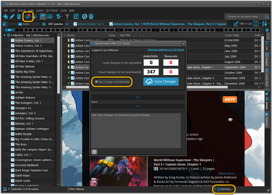
NEW: Fully Automatic CLZ Cloud Syncing!
The free CLZ Cloud service is at the center of all our cataloging solutions (desktop, mobile and web), the glue that binds them all together.
Tens of thousands of users are using the CLZ Cloud syncing every day, to transfer data between their desktop, Connect and mobile software, to update their online collection list, or simply for keeping an online backup of their precious database.
Now, it is time to take the CLZ Cloud to the next level, with automatic syncing:
Add or edit comics in Comic Collector and these changes will auto-upload to the CLZ Cloud instantly. Did you make changes using CLZ Comics or directly in Comic Connect? Just start your software and changes will download automatically.
No more need to go to the Sync with CLZ Cloud screen, ever.
With “Sync Automatically” switched on…
- Your online cloud backup is always up-to-date.
- Your cloud viewer always shows the current state of your collection.
- All your CLZ tools (desktop, mobile and Connect) will always be in-sync.
Automatic Cloud Syncing is an optional feature, switched OFF by default. If you don’t want to auto-sync, or don’t want to sync with the CLZ Cloud at all, just leave it switched OFF.
Revamped Edit Comic screen
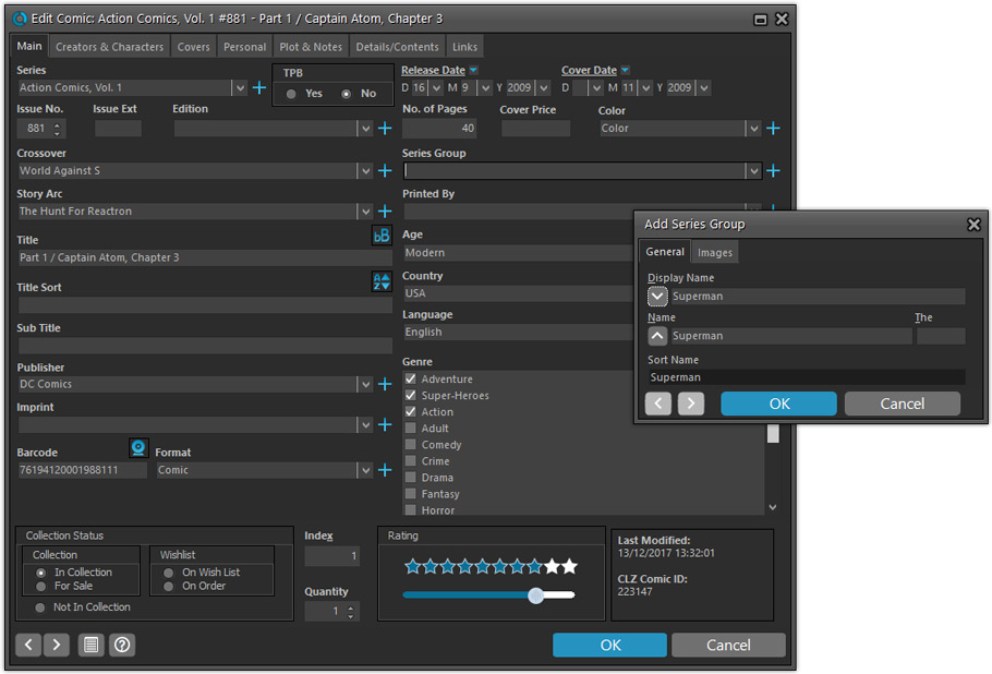
A huge refresh of the Edit Comic screen, bringing the look and feel more in line with the recent Add Comics from Core screen.
- Button bar is now at the bottom of the screen
With OK button high-lighted in blue, nice Next/Prev arrow buttons, etc… - Clearer blue + buttons for checkbox list fields (like Genres)
- Same blue + buttons for dropdown fields (like Series, Publisher, Imprint)
- Revamped Edit screen for pick list items
Button bar at the bottom with blue OK button, smaller generate buttons, etc..
But it’s not all just cosmetic changes:
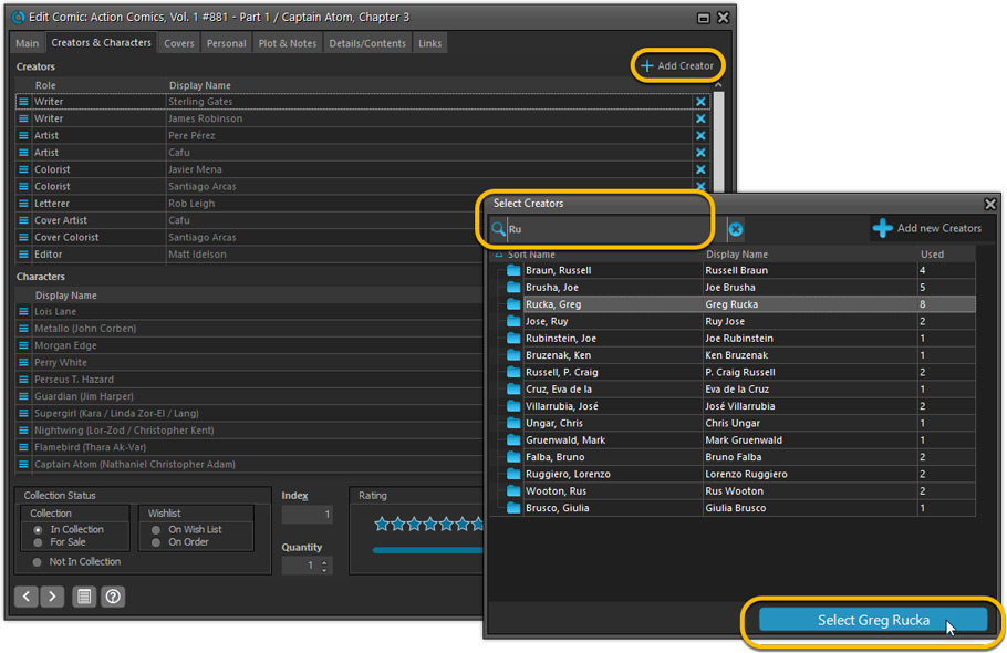
Improved interface for adding Creators and Characters
The new interface helps you make better use of your existing creator and character pick lists:
- Cleaner lists, showing just Display Name and Role/Alias.
- Right-click to Modify the name and sort name of a person in the list.
- Drag the icon in the first column to change the order.
- Click the “x” in the last column to remove entries.
- 1. click the “+ Add Creator” button, or hit Insert on your keyboard
- 2. Select the creator type (Writer, Penciler, Inker, etc…)
- 3. A new screen appears, showing your existing creator pick list.
- 4. Type a few letters in the search box to find the creator you want to add, e.g. enter “stra” to find J. Michael Straczynski.
- 5. Hit the down arrow on your keyboard a few times to select the creator from the search results
- 6. Hit Enter to return to the Edit Comic screen with the creator added to the list.
ONLY when the creator is not in your pick list yet, there’s 3 extra steps:
- 4a: click the New Creator button top right
- 4b. enter/paste the display name
- 4c. click OK
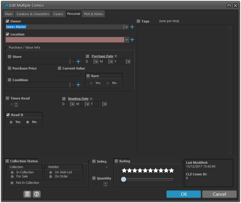
Simplified: Edit Multiple Comics screen
- Now use checkboxes to explicitly indicate which field(s) you want set.
Safer and clearer, no more unexpected changes. - To clear a field, just click the checkbox and leave the box empty.
The box will highlight in red to indicate the CLEAR action. No more hidden F8 keys.
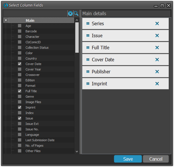
Simplified screens for selecting Column, Sort and Folder fields.
The ability to select your own Columns for the List View is an important customization feature of our Comic Collector software. The same holds for selecting the sort order and the folder fields for the folder panel.
However, the “field selection” screens for doing these customizations have always been an area of confusion. So for v18 we decided to re-imagine both the field selection screens and the system for creating/managing your own presets.
- Simplified Field Selection screen:
- Available fields are now grouped, like the tabs in the Edit Comic screen.
- Easily find the field you want with the search box top left.
- Use checkboxes on the left to select fields.
- Use the “x” button on the right to remove fields.
- Drag and drop fields on the right side to change the order.
- Rename the field set at the top right.
- Simplified system for managing your field presets:
- Just click the Columns or Sort Order button to EDIT the current preset.
- Click the little arrow to the right of the Columns or Sort Order button to open the preset menu and switch to a different preset.
- Choose Manage Presets from the preset menu to edit your presets and create new ones.
NEW: “Clean” template for the details panel, in Light and Dark styles
A complete refresh, based on the recent Connect/Cloud details page updates. Clean, clear and modern, with some fresh layout ideas:
- Cleaner look, in both Light and Dark styles.
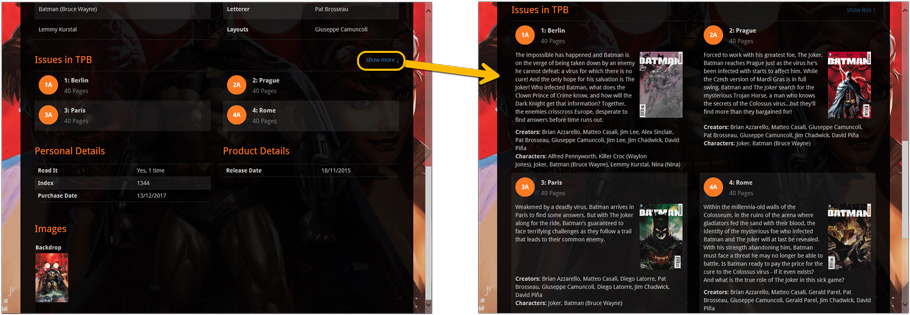
- Clear display of Series, Issue Number, Date and Edition.
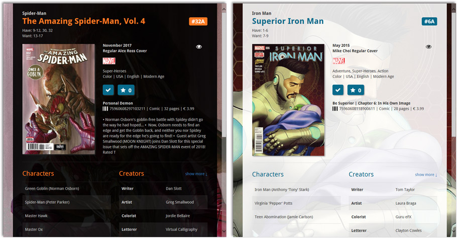
- Nicer display of contents of Trade Paper Backs:
No more Standard edition: Pro-only features now available for everyone!
Since last week, we stopped selling the Standard edition of Comic Collector. From now on, the Pro edition is the only edition we sell, and will just be called “Comic Collector” now.
Our gift to all users on the Standard edition who have a valid Update Plan:
Starting with v18, you now get access to all Pro-only features:
- Batch editing with the Edit Multiple feature:
Save time by editing multiple items in batch, e.g. to fill in a field value for many items in one go. - Customizable pre-sets for sorting, columns and folders:
Create your own pre-set field combination for sorting and columns. Define your own folder options, even multi-level folder combinations. - User Defined Fields:
Create your own fields (text, number, pick list, checkbox or date) and rename pre-defined fields. - Export features:
Export your database to a CSV or XML file.
v18: Auto-Cloud-Syncing, revamped Edit screen, new “Clean” template and more!

NEW: Fully Automatic CLZ Cloud Syncing!
The free CLZ Cloud service is at the center of all our cataloging solutions (desktop, mobile and web), the glue that binds them all together.
Tens of thousands of users are using the CLZ Cloud syncing every day, to transfer data between their desktop, Connect and mobile software, to update their online collection list, or simply for keeping an online backup of their precious database.
Now, it is time to take the CLZ Cloud to the next level, with automatic syncing:
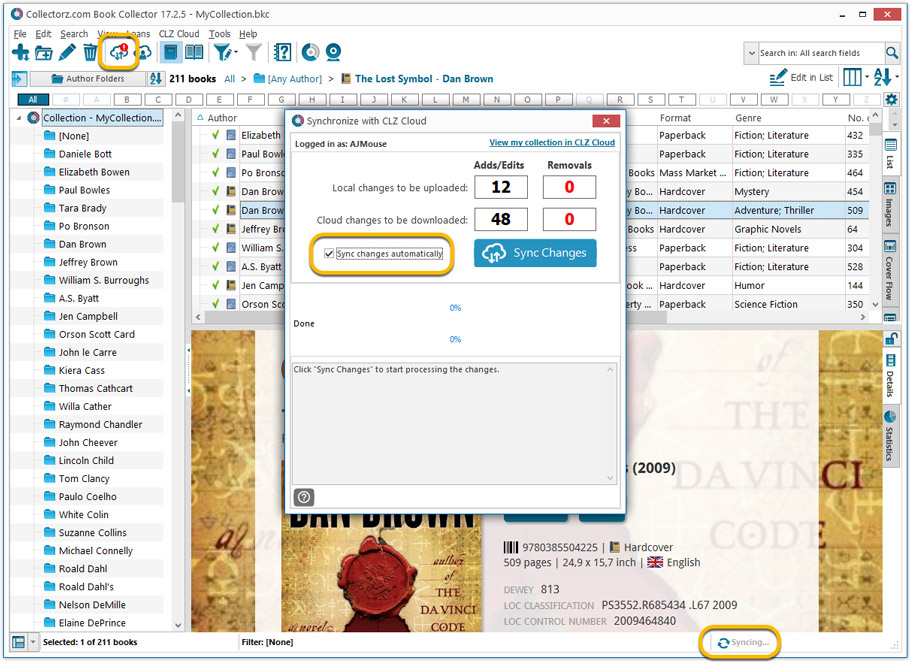
Add or edit books in Book Collector and these changes will auto-upload to the CLZ Cloud instantly. Did you make changes using CLZ Books or directly in Book Connect? Just start your software and changes will download automatically.
No more need to go to the Sync with CLZ Cloud screen, ever.
With “Sync Automatically” switched on…
- Your online cloud backup is always up-to-date.
- Your cloud viewer always shows the current state of your collection.
- All your CLZ tools (desktop, mobile and Connect) will always be in-sync.
Automatic Cloud Syncing is an optional feature, switched OFF by default. If you don’t want to auto-sync, or don’t want to sync with the CLZ Cloud at all, just leave it switched OFF.
Revamped Edit Book screen
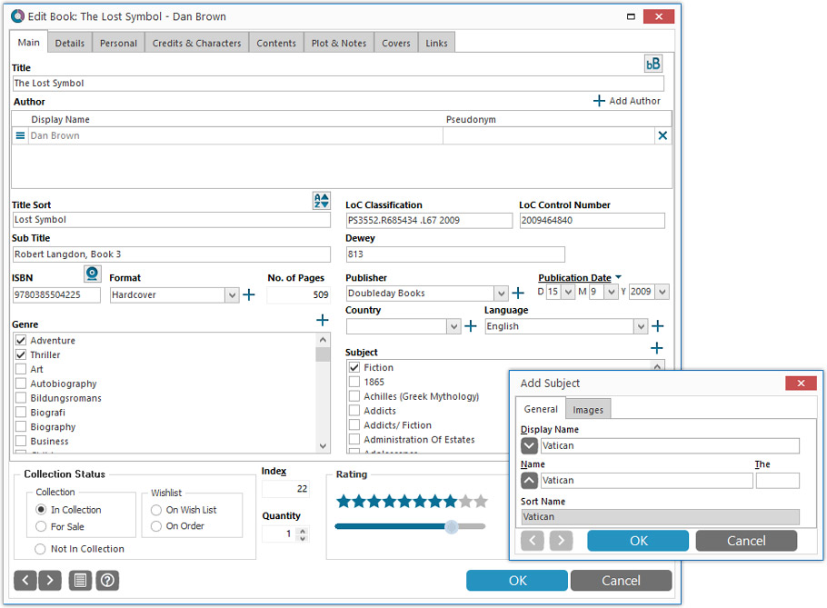
A huge refresh of the Edit Book screen, bringing the look and feel more in line with the recent Add Books from Core screen. But it’s not all just cosmetic changes, here’s what’s new:
- Button bar is now at the bottom of the screen
With OK button high-lighted in blue, nice Next/Prev arrow buttons, etc… - Re-designed user interface for adding and editing Authors
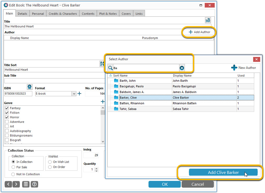
- The Author list in the Edit Book screen is now a cleaner list, showing just Display Name and Pseudonym.
- To add an Author, click the Add button top right. The new Select Author screen appears, showing your current Author pick list. Use the search box to find the author you’d like to add, typing just a few letters will make it appear. Select it, then click the big blue Add Author button at the bottom right. If your author is not in the pick list yet, use the New Author button to create it.
- Right-click to Modify the name and sort name of an author in the list.
- Drag the icon in the first column to change the order.
- Click the “x” in the last column to remove entries.
- Clearer blue + buttons for checkbox list fields (like Genres and Subjects)
- Same blue + buttons for dropdown fields (like Publisher, Country and Language)
- Revamped Edit screen for pick list items
Button bar at the bottom with blue OK button, smaller generate buttons, etc..
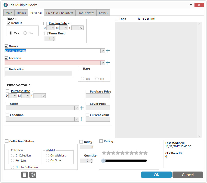
Simplified: Edit Multiple Books screen
- Now use checkboxes to explicitly indicate which field(s) you want set.
Safer and clearer, no more unexpected changes. - To clear a field, just click the checkbox and leave the box empty.
The box will highlight in red to indicate the CLEAR action. No more hidden F8 keys.
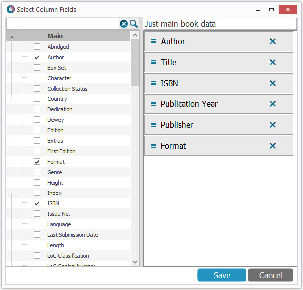
Simplified screens for selecting Column, Sort and Folder fields.
The ability to select your own Columns for the List View is an important customization feature of our Book Collector software. The same holds for selecting the sort order and the folder fields for the folder panel.
However, the “field selection” screens for doing these customizations have always been an area of confusion. So for v18 we decided to re-imagine both the field selection screens and the system for creating/managing your own presets.
- Simplified Field Selection screen:
- Available fields are now grouped, like the tabs in the Edit Book screen.
- Easily find the field you want with the search box top left.
- Use checkboxes on the left to select fields.
- Use the “x” button on the right to remove fields.
- Drag and drop fields on the right side to change the order.
- Rename the field set at the top right.
- Simplified system for managing your field presets:
- Just click the Columns or Sort Order button to EDIT the current preset.
- Click the little arrow to the right of the Columns or Sort Order button to open the preset menu and switch to a different preset.
- Choose Manage Presets from the preset menu to edit your presets and create new ones.
NEW: “Clean” template for the details panel, in Light and Dark styles
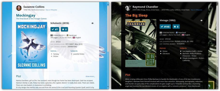
A complete refresh, based on the recent Connect/Cloud details page updates. Clean, clear and modern, with some fresh layout ideas:
- Cleaner look, in both Light and Dark styles.
- Re-designed and more compact Author panel at the top.
- Clearer display of Genres and Subjects.
- Now uses the book cover image as a subtle background image. Or opt for the “Plain” style for a “quieter” background.
No more Standard edition: Pro-only features now available for everyone!
Since last week, we stopped selling the Standard edition of Book Collector. From now on, the Pro edition is the only edition we sell, and will just be called “Book Collector” now.
Our gift to all users on the Standard edition who have a valid Update Plan:
Starting with v18, you now get access to all Pro-only features:
- Batch editing with the Edit Multiple feature:
Save time by editing multiple items in batch, e.g. to fill in a field value for many items in one go. - Customizable pre-sets for sorting, columns and folders:
Create your own pre-set field combination for sorting and columns. Define your own folder options, even multi-level folder combinations. - User Defined Fields:
Create your own fields (text, number, pick list, checkbox or date) and rename pre-defined fields. - Export features:
Export your database to a CSV or XML file.
v18: Auto-Cloud-Syncing, revamped Edit screen, new “Clean” template and more!

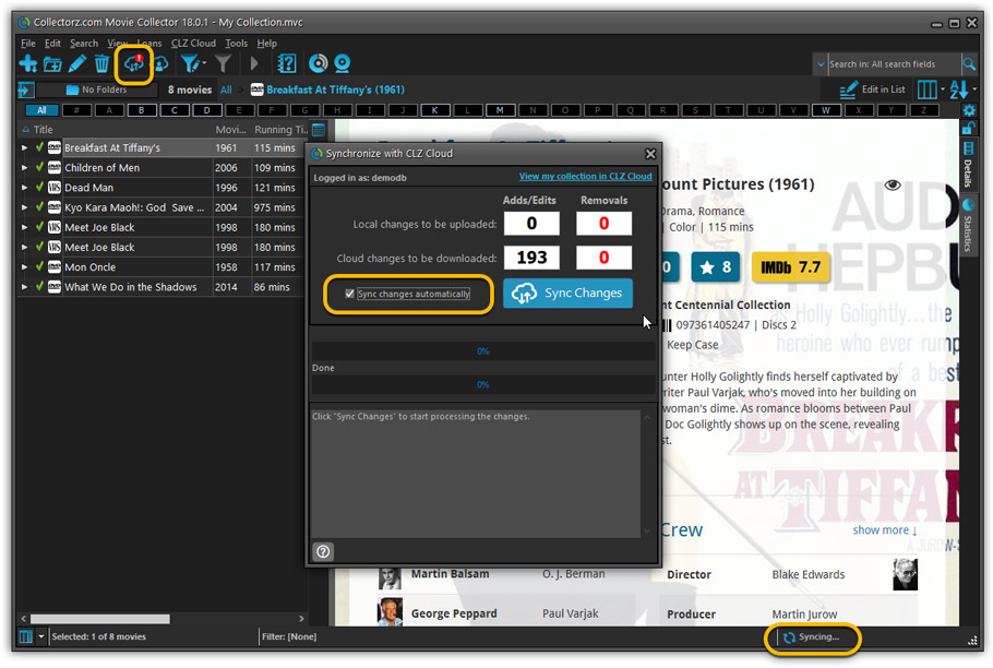
NEW: Fully Automatic CLZ Cloud Syncing!
The free CLZ Cloud service is at the center of all our cataloging solutions (desktop, mobile and web), the glue that binds them all together.
Tens of thousands of users are using the CLZ Cloud syncing every day, to transfer data between their desktop, Connect and mobile software, to update their online collection list, or simply for keeping an online backup of their precious database.
Now, it is time to take the CLZ Cloud to the next level, with automatic syncing:
Add or edit movies in Movie Collector and these changes will auto-upload to the CLZ Cloud instantly. Did you make changes using CLZ Movies or directly in Movie Connect? Just start your software and changes will download automatically.
No more need to go to the Sync with CLZ Cloud screen, ever.
With “Sync Automatically” switched on…
- Your online cloud backup is always up-to-date.
- Your cloud viewer always shows the current state of your collection.
- All your CLZ tools (desktop, mobile and Connect) will always be in-sync.
Automatic Cloud Syncing is an optional feature, switched OFF by default. If you don’t want to auto-sync, or don’t want to sync with the CLZ Cloud at all, just leave it switched OFF.
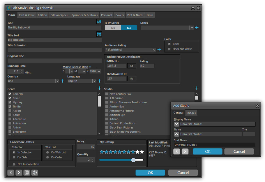
Revamped Edit Movie screen
A huge refresh of the Edit Movie, bringing the look and feel more in line with the recent Add Movies from Core screen. But it’s not all just cosmetic changes, here’s what’s new:
- Button bar is now at the bottom of the screen
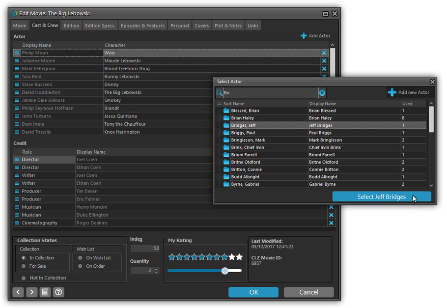
With OK button high-lighted in blue, nice Next/Prev arrow buttons, etc… - Re-designed user interface for editing Cast and Crew list:
- Clean lists showing just Display Name and Character/Role.
- Click the Add button top right and a new Select Person screen will show up, with a built-in search feature to make it super-fast to find the person you’d like to add. No more endless scrolling in a small dropdown list.
- Right-click to Modify the name of a person in the list.
- Drag the icon in the first column to change the order.
- Click the “x” in the last column to remove entries.
- Clearer blue + buttons for checkbox list fields (like Format, Genre)
- Same blue + buttons for dropdown fields (like Country, Language)
- Revamped Edit screen for pick list items
Button bar at the bottom with blue OK button, smaller generate buttons, etc..
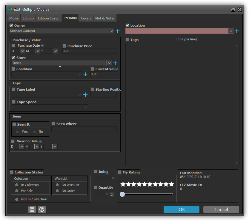
Simplified: Edit Multiple Movies screen
- Now use checkboxes to explicitly indicate which field(s) you want set.
Safer and clearer, no more unexpected changes. - To clear a field, just click the checkbox and leave the box empty.
The box will highlight in red to indicate the CLEAR action. No more hidden F8 keys.
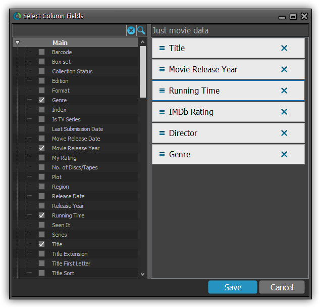
Simplified screens for selecting Column, Sort and Folder fields.
The ability to select your own Columns for the List View is an important customization feature of our Movie Collector software. The same holds for selecting the sort order and the folder fields for the folder panel.
However, the “field selection” screens for doing these customizations have always been an area of confusion. So for v18 we decided to re-imagine both the field selection screens and the system for creating/managing your own presets.
- Simplified Field Selection screen:
- Available fields are now grouped, like the tabs in the Edit Movie screen.
- Easily find the field you want with the search box top left.
- Use checkboxes on the left to select fields.
- Use the “x” button on the right to remove fields.
- Drag and drop fields on the right side to change the order.
- Rename the field set at the top right.
- Simplified system for managing your field presets:
- Just click the Columns or Sort Order button to EDIT the current preset.
- Click the little arrow to the right of the Columns or Sort Order button to select from and manage your field presets.
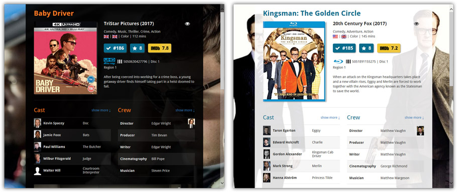
NEW: “Clean” template for the details panel, in Light and Dark styles
A complete refresh, based on the recent Connect/Cloud details page updates. Clean, clear and modern, with some fresh layout ideas:
- Cleaner, clearer look, in both Light and Dark styles.
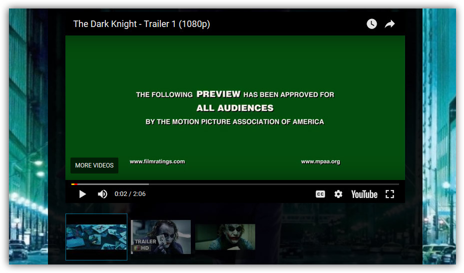
- Now shows just one embedded trailer video, with a trailer selection bar beneath to switch between multiple trailers.
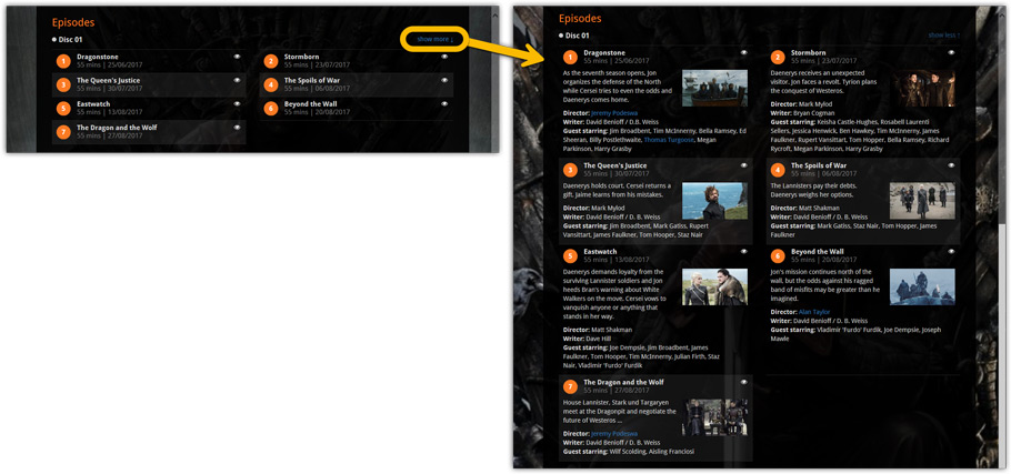
- More compact episode lists for TV series, click Show More to see full details (images, plots, etc..)
No more Standard edition: Pro-only features now available for everyone!
As of today, we stopped selling the Standard edition of Movie Collector. From now on, the Pro edition is the only edition we sell, and will just be called “Movie Collector” now.
Our gift to all users on the Standard edition who have a valid Update Plan:
Starting with v18, you now get access to all Pro-only features:
- Batch editing with the Edit Multiple feature:
Save time by editing multiple items in batch, e.g. to fill in a field value for many items in one go. - Customizable pre-sets for sorting, columns and folders:
Create your own pre-set field combination for sorting and columns. Define your own folder options, even multi-level folder combinations. - User Defined Fields:
Create your own fields (text, number, pick list, checkbox or date) and rename pre-defined fields. - Export features:
Export your database to a CSV or XML file.