News & updates tagged 'shelves'
Fixed
- Images View: Improved spacing between thumbnails
- Images View: Mouse over on images didn’t show the title of the item
- Cover Flow: Now uses big sharp images instead of the small thumbnails
- Find Cover: Could give an Access Violation when finding GIF images
- Templates: Improved visibility of authors if a book has multiple authors
Fixed
- Images View: Improved spacing between thumbnails
- Images View: Mouse over on images didn’t show the title of the item
- Cover Flow: Now uses big sharp images instead of the small thumbnails
- Find Cover: Could give an Access Violation when finding GIF images
Fixed:
- Images View: Improved spacing between thumbnails
- Images View: Mouse over on images didn’t show the title of the item
- Cover Flow: Now uses big sharp images instead of the small thumbnails
- Find Cover: Could give an Access Violation when finding GIF images
Fixed:
- Images View: Improved spacing between thumbnails
- Images View: Mouse over on images didn’t show the title of the item
- Cover Flow: Now uses big sharp images instead of the small thumbnails
- Find Cover: Could give an Access Violation when finding GIF images
Fixed:
- Images View: Improved spacing between thumbnails
- Images View: Mouse over on images didn’t show the title of the item
- Cover Flow: Now uses big sharp images instead of the small thumbnails
- Find Cover: Could give an Access Violation when finding GIF images
When users send us screenshots during support conversations, we are seeing that many of you are using the Shelves View when browsing your collections. And we can’t blame you, that IS a cool looking view 🙂 However, it *could* be a bit slow and jerky, especially when displaying many cover images in one list.
So our Windows guy Joe has spent several weeks to make this Shelves View faster and smoother. At the same time, our in-house graphics man AJ has created two new Shelf styles. Here’s what’s new:
- Images are now loading a lot faster.
- Scrolling is faster and smoother.
- Shelves background is smoother, no more visible tile edges.
- Shelves now always continue over the full width, even when a row is not full.
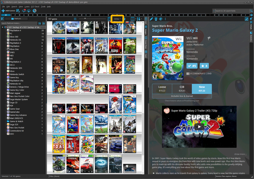
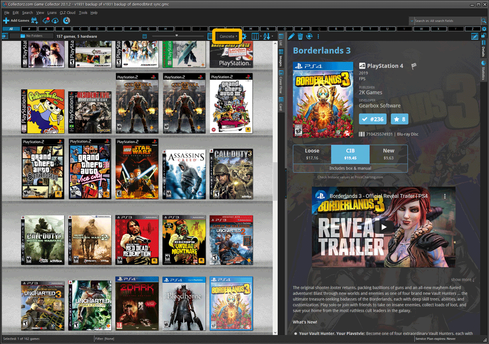
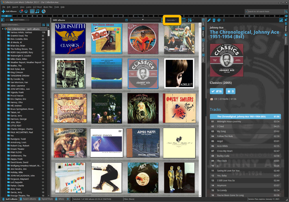
- Two new Shelf Styles are now available: White and Concrete.
TIP: here’s how to get to Shelves View:
in your program’s game list panel, click the vertical Images tab on the right, then from the toolbar above the list panel, choose a Shelf Style. Use the slider to control the size of the images.
The new “White” style:
The new “Concrete” style:
When users send us screenshots during support conversations, we are seeing that many of you are using the Shelves View when browsing your collections. And we can’t blame you, that IS a cool looking view 🙂 However, it *could* be a bit slow and jerky, especially when displaying many cover images in one list.
So our Windows guy Joe has spent several weeks to make this Shelves View faster and smoother. At the same time, our in-house graphics man AJ has created two new Shelf styles. Here’s what’s new:
- Images are now loading a lot faster.
- Scrolling is faster and smoother.
- Shelves background is smoother, no more visible tile edges.
- Shelves now always continue over the full width, even when a row is not full.
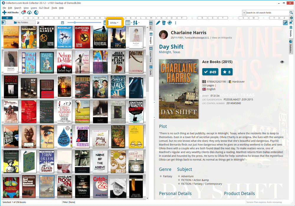
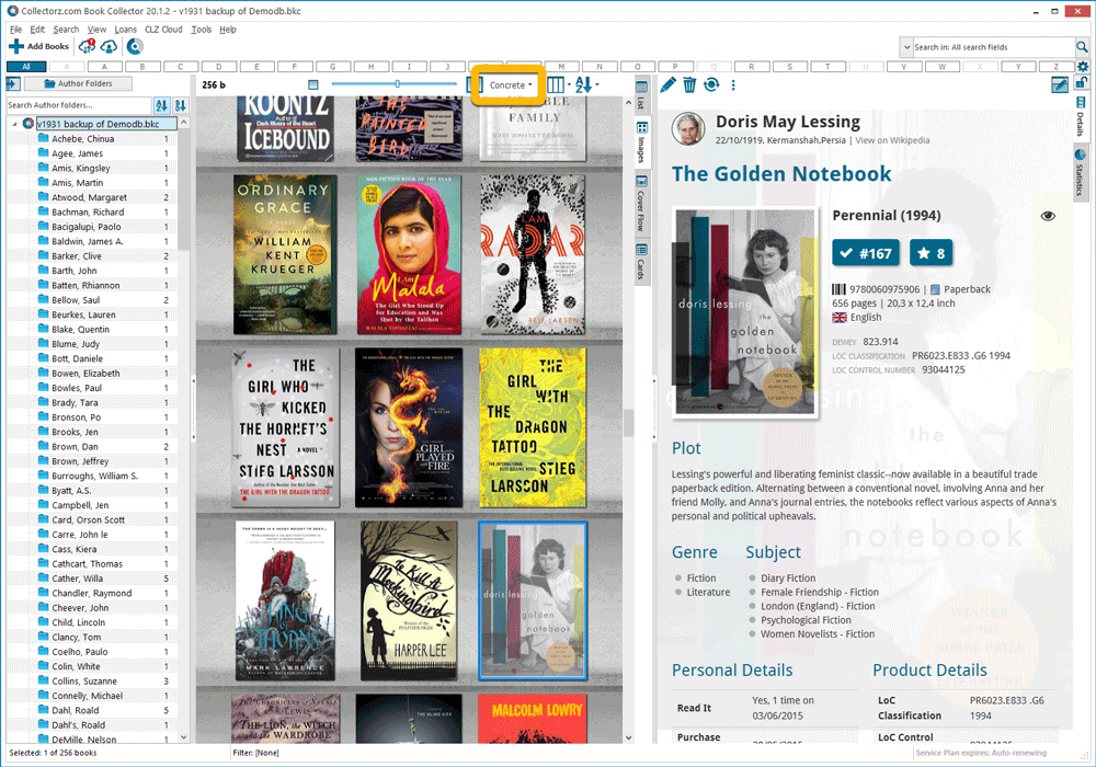
- Two new Shelf Styles are now available: White and Concrete.
TIP: here’s how to get to Shelves View:
in your program’s book list panel, click the vertical Images tab on the right, then from the toolbar above the list panel, choose a Shelf Style. Use the slider to control the size of the images.
The new “White” style:
The new “Concrete” style:
When users send us screenshots during support conversations, we are seeing that many of you are using the Shelves View when browsing your collections. And we can’t blame you, that IS a cool looking view 🙂 However, it *could* be a bit slow and jerky, especially when displaying many cover images in one list.
So our Windows guy Joe has spent several weeks to make this Shelves View faster and smoother. At the same time, our in-house graphics man AJ has created two new Shelf styles. Here’s what’s new:
- Images are now loading a lot faster.
- Scrolling is faster and smoother.
- Shelves background is smoother, no more visible tile edges.
- Shelves now always continue over the full width, even when a row is not full.
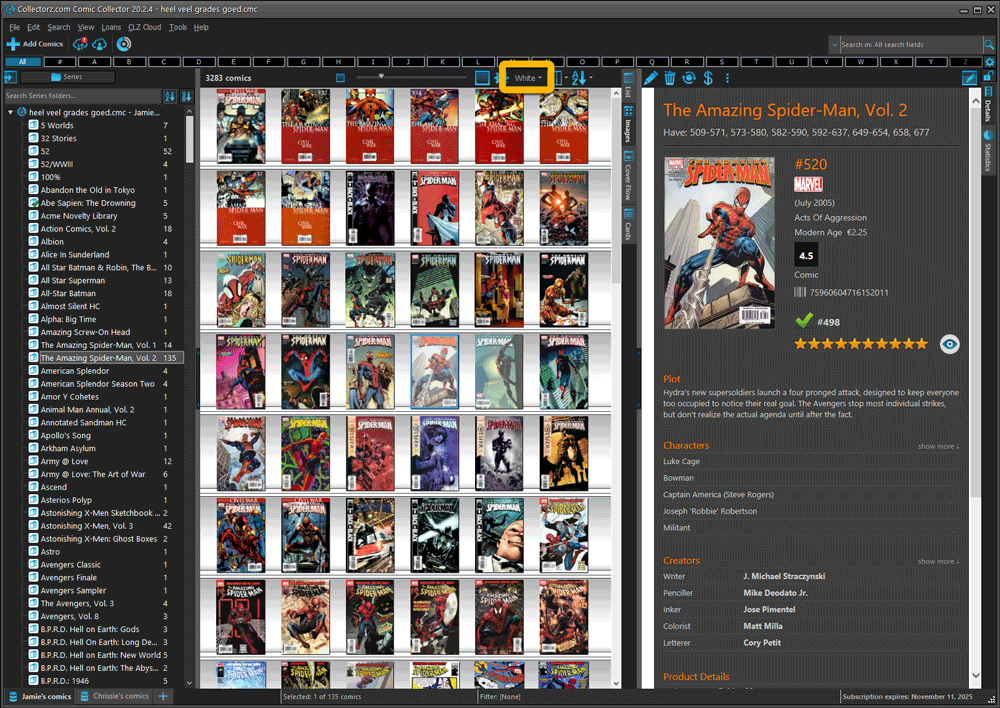
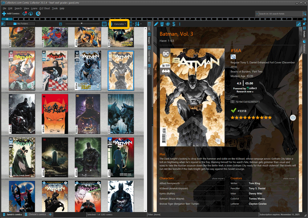
- Two new Shelf Styles are now available: White and Concrete.
TIP: here’s how to get to Shelves View:
in your program’s comic list panel, click the vertical Images tab on the right, then from the toolbar above the list panel, choose a Shelf Style. Use the slider to control the size of the images.
The new “White” style:
The new “Concrete” style:
When users send us screenshots during support conversations, we are seeing that many of you are using the Shelves View when browsing your collections. And we can’t blame you, that IS a cool looking view 🙂 However, it *could* be a bit slow and jerky, especially when displaying many cover images in one list.
So our Windows guy Joe has spent several weeks to make this Shelves View faster and smoother. At the same time, our in-house graphics man AJ has created two new Shelf styles. Here’s what’s new:
- Images are now loading a lot faster.
- Scrolling is faster and smoother.
- Shelves background is smoother, no more visible tile edges.
- Shelves now always continue over the full width, even when a row is not full.
- Two new Shelf Styles are now available: White and Concrete.
TIP: here’s how to get to Shelves View:
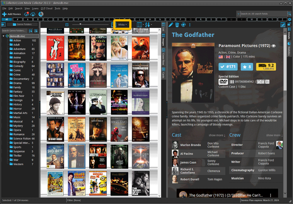
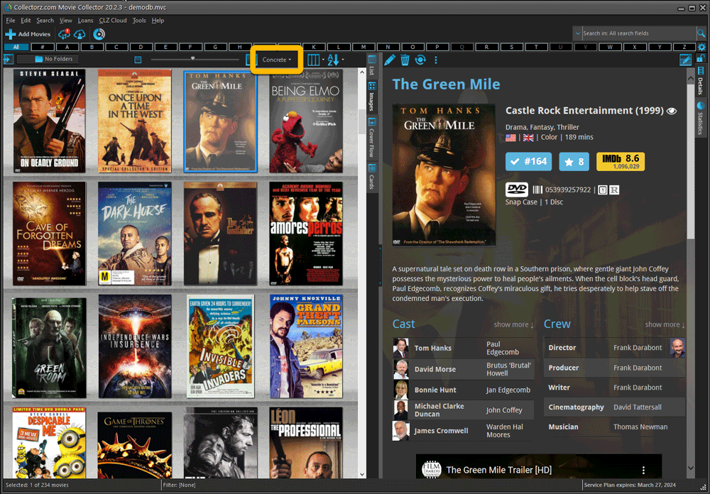
in your program’s movie list panel, click the vertical Images tab on the right, then from the toolbar above the list panel, choose a Shelf Style. Use the slider to control the size of the images.
The new “White” style:
The new “Concrete” style:
v20.3.2: Smaller thumbs return and dark “Classic” shelf fixed
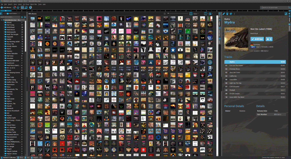
In yesterday’s build the thumbnails couldn’t be set as small as they used to and we forgot to put in the dark background for the classic images view. Both fixed now!
Fixed:
- Thumbnails can now be set as small as before
- Classic shelf in dark skin: dark background was missing
When users send us screenshots during support conversations, we are seeing that many of you are using the Shelves View when browsing your collections. And we can’t blame you, that IS a cool looking view 🙂 However, it *could* be a bit slow and jerky, especially when displaying many cover images in one list.
So our Windows guy Joe has spent several weeks to make this Shelves View faster and smoother. At the same time, our in-house graphics man AJ has created two new Shelf styles. Here’s what’s new:
- Images are now loading a lot faster.
- Scrolling is faster and smoother.
- Shelves background is smoother, no more visible tile edges.
- Shelves now always continue over the full width, even when a row is not full.
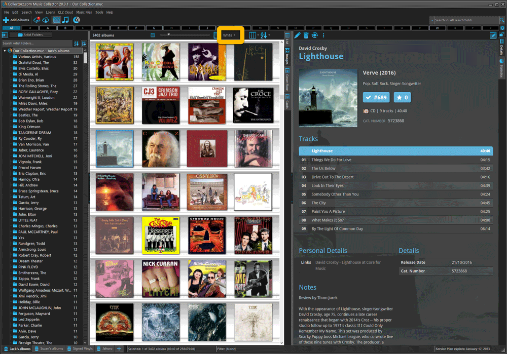
- Two new Shelf Styles are now available: White and Concrete.
The new “White” style:
The new “Concrete” style:
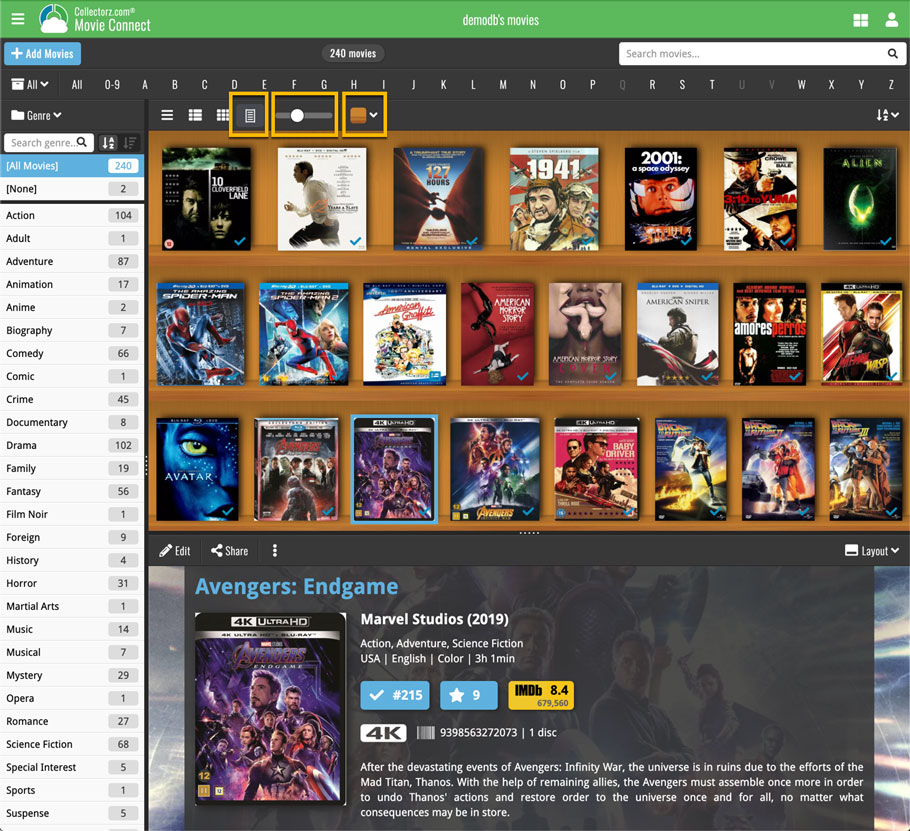
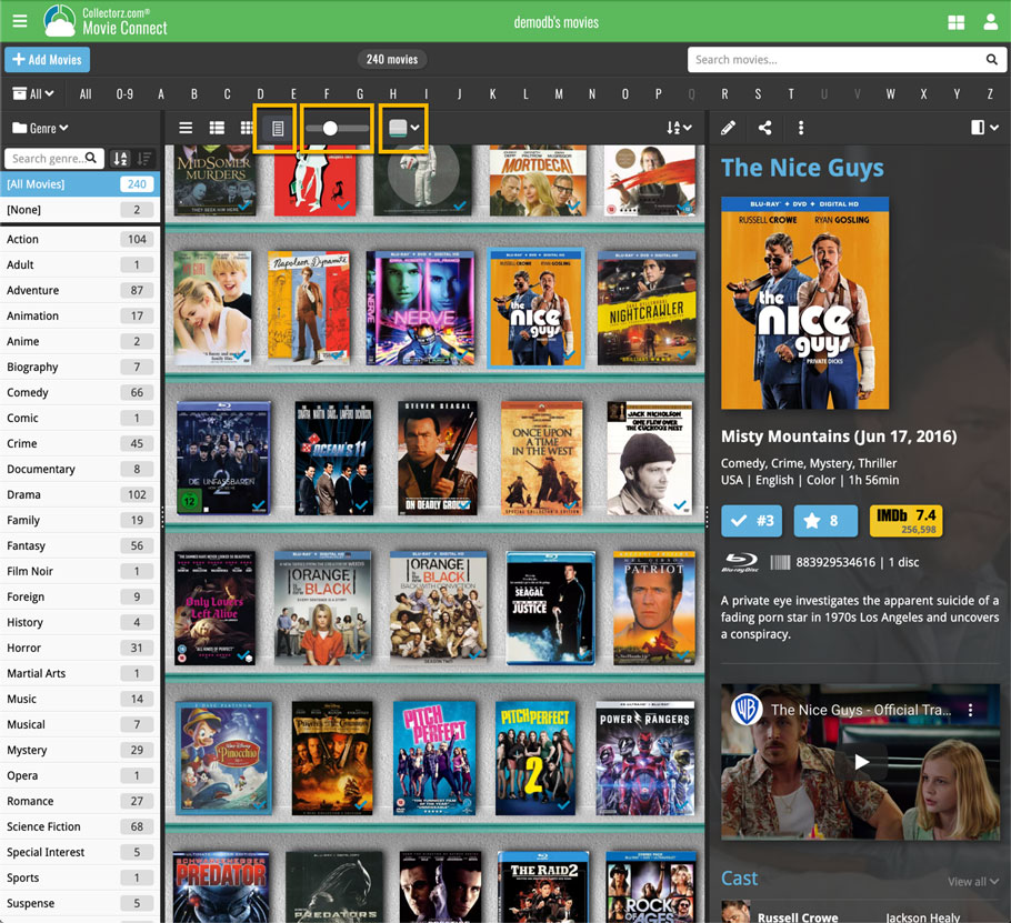
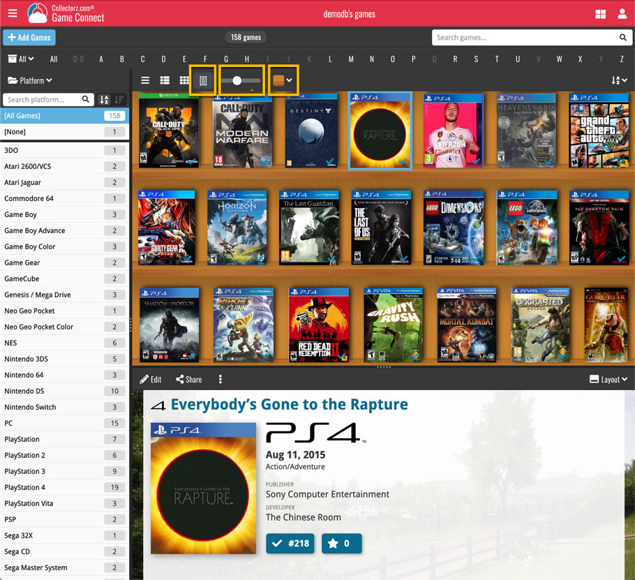
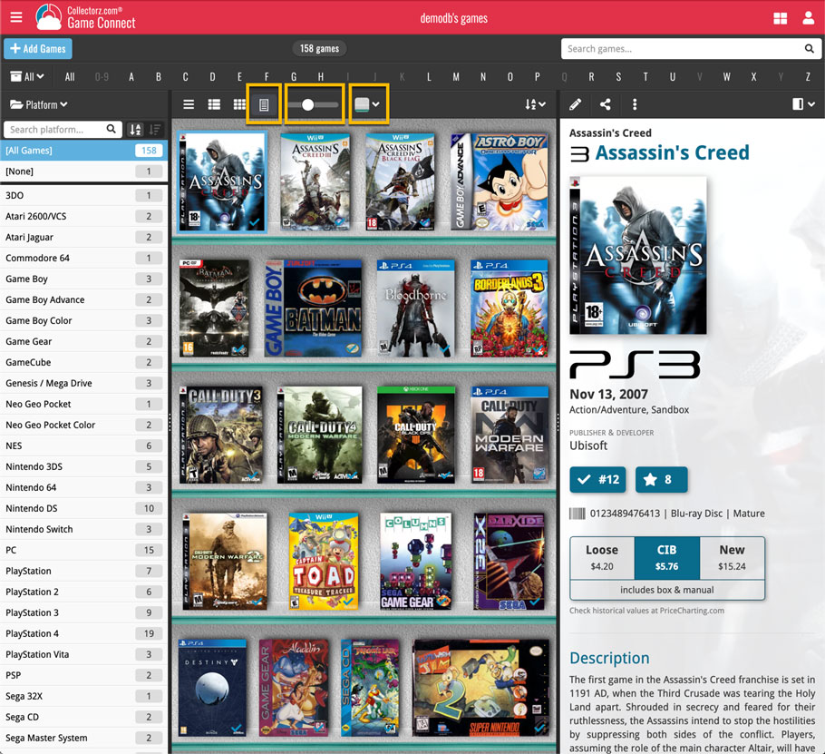
A very nice cosmetic update for your Connect software today: a new “Shelves View”!
Shelves View is a fourth view for your game list, similar to Cover View, but with your cover images standing on a nice shelves background. You can even choose between 6 different shelf styles using the Shelf Style selector:
- Wood Light
- Wood Dark
- Glass
- Metal
- Carbon
- White
Also new, for both Shelves View and Images View, as “Size Slider” to control the size of the images.
Toolbar tweaks
Because of the introduction of the new view, the Shelf Style selector and the Size Slider, we have also made several changes to the various Connect toolbars:
- A new “View” toolbar right above the list, with 4 buttons for switching between the 4 views (List, Card, Cover and Shelves), the Size Slider and the Style Selector (for Shelves) and finally the Sort Order button (on the far right).
- The new “View” toolbar replaces the “Filter” toolbar that was in that spot.
- The “Filter” toolbar now only appears when a filter is actually active, and now has a pale yellow background to make it super-clear that you are looking at a filtered list.
- The number of games indicator has been moved (back) to the center of the top toolbar.
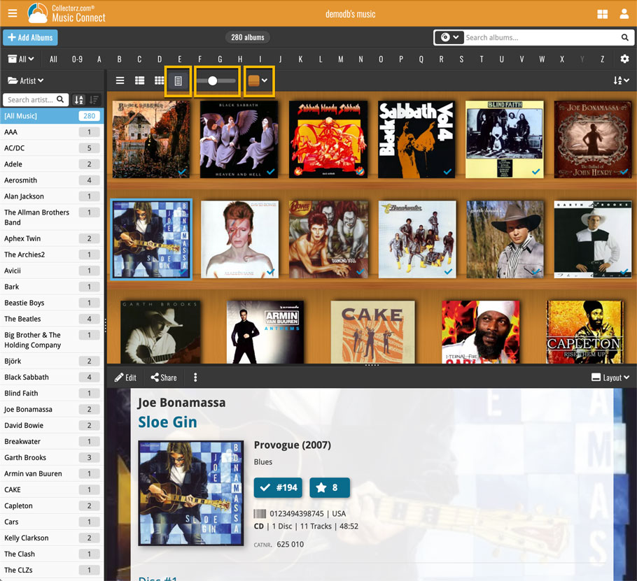
A very nice cosmetic update for your Connect software today: a new “Shelves View”!
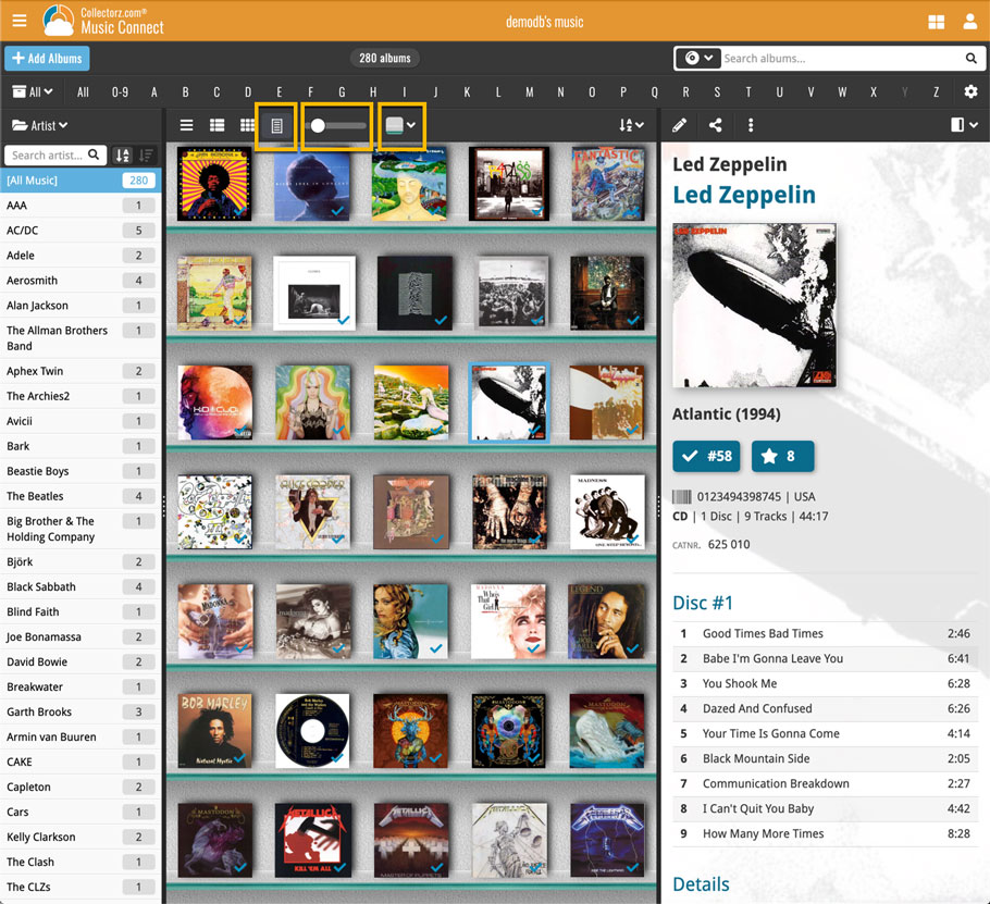
Shelves View is a fourth view for your album list, similar to Cover View, but with your cover images standing on a nice shelves background. You can even choose between 6 different shelf styles using the Shelf Style selector:
- Wood Light
- Wood Dark
- Glass
- Metal
- Carbon
- White
Also new, for both Shelves View and Images View, as “Size Slider” to control the size of the images.
Toolbar tweaks
Because of the introduction of the new view, the Shelf Style selector and the Size Slider, we have also made several changes to the various Connect toolbars:
- A new “View” toolbar right above the list, with 4 buttons for switching between the 4 views (List, Card, Cover and Shelves), the Size Slider and the Style Selector (for Shelves) and finally the Sort Order button (on the far right).
- The new “View” toolbar replaces the “Filter” toolbar that was in that spot.
- The “Filter” toolbar now only appears when a filter is actually active, and now has a pale yellow background to make it super-clear that you are looking at a filtered list.
- The number of albums indicator has been moved (back) to the center of the top toolbar.
A very nice cosmetic update for your Connect software today: a new “Shelves View”!
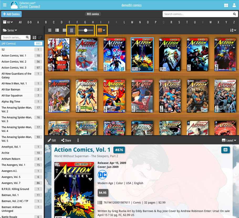
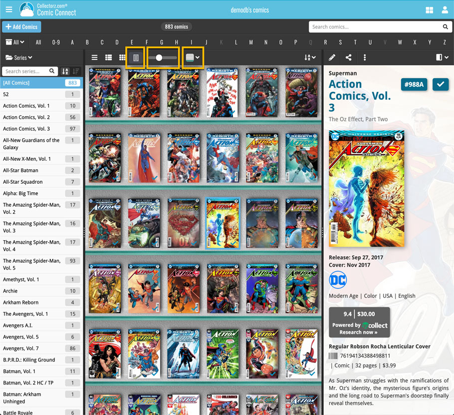
Shelves View is a fourth view for your comic list, similar to Cover View, but with your cover images standing on a nice shelves background. You can even choose between 6 different shelf styles using the Shelf Style selector:
- Wood Light
- Wood Dark
- Glass
- Metal
- Carbon
- White
Also new, for both Shelves View and Images View, as “Size Slider” to control the size of the images.
Toolbar tweaks
Because of the introduction of the new view, the Shelf Style selector and the Size Slider, we have also made several changes to the various Connect toolbars:
- A new “View” toolbar right above the list, with 4 buttons for switching between the 4 views (List, Card, Cover and Shelves), the Size Slider and the Style Selector (for Shelves) and finally the Sort Order button (on the far right).
- The new “View” toolbar replaces the “Filter” toolbar that was in that spot.
- The “Filter” toolbar now only appears when a filter is actually active, and now has a pale yellow background to make it super-clear that you are looking at a filtered list.
- The number of comics indicator has been moved (back) to the center of the top toolbar.
A very nice cosmetic update for your Connect software today: a new “Shelves View”!
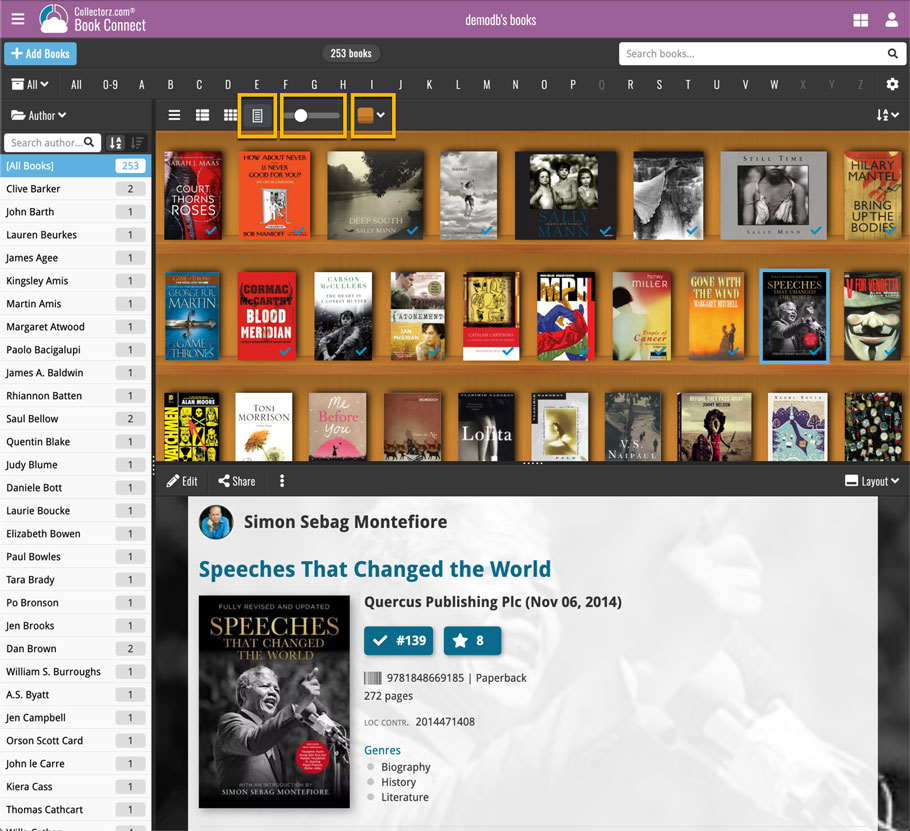
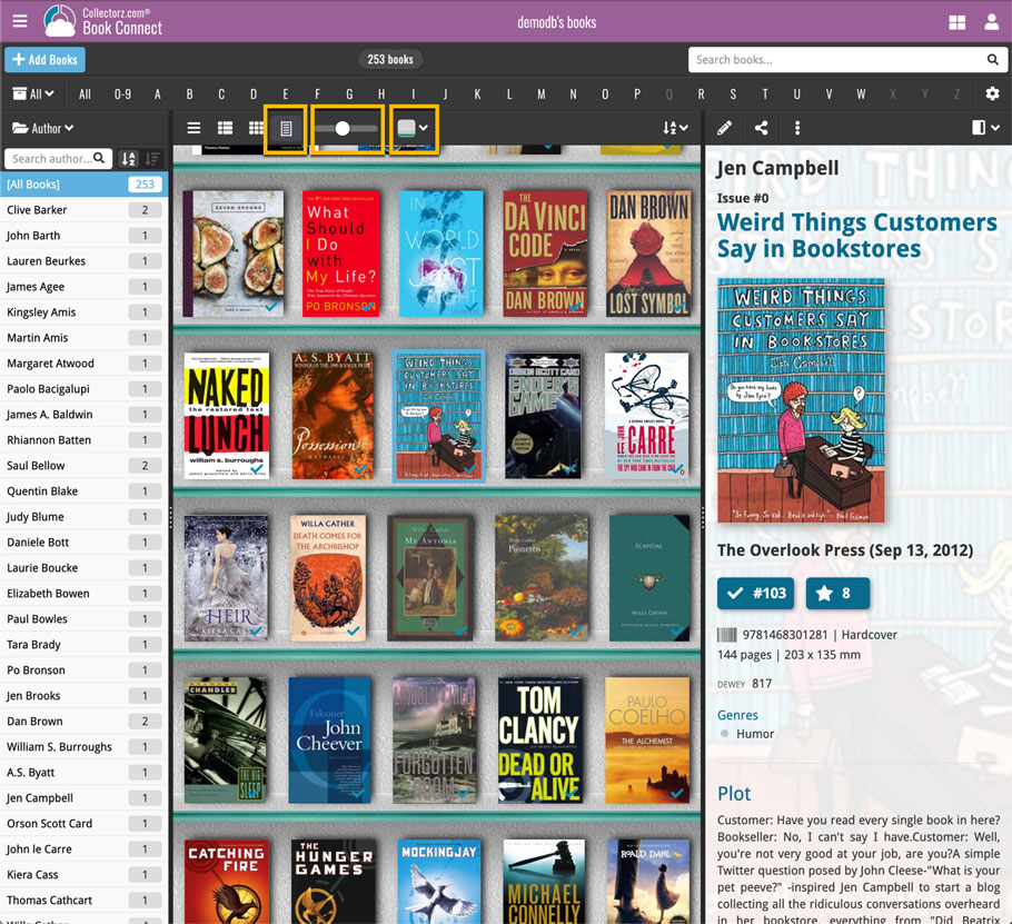
Shelves View is a fourth view for your book list, similar to Cover View, but with your cover images standing on a nice shelves background. You can even choose between 6 different shelf styles using the Shelf Style selector:
- Wood Light
- Wood Dark
- Glass
- Metal
- Carbon
- White
Also new, for both Shelves View and Images View, as “Size Slider” to control the size of the images.
Toolbar tweaks
Because of the introduction of the new view, the Shelf Style selector and the Size Slider, we have also made several changes to the various Connect toolbars:
- A new “View” toolbar right above the list, with 4 buttons for switching between the 4 views (List, Card, Cover and Shelves), the Size Slider and the Style Selector (for Shelves) and finally the Sort Order button (on the far right).
- The new “View” toolbar replaces the “Filter” toolbar that was in that spot.
- The “Filter” toolbar now only appears when a filter is actually active, and now has a pale yellow background to make it super-clear that you are looking at a filtered list.
- The number of books indicator has been moved (back) to the center of the top toolbar.
A very nice cosmetic update for your Connect software today: a new “Shelves View”!
Shelves View is a fourth view for your movie list, similar to Cover View, but with your cover images standing on a nice shelves background. You can even choose between 6 different shelf styles using the Shelf Style selector:
- Wood Light
- Wood Dark
- Glass
- Metal
- Carbon
- White
Also new, for both Shelves View and Images View, as “Size Slider” to control the size of the images.
Toolbar tweaks
Because of the introduction of the new view, the Shelf Style selector and the Size Slider, we have also made several changes to the various Connect toolbars:
- A new “View” toolbar right above the list, with 4 buttons for switching between the 4 views (List, Card, Cover and Shelves), the Size Slider and the Style Selector (for Shelves) and finally the Sort Order button (on the far right).
- The new “View” toolbar replaces the “Filter” toolbar that was in that spot.
- The “Filter” toolbar now only appears when a filter is actually active, and now has a pale yellow background to make it super-clear that you are looking at a filtered list.
- The number of movies indicator has been moved (back) to the center of the top toolbar.
