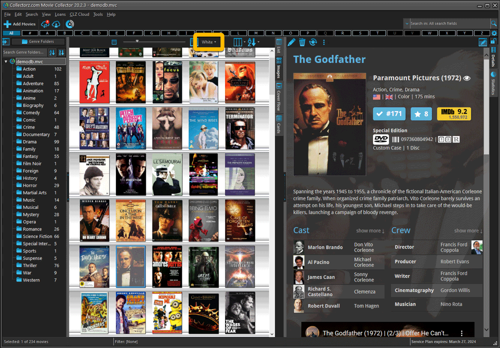
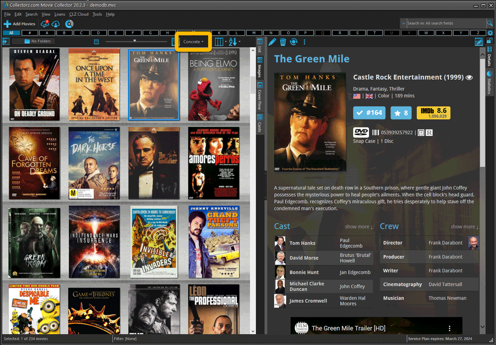
When users send us screenshots during support conversations, we are seeing that many of you are using the Shelves View when browsing your collections. And we can’t blame you, that IS a cool looking view 🙂 However, it *could* be a bit slow and jerky, especially when displaying many cover images in one list.
So our Windows guy Joe has spent several weeks to make this Shelves View faster and smoother. At the same time, our in-house graphics man AJ has created two new Shelf styles. Here’s what’s new:
- Images are now loading a lot faster.
- Scrolling is faster and smoother.
- Shelves background is smoother, no more visible tile edges.
- Shelves now always continue over the full width, even when a row is not full.
- Two new Shelf Styles are now available: White and Concrete.
TIP: here’s how to get to Shelves View:
in your program’s movie list panel, click the vertical Images tab on the right, then from the toolbar above the list panel, choose a Shelf Style. Use the slider to control the size of the images.
The new “White” style:

The new “Concrete” style:
