With so many users switching from the desktop software to the Connect web-based software, we are getting a lot of useful feedback about the things they are missing, or would like to see in Connect.
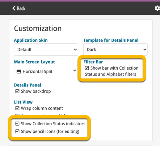
Today, a small update with 3 new settings to save screen space in the main screen:
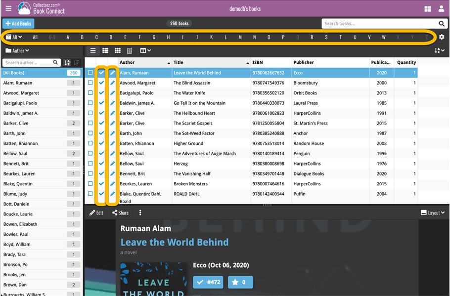
- Show Filter Bar: uncheck this setting to hide the bar at the top with the Collection Status filter and the Alphabet Bar, giving you quite a bit more vertical screen space for your list.
- Show Collection Status indicators: uncheck this to remove the column with the status icons from your List View, giving you more horizontal room for your columns.
- Show pencil icons (for editing): uncheck this to remove the column with the pencil (edit) icons from your List View, again giving you more horizontal list space.
Oh and BTW: we also took this opportunity to complete re-think the layout of the Settings screen, to make the grouping of settings more logical. I recommend to take a good look again, maybe you will find some useful settings you never knew existed 🙂


Recent changes
Create your own Custom Fields!
Feb 23, 2026
New setting to disable book values
Jan 09, 2026
New: track your Reading History, plus other new data fields
Dec 17, 2025
Further tweaks to eBay links
Jul 24, 2025
Automatic eBay search links
Jul 08, 2025
Book details panel: improved design, layout and performance
Jun 20, 2025
More compact design and layout: fit more books on screen
May 27, 2025
Automatic book values and retail prices
Apr 03, 2025
Improved Add Books screen
Dec 17, 2024
Improved search behaviour
May 24, 2024
Improved managing and editing of pick list fields
Apr 08, 2024
Connect is now available in Swedish!
Feb 21, 2024
Connect is now available in Danish!
Jan 30, 2024
Improvements to the Collections and Edit Multiple features
Nov 20, 2023
Complete re-design of Edit Multiple feature
Oct 30, 2023
Pre-fill screen: Orange highlights and a Clear button
Oct 30, 2023
Improved search results in the Link with Core screen
Oct 12, 2023
Connect is now available in French, Spanish and Hungarian!
Sep 29, 2023
Improved Import from CSV/TXT screen
Aug 16, 2023
Printing / Exporting a selection is now much easier
Aug 10, 2023
Connect is now available in German!
Jul 04, 2023
Re-designed collection tab-bar
May 04, 2023
Connect is now available in Dutch!
Apr 27, 2023
v8.0: 7 new data fields!
Jan 16, 2023
New collection view : Vertical Cards!
Jul 07, 2022