News & updates tagged 'ui'
A big update for your CLZ app today. Instead of bringing one big new feature, we decided to work on multiple areas that could be improved, all of them based on the feedback we received from you all. Thanks for that!
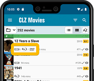
Movie list now allows multiple format logos
Previously, the movie list only showed the logo of the first Format, but now it shows all Formats that you selected for the movie, e.g. 4K UDH and Blu-ray.
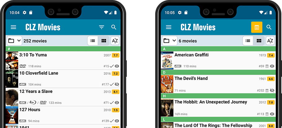
Collection Status filter
The 2nd button from the top right (next to the search button) is the Collection Status filter. Previously, it allowed you to filter by All, Collection or Wish List, but with this update, we added all collection status option there as filters, including On order and For Sale.
Also, the button will now be highlighted in yellow when a filter is active, that is, when it is set to anything other than “All”.
Re-designed toolbars at the top
The toolbars at the top have been re-designed, mainly to make the interactive elements stand out more as actual “buttons”.
(Especially the folder icon on the left was something that was often overlooked as something you could tap on. Hopefully this re-design will help to let more users find the most powerful feature of the app 🙂 )
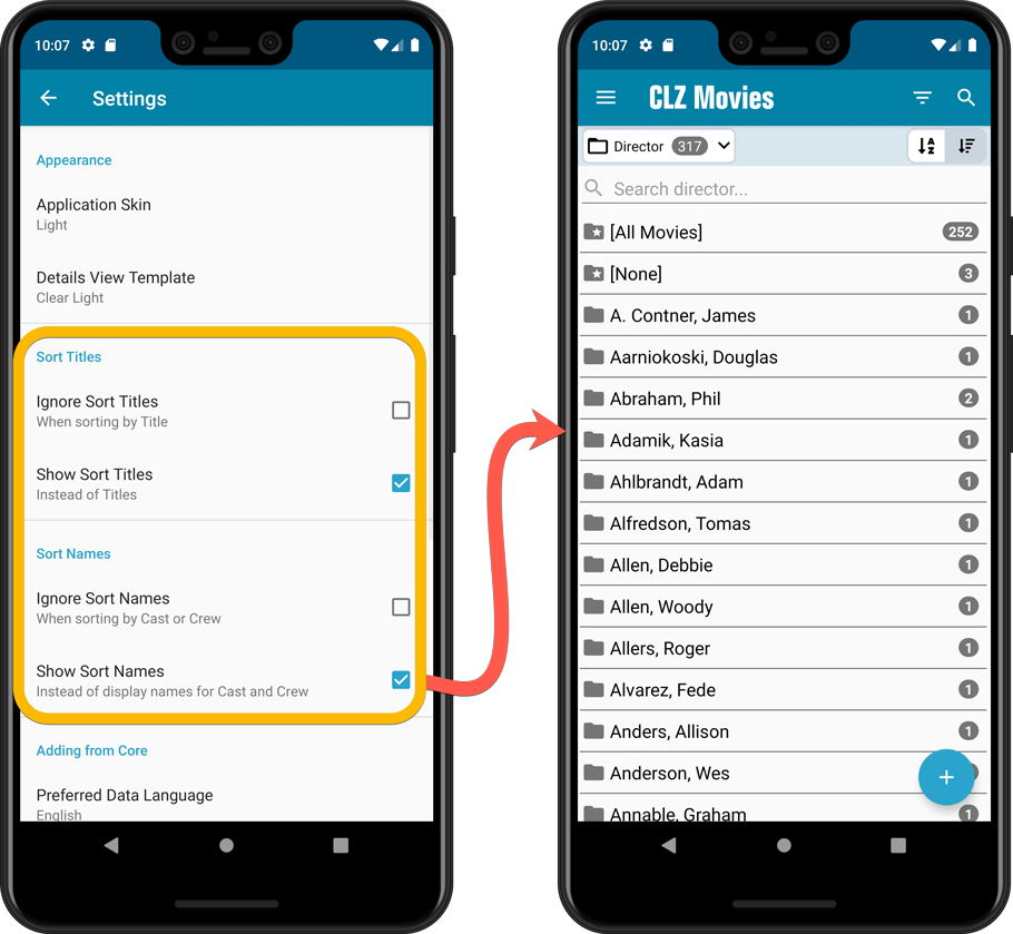
New sort and display options in Settings
For Titles:
- Ignore Sort Titles when sorting by Title
- Show Sort Titles instead of Titles
For Cast and Crew
- Ignore Sort Names when sorting by Cast or Crew
- Show Sort Names instead of display names for Cast and Crew
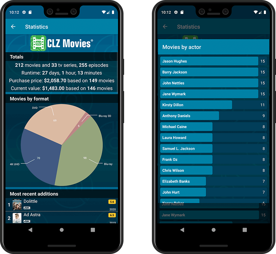
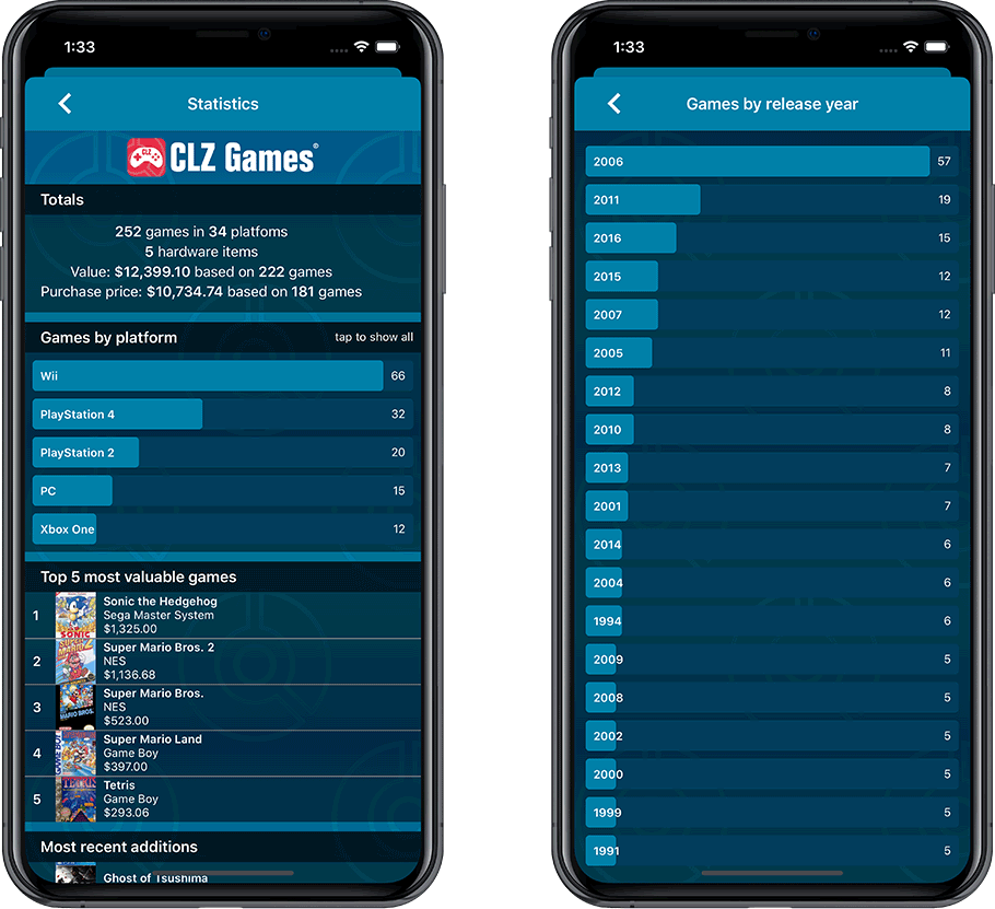
Improved Statistics screen
The Statistics screen has been updated with:
- More database totals at the top (nr of episodes, runtime, purchase price, current value)
- More charts (by Year, by Actor)
- A new: “tap to show all” option to enlarge charts and see ALL entries
A big update for your CLZ app today. Instead of bringing one big new feature, we decided to work on multiple areas that could be improved, all of them based on the feedback we received from you all. Thanks for that!
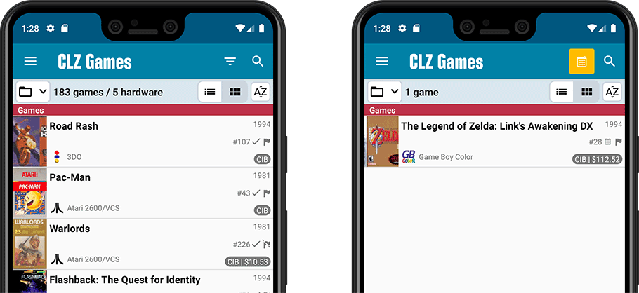
Collection Status filter
The 2nd button from the top right (next to the search button) is the Collection Status filter. Previously, it allowed you to filter by All, Collection or Wish List, but with this update, we added all collection status option there as filters, including On order and For Sale.
Also, the button will now be highlighted in yellow when a filter is active, that is, when it is set to anything other than “All”.
Re-designed toolbars at the top
The toolbars at the top have been re-designed, mainly to make the interactive elements stand out more as actual “buttons”.
(Especially the folder icon on the left was something that was often overlooked as something you could tap on. Hopefully this re-design will help to let more users find the most powerful feature of the app 🙂 )
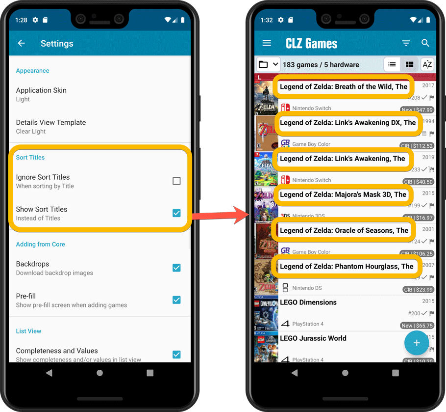
New sort and display options in Settings
- Ignore Sort Titles when sorting by Title
- Show Sort Titles instead of Titles
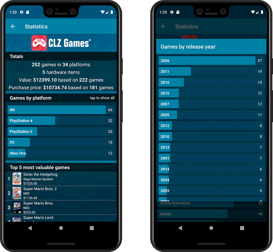
Improved Statistics screen
The Statistics screen has been updated with:
- More database totals at the top (purchase price, current value)
- More charts (by Year, by Genre, by Completeness, by Completed, Value by Completeness)
- A new: “tap to show all” option to enlarge charts and see ALL entries
A big update for your CLZ app today. Instead of bringing one big new feature, we decided to work on multiple areas that could be improved, all of them based on the feedback we received from you all. Thanks for that!
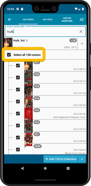
Add Comics by Series: New “Select All” checkbox
By popular demand: in the Add Comics screen, on the By Series tab right above the Issue List, we have added an new “Select All” checkbox, for easily selecting ALL issues in the series!
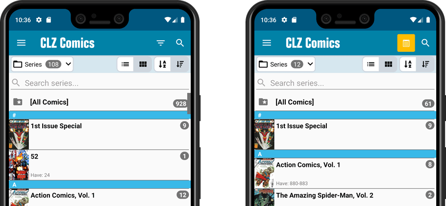
Collection Status filter
The 2nd button from the top right (next to the search button) is the Collection Status filter. Previously, it allowed you to filter by All, Collection or Wish List, but with this update, we added all collection status option there as filters, including On order and For Sale.
Also, the button will now be highlighted in yellow when a filter is active, that is, when it is set to anything other than “All”.
Re-designed toolbars at the top
The toolbars at the top have been re-designed, mainly to make the interactive elements stand out more as actual “buttons”.
(Especially the folder icon on the left was something that was often overlooked as something you could tap on. Hopefully this re-design will help to let more users find the most powerful feature of the app 🙂 )
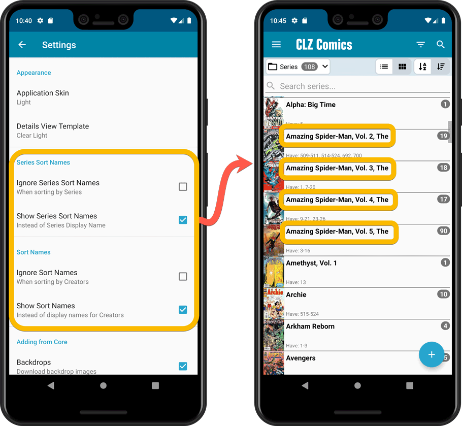
New sort and display options in Settings
For Series:
- Ignore Series Sort Names when sorting by Series
- Show Series Sort Names instead of Series Display Name
For Creators:
- Ignore Sort Names when sorting by Creators
- Show Sort Names instead of display names for Creators
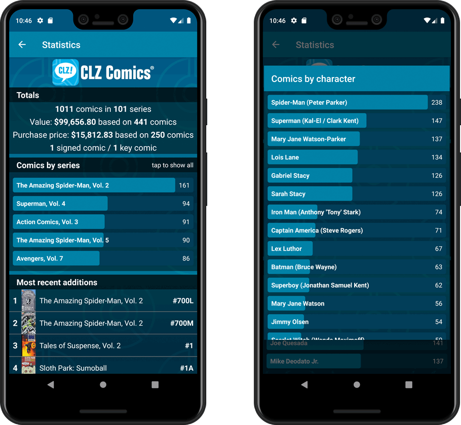
Improved Statistics screen
The Statistics screen has been updated with:
- More database totals at the top (signed comics, key comics, purchase price)
- More charts (by Publisher, by Grade, by Year, by Creator, by Character, Purchase Price by Series)
- A new: “tap to show all” option to enlarge charts and see ALL entries
A big update for your CLZ app today. Instead of bringing one big new feature, we decided to work on multiple areas that could be improved, all of them based on the feedback we received from you all. Thanks for that!
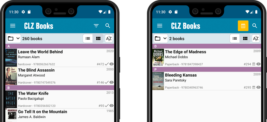
Collection Status filter
The 2nd button from the top right (next to the search button) is the Collection Status filter. Previously, it allowed you to filter by All, Collection or Wish List, but with this update, we added all collection status option there as filters, including On order and For Sale.
Also, the button will now be highlighted in yellow when a filter is active, that is, when it is set to anything other than “All”.
Re-designed toolbars at the top
The toolbars at the top have been re-designed, mainly to make the interactive elements stand out more as actual “buttons”.
(Especially the folder icon on the left was something that was often overlooked as something you could tap on. Hopefully this re-design will help to let more users find the most powerful feature of the app 🙂 )
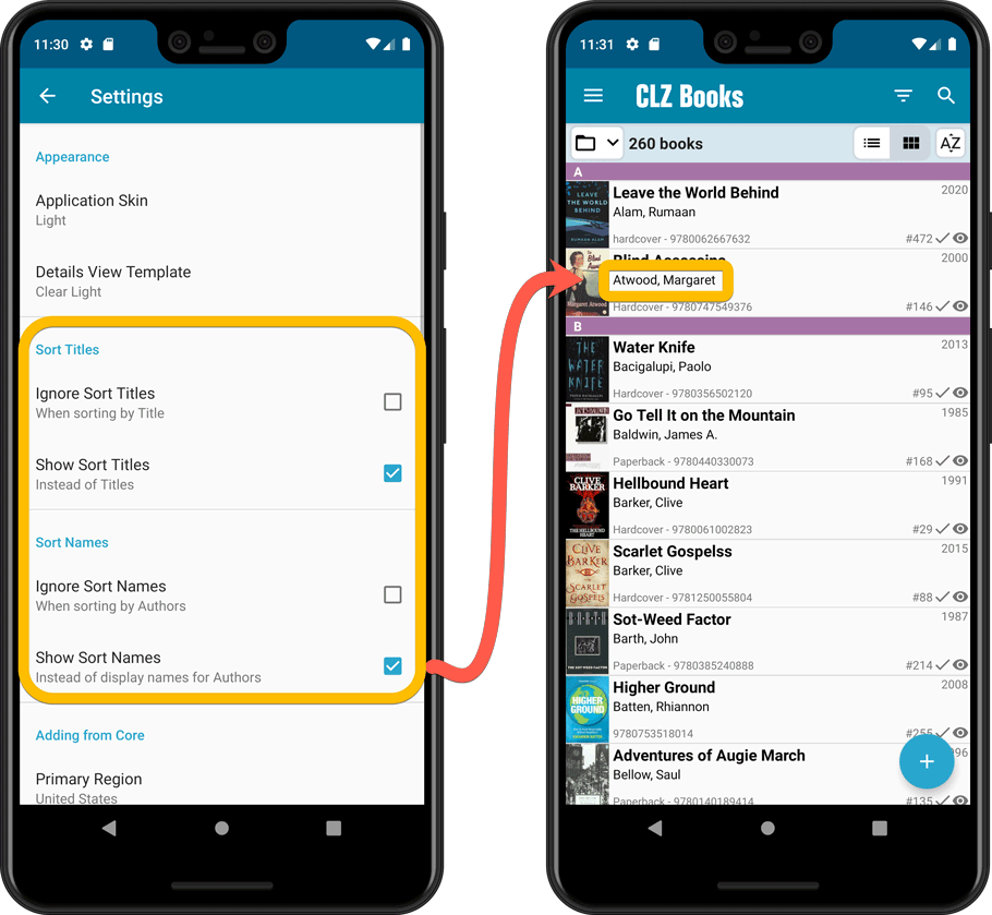
New sort and display options in Settings
For Authors:
- Ignore Sort Names when sorting by Authors
- Show Sort Names instead of display names for Authors
For Titles:
- Ignore Sort Titles when sorting by Title
- Show Sort Titles instead of Titles
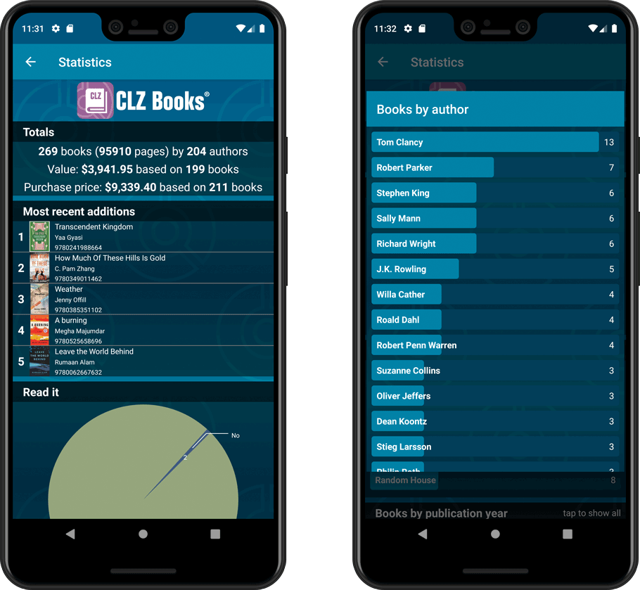
Improved Statistics screen
The Statistics screen has been updated with:
- More database totals at the top (nr of pages, purchase price, current value)
- An extra chart that shows Books by Year
- A new: “tap to show all” option to enlarge charts and see ALL entries
A big update for your CLZ app today. Instead of bringing one big new feature, we decided to work on multiple areas that could be improved, all of them based on the feedback we received from you all. Thanks for that!
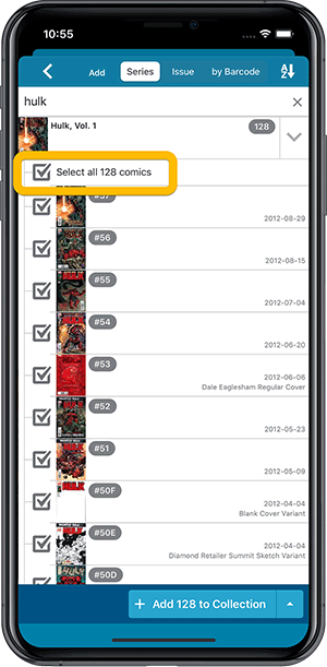
Add Comics by Series: New “Select All” checkbox
By popular demand: in the Add Comics screen, on the By Series tab right above the Issue List, we have added an new “Select All” checkbox, for easily selecting ALL issues in the series!
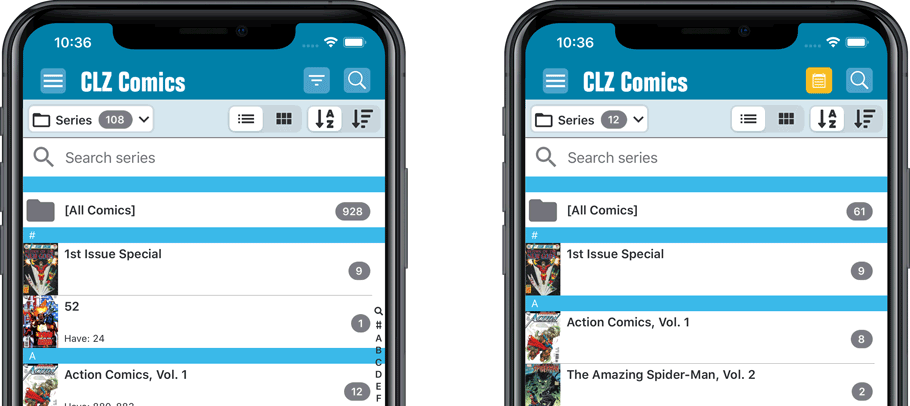
Collection Status filter
The 2nd button from the top right (next to the search button) is the Collection Status filter. Previously, it allowed you to filter by All, Collection or Wish List, but with this update, we added all collection status option there as filters, including On order and For Sale.
Also, the button will now be highlighted in yellow when a filter is active, that is, when it is set to anything other than “All”.
Re-designed toolbars at the top
The toolbars at the top have been re-designed, mainly to make the interactive elements stand out more as actual “buttons”.
(Especially the folder icon on the left was something that was often overlooked as something you could tap on. Hopefully this re-design will help to let more users find the most powerful feature of the app 🙂 )
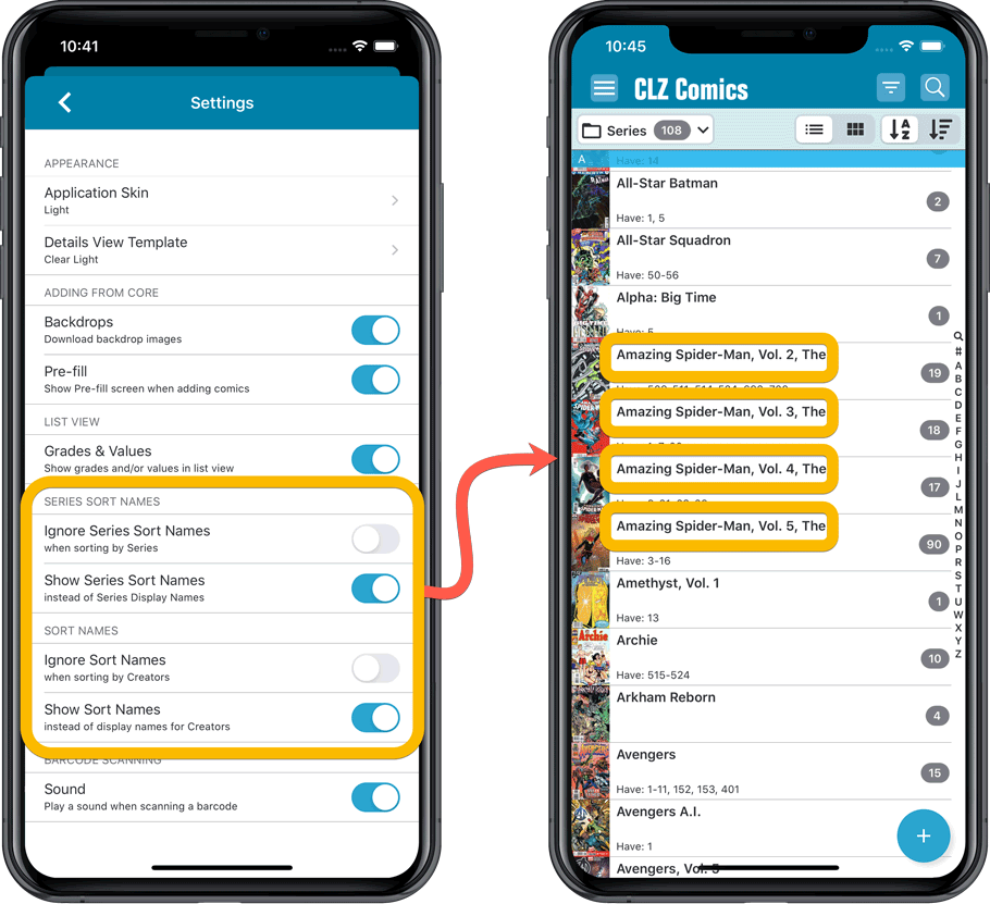
New sort and display options in Settings
For Series:
- Ignore Series Sort Names when sorting by Series
- Show Series Sort Names instead of Series Display Name
For Creators:
- Ignore Sort Names when sorting by Creators
- Show Sort Names instead of display names for Creators
Improved Statistics screen
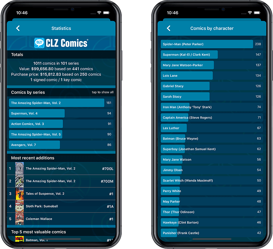
The Statistics screen has been updated with:
- More database totals at the top (signed comics, key comics, purchase price)
- More charts (by Publisher, by Grade, by Year, by Creator, by Character, Purchase Price by Series)
- A new: “tap to show all” option to enlarge charts and see ALL entries
A big update for your CLZ app today. Instead of bringing one big new feature, we decided to work on multiple areas that could be improved, all of them based on the feedback we received from you all. Thanks for that!
Collection Status filter
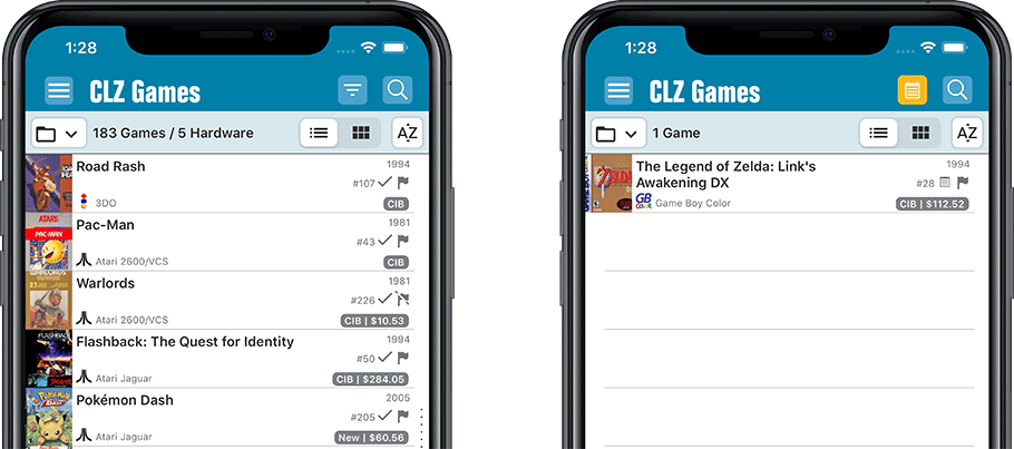
The 2nd button from the top right (next to the search button) is the Collection Status filter. Previously, it allowed you to filter by All, Collection or Wish List, but with this update, we added all collection status option there as filters, including On order and For Sale.
Also, the button will now be highlighted in yellow when a filter is active, that is, when it is set to anything other than “All”.
Re-designed toolbars at the top
The toolbars at the top have been re-designed, mainly to make the interactive elements stand out more as actual “buttons”.
(Especially the folder icon on the left was something that was often overlooked as something you could tap on. Hopefully this re-design will help to let more users find the most powerful feature of the app 🙂 )
New sort and display options in Settings
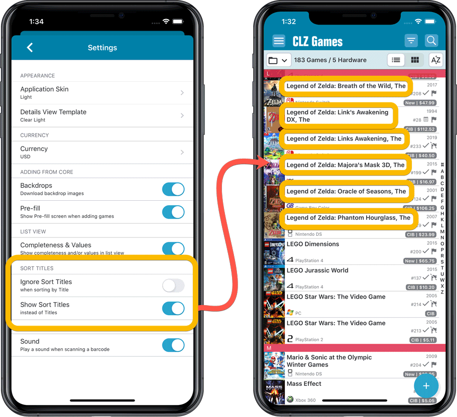
- Ignore Sort Titles when sorting by Title
- Show Sort Titles instead of Titles
Improved Statistics screen
The Statistics screen has been updated with:
- More database totals at the top (purchase price, current value)
- More charts (by Year, by Genre, by Completeness, by Completed, Value by Completeness)
- A new: “tap to show all” option to enlarge charts and see ALL entries
A big update for your CLZ app today. Instead of bringing one big new feature, we decided to work on multiple areas that could be improved, all of them based on the feedback we received from you all. Thanks for that!
Collection Status filter
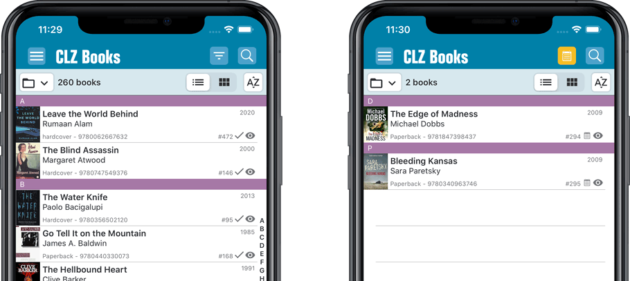
The 2nd button from the top right (next to the search button) is the Collection Status filter. Previously, it allowed you to filter by All, Collection or Wish List, but with this update, we added all collection status option there as filters, including On order and For Sale.
Also, the button will now be highlighted in yellow when a filter is active, that is, when it is set to anything other than “All”.
Re-designed toolbars at the top
The toolbars at the top have been re-designed, mainly to make the interactive elements stand out more as actual “buttons”.
(Especially the folder icon on the left was something that was often overlooked as something you could tap on. Hopefully this re-design will help to let more users find the most powerful feature of the app 🙂 )
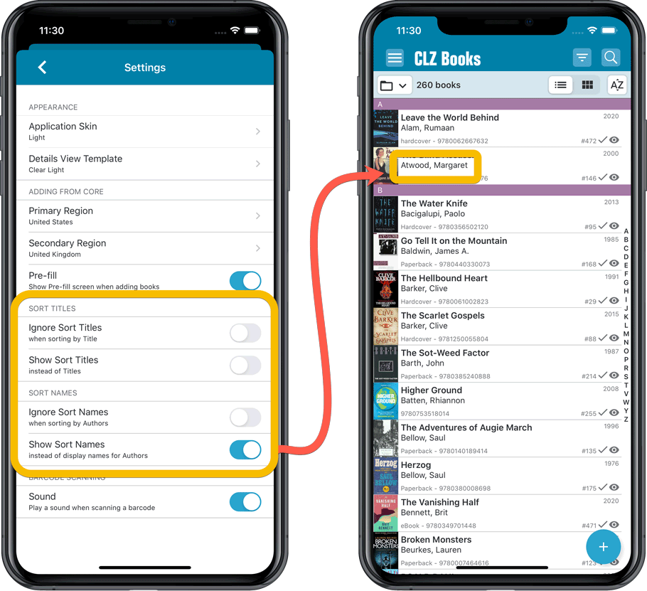
New sort and display options in Settings
For Authors:
- Ignore Sort Names when sorting by Authors
- Show Sort Names instead of display names for Authors
For Titles:
- Ignore Sort Titles when sorting by Title
- Show Sort Titles instead of Titles
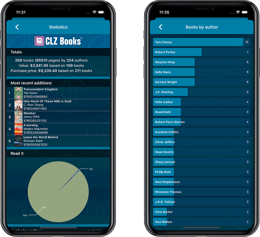
Improved Statistics screen
The Statistics screen has been updated with:
- More database totals at the top (nr of pages, purchase price, current value)
- An extra chart that shows Books by Year
- A new: “tap to show all” option to enlarge charts and see ALL entries
A big update for your CLZ app today. Instead of bringing one big new feature, we decided to work on multiple areas that could be improved, all of them based on the feedback we received from you all. Thanks for that!
Collection Status filter
The 2nd button from the top right (next to the search button) is the Collection Status filter. Previously, it allowed you to filter by All, Collection or Wish List, but with this update, we added all collection status option there as filters, including On order and For Sale.
Also, the button will now be highlighted in yellow when a filter is active, that is, when it is set to anything other than “All”.
Re-designed toolbars at the top
The toolbars at the top have been re-designed, mainly to make the interactive elements stand out more as actual “buttons”.
(Especially the folder icon on the left was something that was often overlooked as something you could tap on. Hopefully this re-design will help to let more users find the most powerful feature of the app 🙂 )
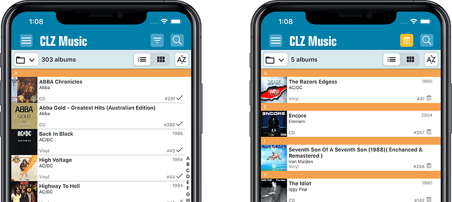
New sort and display options in Settings
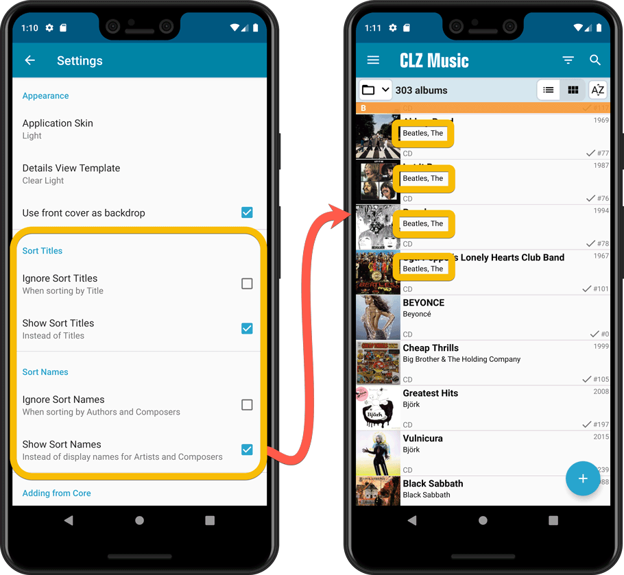
For Artists and Composers:
- Ignore Sort Names when sorting by Artists and Composers.
- Show Sort Names instead of display names for Artists and Composers
For Titles:
- Ignore Sort Titles when sorting by Title
- Show Sort Titles instead of Titles
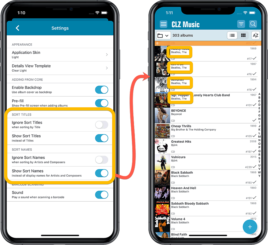
Improved Statistics screen
The Statistics screen has been updated with:
- More database totals at the top (nr of discs, purchase price, current value)
- An extra chart that shows Albums by Year
- A new: “tap to show all” option to enlarge charts and see ALL entries
A big update for your CLZ app today. Instead of bringing one big new feature, we decided to work on multiple areas that could be improved, all of them based on the feedback we received from you all. Thanks for that!
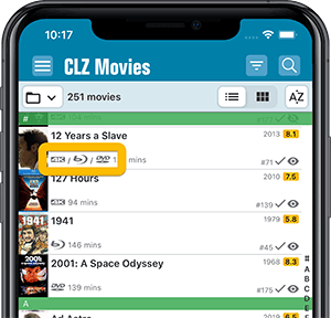
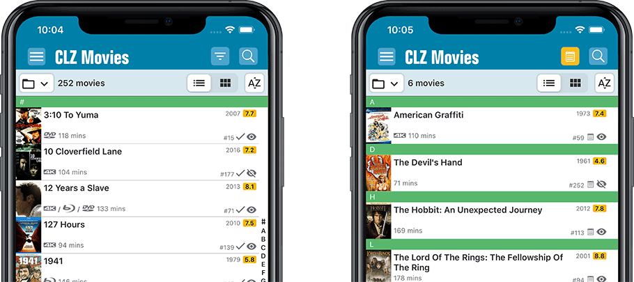
Movie list now allows multiple format logos
Previously, the movie list only showed the logo of the first Format, but now it shows all Formats that you selected for the movie, e.g. 4K UDH and Blu-ray.
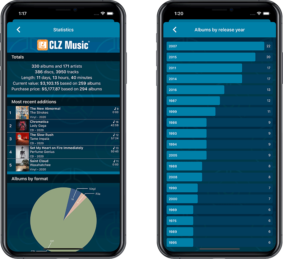
Collection Status filter
The 2nd button from the top right (next to the search button) is the Collection Status filter. Previously, it allowed you to filter by All, Collection or Wish List, but with this update, we added all collection status option there as filters, including On order and For Sale.
Also, the button will now be highlighted in yellow when a filter is active, that is, when it is set to anything other than “All”.
Re-designed toolbars at the top
The toolbars at the top have been re-designed, mainly to make the interactive elements stand out more as actual “buttons”.
(Especially the folder icon on the left was something that was often overlooked as something you could tap on. Hopefully this re-design will help to let more users find the most powerful feature of the app 🙂 )
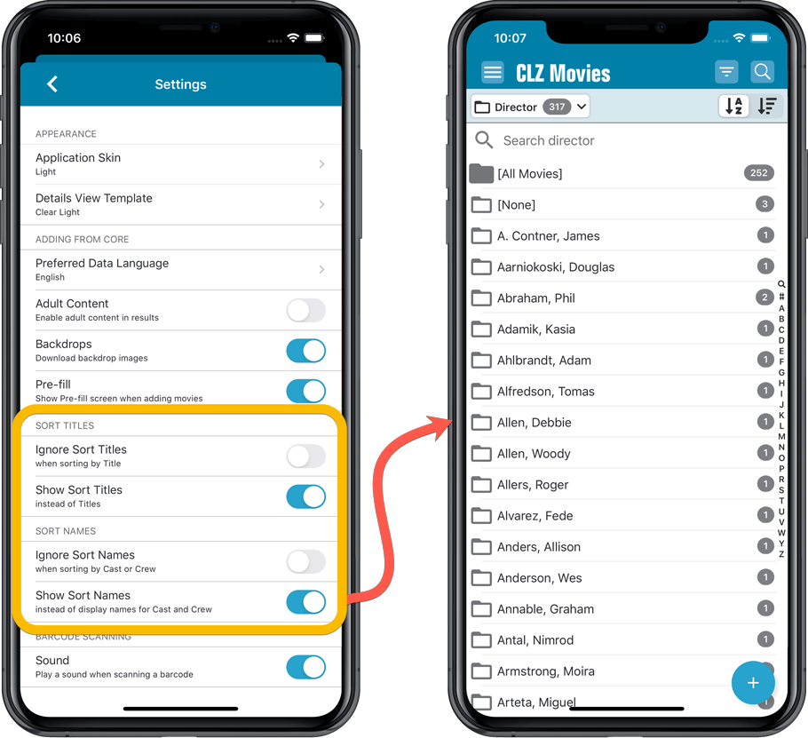
New sort and display options in Settings
For Titles:
- Ignore Sort Titles when sorting by Title
- Show Sort Titles instead of Titles
For Cast and Crew
- Ignore Sort Names when sorting by Cast or Crew
- Show Sort Names instead of display names for Cast and Crew
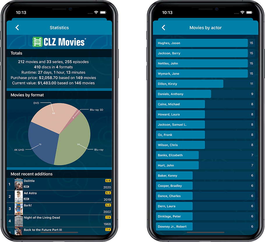
Improved Statistics screen
The Statistics screen has been updated with:
- More database totals at the top (nr of episodes, runtime, purchase price, current value)
- More charts (by Year, by Actor)
- A new: “tap to show all” option to enlarge charts and see ALL entries
A big update for your CLZ app today. Instead of bringing one big new feature, we decided to work on multiple areas that could be improved, all of them based on the feedback we received from you all. Thanks for that!
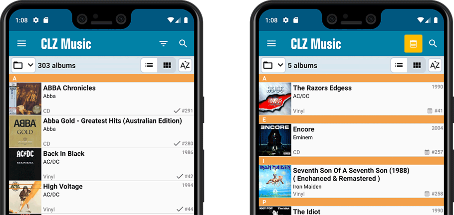
Collection Status filter
The 2nd button from the top right (next to the search button) is the Collection Status filter. Previously, it allowed you to filter by All, Collection or Wish List, but with this update, we added all collection status option there as filters, including On order and For Sale.
Also, the button will now be highlighted in yellow when a filter is active, that is, when it is set to anything other than “All”.
Re-designed toolbars at the top
The toolbars at the top have been re-designed, mainly to make the interactive elements stand out more as actual “buttons”.
(Especially the folder icon on the left was something that was often overlooked as something you could tap on. Hopefully this re-design will help to let more users find the most powerful feature of the app 🙂 )
New sort and display options in Settings
For Artists and Composers:
- Ignore Sort Names when sorting by Artists and Composers.
- Show Sort Names instead of display names for Artists and Composers
For Titles:
- Ignore Sort Titles when sorting by Title
- Show Sort Titles instead of Titles
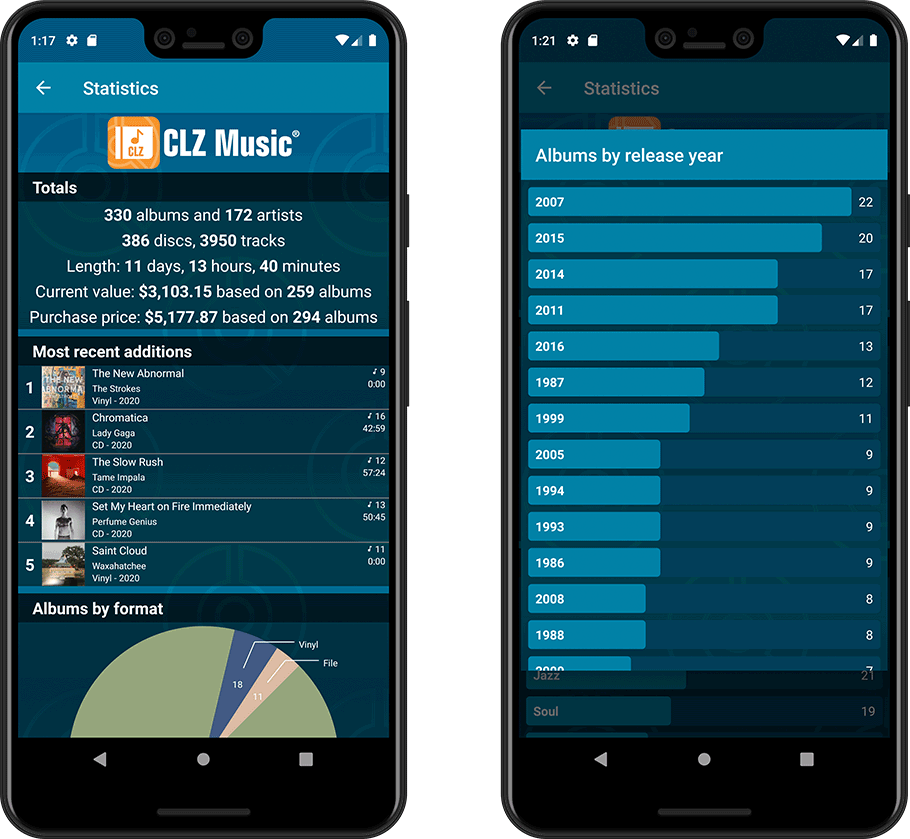
Improved Statistics screen
The Statistics screen has been updated with:
- More database totals at the top (nr of discs, purchase price, current value)
- An extra chart that shows Albums by Year
- A new: “tap to show all” option to enlarge charts and see ALL entries
Instead of working on new features, we decided to take a few weeks to look at existing screens and functionality and see where things could be improved, of course all based on your feedback.
Today’s update brings you new iOS 13 style “sheet” screens and a batch of user interface improvements we implemented (more coming up!):
Instead of working on new features, we decided to take a few weeks to look at existing screens and functionality and see where things could be improved, of course all based on your feedback.
Today’s update brings you the first batch of user interface improvements that we implemented (more coming up!), plus it bring the app fully up-to-date with the new iOS 13 “sheet-style” popup screens!
Instead of working on new features, we decided to take a few weeks to look at existing screens and functionality and see where things could be improved, of course all based on your feedback.
Today’s update brings you the first user interface improvements we implemented (more coming up!):
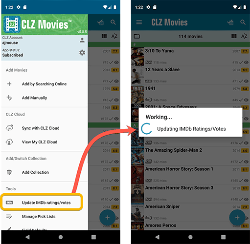
New “Update IMDb ratings/votes” menu option to update all movies in 1 go
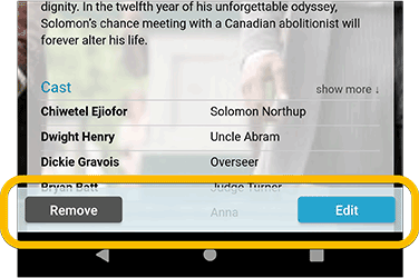
Easier to find Edit and Remove buttons on movie details screen (phone only)
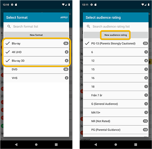
Easier editing of pick list fields, especially multi-value fields
- Selected/checked values are now always at the top
- For multi-value fields (like Genre, Studio), check/uncheck multiple values in one go!
- Easier to find big button at the top for adding NEW values..
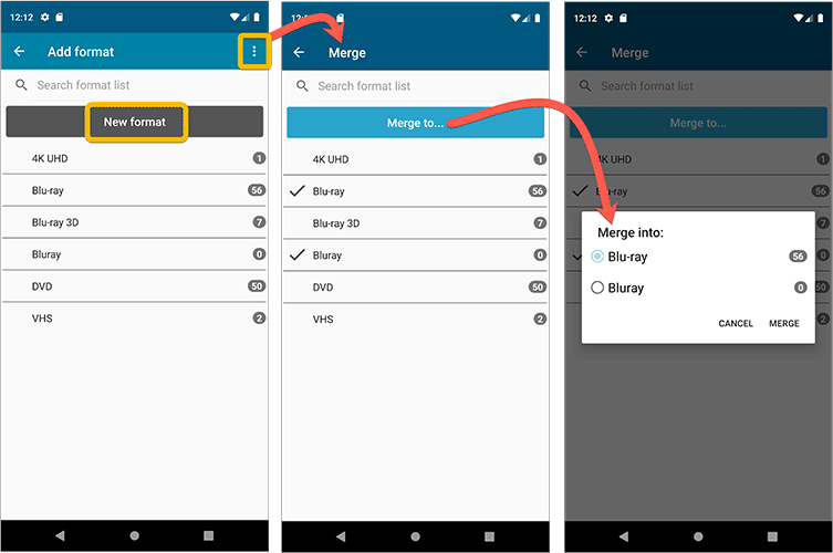
Complete Re-design of Manage Pick List screen
- Easier to find big button at the top for adding NEW values.
- Remove Unused and Merge action have now been moved to action (…) button top right.
- Easier to use Merge mode.
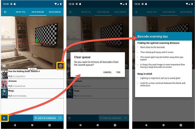
Add by barcode: New Clear Queue button and new “Scanning tips” popup
Fixed:
- Edit screen: the “Seen it” checkbox wouldn’t always work
- Re-introduced a “sync changes pending” icon to the “Sync with CLZ Cloud” menu item
Instead of working on new features, we decided to take a few weeks to look at existing screens and functionality and see where things could be improved, of course all based on your feedback.
Today’s update brings you the first user interface improvements we implemented (more coming up!):
Easier to find Edit and Remove buttons on album details screen (phone only)
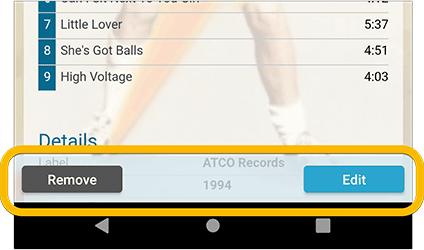
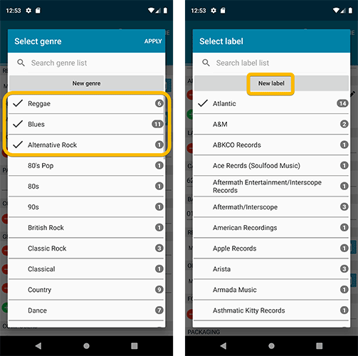
Easier editing of pick list fields, especially multi-value fields
- Selected/checked values are now always at the top
- For multi-value fields (like Genre), check/uncheck multiple values in one go!
- Easier to find big button at the top for adding NEW values..
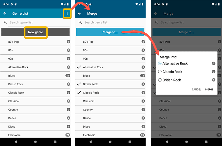
Complete Re-design of Manage Pick List screen
- Easier to find big button at the top for adding NEW values.
- Remove Unused and Merge action have now been moved to action (…) button top right.
- Easier to use Merge mode.
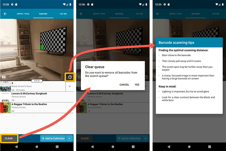
Add by barcode: New Clear Queue button and new “Scanning tips” popup
Fixed:
- Re-introduced a “sync changes pending” icon to the “Sync with CLZ Cloud” menu item
Instead of working on new features, we decided to take a few weeks to look at existing screens and functionality and see where things could be improved, of course all based on your feedback.
Today’s update brings you the first user interface improvements we implemented (more coming up!):
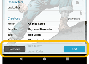
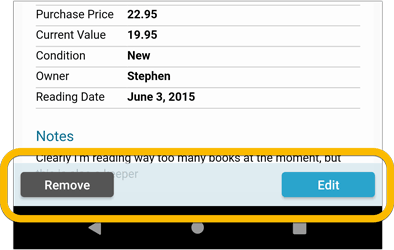
Easier to find Edit and Remove buttons on comic details screen (phone only)
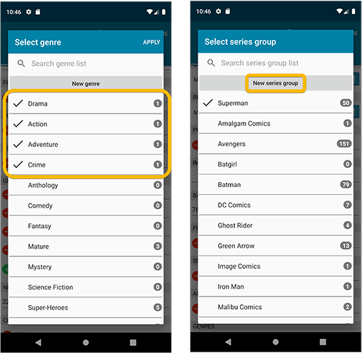
Easier editing of pick list fields, especially multi-value fields
- Selected/checked values are now always at the top
- For multi-value fields (like Genre), check/uncheck multiple values in one go!
- Easier to find big button at the top for adding NEW values..
Complete Re-design of Manage Pick List screen
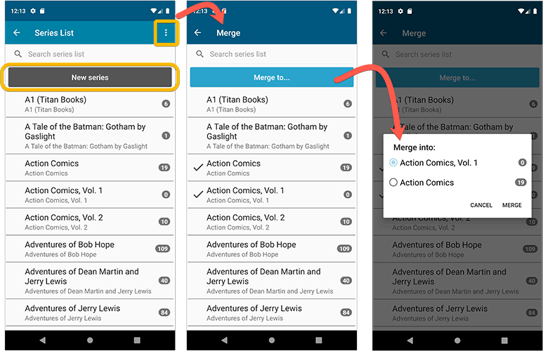
- Easier to find big button at the top for adding NEW values.
- Remove Unused and Merge action have now been moved to action (…) button top right.
- Easier to use Merge mode.
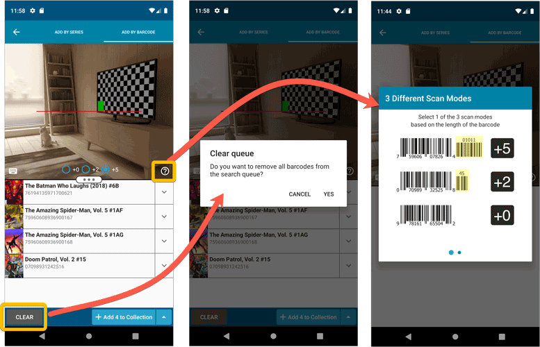
Add by barcode: New Clear Queue button and new “Scanning tips” popup
Other tweaks:
- Re-introduced a “sync changes pending” icon to the “Sync with CLZ Cloud” menu item
Instead of working on new features, we decided to take a few weeks to look at existing screens and functionality and see where things could be improved, of course all based on your feedback.
Today’s update brings you the first user interface improvements we implemented (more coming up!):
Easier to find Edit and Remove buttons on book details screen (phone only)
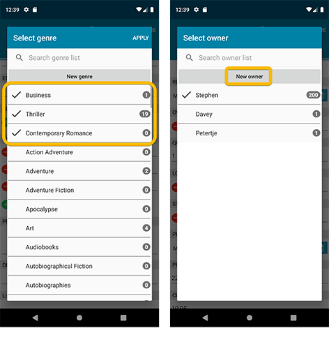
Easier editing of pick list fields, especially multi-value fields
- Selected/checked values are now always at the top
- For multi-value fields (like Genre, Studio), check/uncheck multiple values in one go!
- Easier to find big button at the top for adding NEW values..
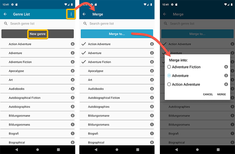
Complete Re-design of Manage Pick List screen
- Easier to find big button at the top for adding NEW values.
- Remove Unused and Merge action have now been moved to action (…) button top right.
- Easier to use Merge mode.
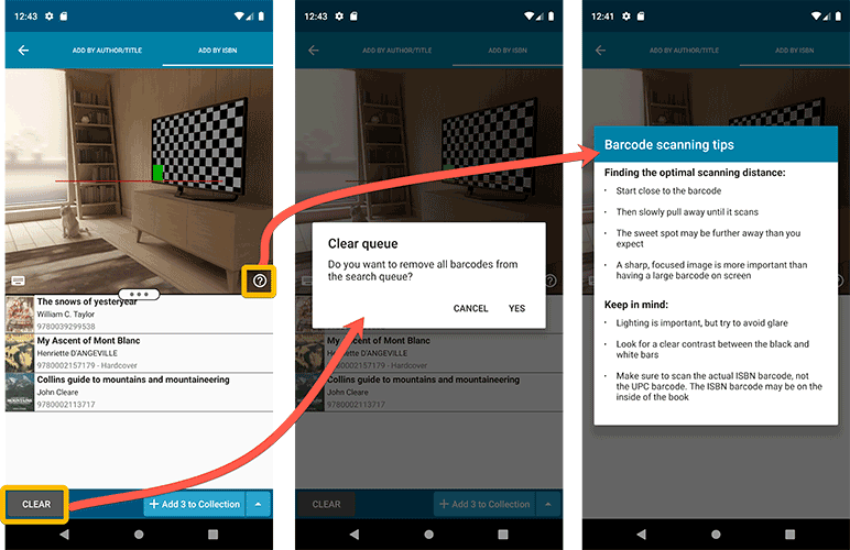
Add by barcode: New Clear Queue button and new “Scanning tips” popup
Fixed:
- Edit screen: the “Read it” checkbox wouldn’t always work
- Re-introduced a “sync changes pending” icon to the “Sync with CLZ Cloud” menu item