Instead of working on new features, we decided to take a few weeks to look at existing screens and functionality and see where things could be improved, of course all based on your feedback.
Today’s update brings you the first batch of user interface improvements that we implemented (more coming up!), plus it bring the app fully up-to-date with the new iOS 13 “sheet-style” popup screens!
New sheet-style popup screens on iOS 13
To stay up to date with iOS 13, we’ve updated some screens to look like “sheets”. This means you can close certain screens and pop-ups by sliding them down! Take a look:
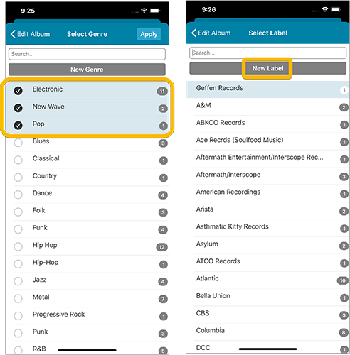
Easier editing of pick list fields, especially multi-value fields
- Selected/checked values are now always at the top
- For multi-value fields (like Genre), check/uncheck multiple values in one go!
- Easier to find big button at the top for adding NEW values..

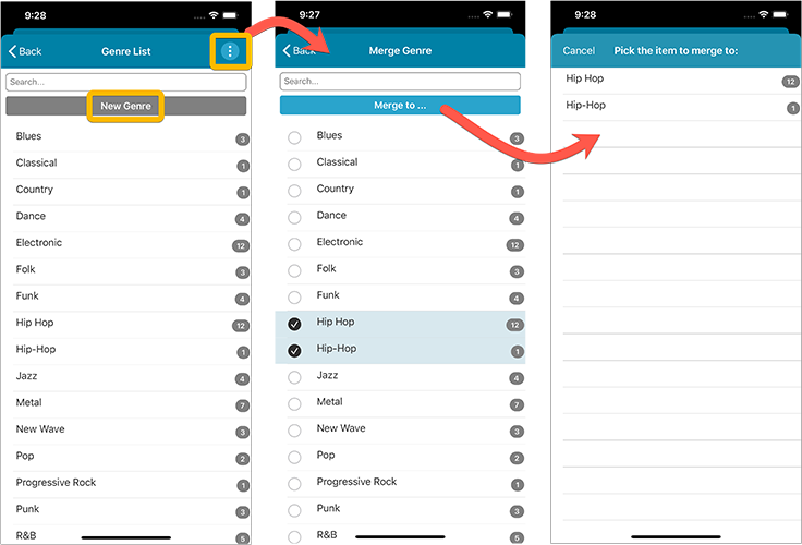
Complete Re-design of Manage Pick List screen
- Easier to find big button at the top for adding NEW values.
- Remove Unused and Merge action have now been moved to action (…) button top right.
- Easier to use Merge mode.

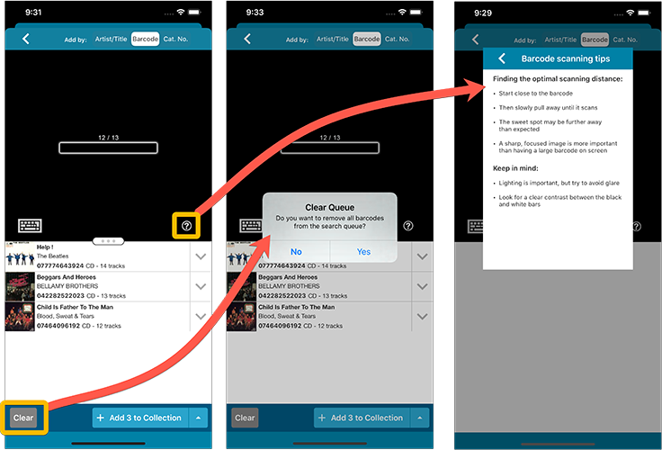
Add by barcode: New Clear Queue button and new “Scanning tips” popup

Recent changes
v10.3: Faster down-syncing from CLZ Cloud
Mar 30, 2026
v10.2: ‘One-by-One’ mode for adding albums by barcode
Nov 25, 2025
v10.1: Automatic eBay search links
Oct 24, 2025
v10.0: New data fields: listening history, matrix numbers, signed by, etc…
Jul 03, 2025
v9.6: Security update
Feb 26, 2025
v9.5: Better barcode scanning
Jan 08, 2025
v9.4: New app icon to fit our new company name and logo
Oct 12, 2024
v9.3: Several improvements and fixes
Sep 27, 2024
v9.0: Collection tabs, better Add Albums screen, easy people filtering
May 03, 2024
v8.4: Easier access to Manage Pick Lists tool
Oct 25, 2023
v8.3: Pre-fill screen: Orange highlights and a Clear button
Oct 16, 2023
v8.1: New Sync button on main screen
Sep 06, 2023
v8.0: Use multiple folder levels
May 17, 2023
v7.4 New “Card View”
May 12, 2022
v7.3: Back Cover images!
Mar 29, 2022
v7.2: Progress Bars and Cancel buttons!
Mar 15, 2022
v7.1: Improved Pre-fill screen: choose your own fields!
Feb 10, 2022
v7.0: New features and lots of improvements
Nov 25, 2021
v6.6.2: Main screen lists now fully support system font sizes
Sep 28, 2021
v6.6 Submit to Core / New Select Mode and action menu
Sep 27, 2021
v6.6 Submit to Core / New Select Mode and action menu
Sep 27, 2021
v6.5: Duplicate / Clear Cloud / Shake to Shuffle / Currency symbol
Sep 09, 2021
v6.5: Duplicate / Clear Cloud / Shake to Shuffle / Currency symbol
Sep 09, 2021
v6.4: Lots of new database fields
Aug 19, 2021
v6.4: Lots of new database fields
Aug 19, 2021