What's new in CLZ Books? (page 5)
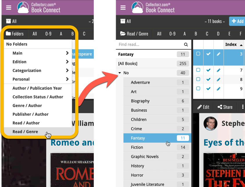
A very cool and useful addition to your Book Connect software today: the folder panel on the left now allows multiple levels of folders!
This is a powerful way to browse your book collection, e.g. by Publisher then Author, or Read it then Genre.
Instead of working on new features, we decided to take a few weeks to look at existing screens and functionality and see where things could be improved, of course all based on your feedback.
Today’s update brings you the first batch of user interface improvements that we implemented (more coming up!), plus it bring the app fully up-to-date with the new iOS 13 “sheet-style” popup screens!
A big step forward for the Book Connect software today, in which we add many new editable fields and Back Cover images. Also, a handy new tool to fill/update your entries with information from our Core online book database.
Many new fields
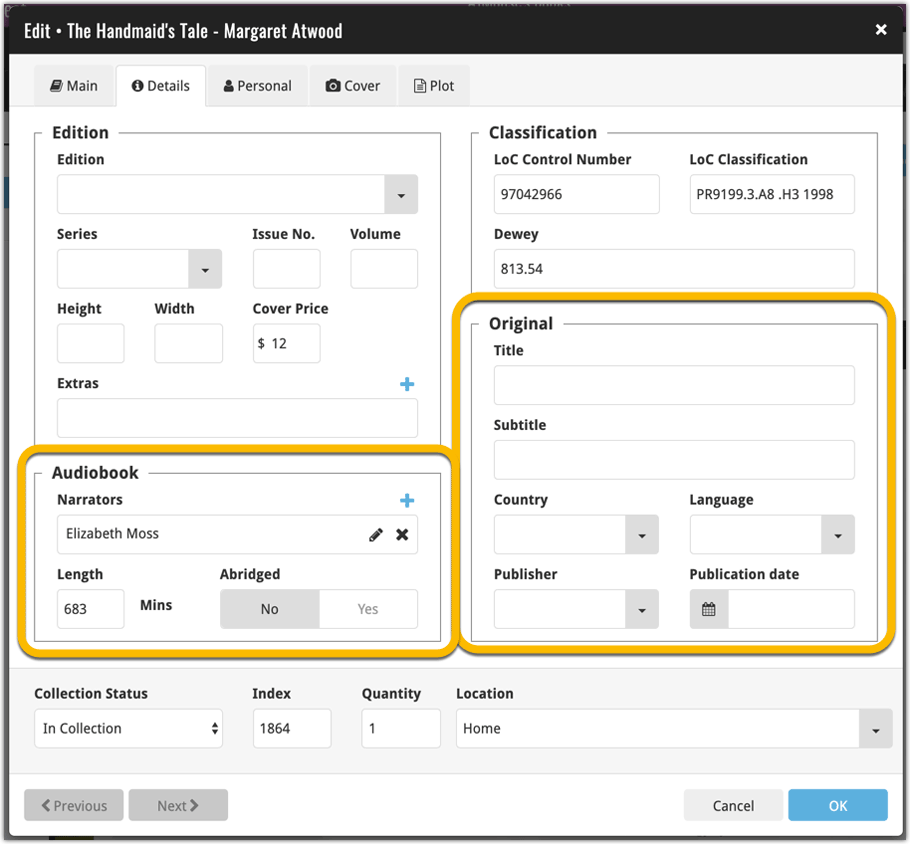
Today we have added many fields to the software, all now editable in the Edit Book screen.
- Illustrator
- For audiobooks:
- Narrator
- Length
- Abridged Yes/No
- About the original book:
- Original Title
- Original Subtitle
- Original Country
- Original Language
- Original Publisher
- Original Publication Date
- Cover Price
- Extras
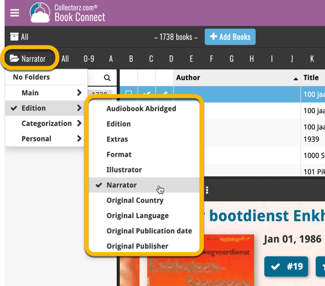
Of course, the pick list fields are immediately available as folder fields too, so that you can browse your collection in folders by Illustrator, Narrator, Original Country, etc…
New: Add your own back covers
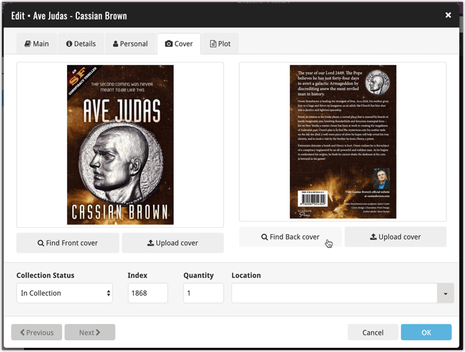
With this big update for Book Connect we have another surprise for you: Back Covers! That’s right, a brand new back cover field you can modify yourself.
Use the “Find Back cover” button to find one, or upload one yourself:
New Update from Core tool
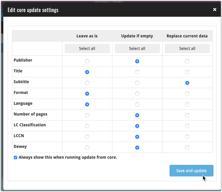
Update from Core fills in the fields in your data entries with data from our Core central online book database. By default, it only adds new data into fields that were still empty on your side, but the config screen also lets you opt to overwrite your data with our Core data.
This new feature is now available for the following fields:
- Publisher
- Title
- Subtitle
- Format
- Language
- Number of pages
- LC Classification
- LCCN
- Dewey
How to use Update from Core on your book entries?
- Select the books you wish to update by clicking the checkboxes in front of them.
- Click “Update from Core” from the blue action toolbar (it’s under the 3 vertical dots
button)
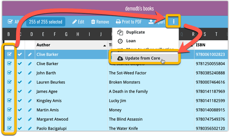
You can choose if the update process should leave, update or replace the current data for each field with the Update from Core settings popup:
Instead of working on new features, we decided to take a few weeks to look at existing screens and functionality and see where things could be improved, of course all based on your feedback.
Today’s update brings you the first user interface improvements we implemented (more coming up!):
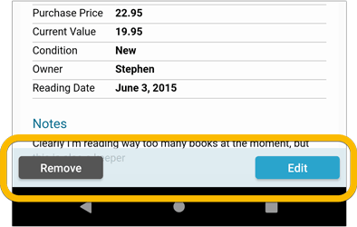
Easier to find Edit and Remove buttons on book details screen (phone only)
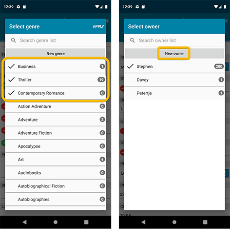
Easier editing of pick list fields, especially multi-value fields
- Selected/checked values are now always at the top
- For multi-value fields (like Genre, Studio), check/uncheck multiple values in one go!
- Easier to find big button at the top for adding NEW values..
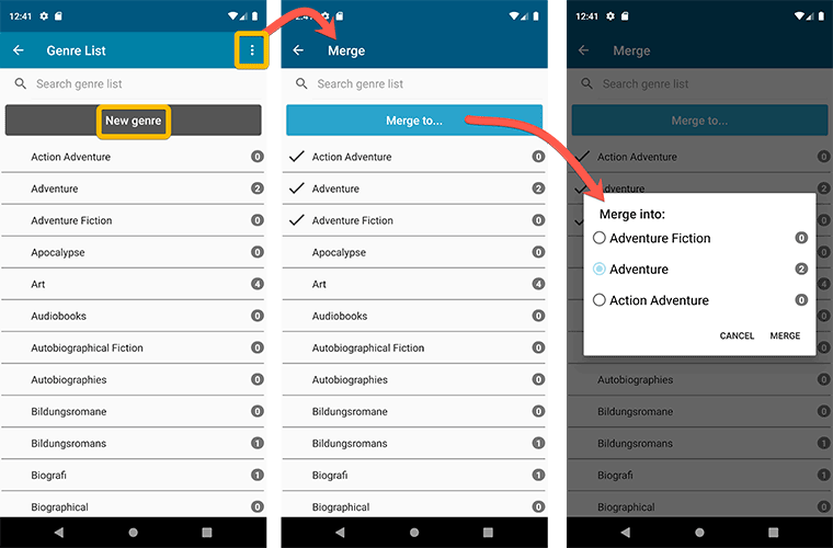
Complete Re-design of Manage Pick List screen
- Easier to find big button at the top for adding NEW values.
- Remove Unused and Merge action have now been moved to action (…) button top right.
- Easier to use Merge mode.
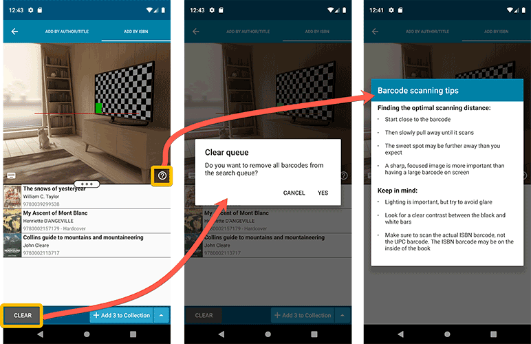
Add by barcode: New Clear Queue button and new “Scanning tips” popup
Fixed:
- Edit screen: the “Read it” checkbox wouldn’t always work
- Re-introduced a “sync changes pending” icon to the “Sync with CLZ Cloud” menu item
Today, a subtle addition to your Book Connect software, but one that can save you a lot of time if you’re always adding your books by ISBN:
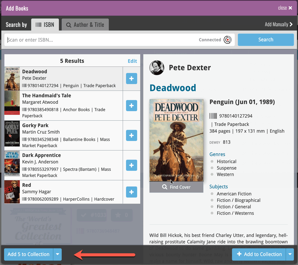
A new “Add [..] to Collection” button under the add queue, that lets you add all scanned books in one go. No more need to click the little “+” buttons for each entry.
Some other improvements:
At the same time, some other tweaks went live in your software:
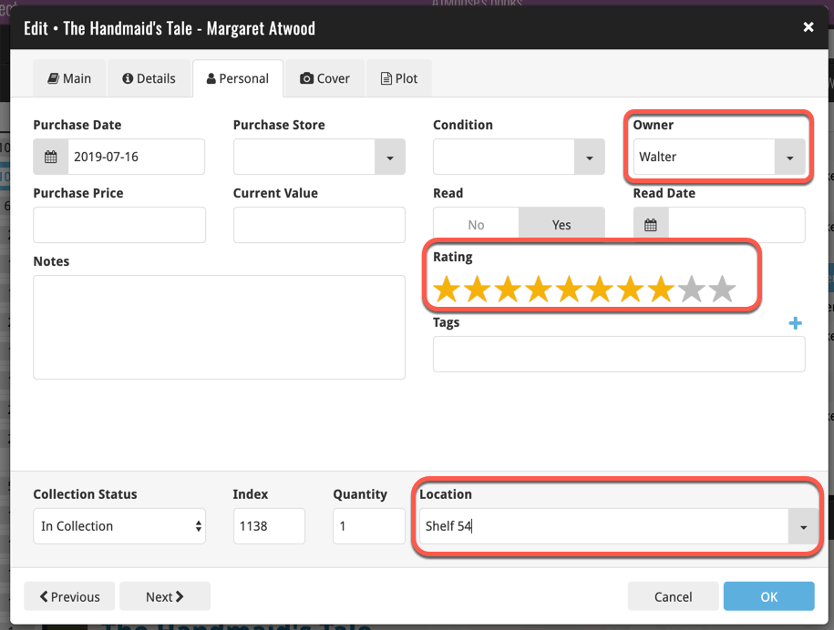
- In the “fixed” area at the bottom of the Edit Book screen, we replaced the Owner field with the Location field.
Through user feedback we found that the Location field is used by many more users, compared to Owner. Also many new users were not finding the field. So we figured the Location field deserved a more prominent spot in the Edit Book screen.
BTW: the Owner field can now be found on the Personal tab. - The User Rating field has received a make-over and can now be set using a nice sliding star thingie.
v5: Multiple collections, automatic syncing of your own images, and: now a subscription app!
It’s finally here: CLZ Books 5.0 for Android! With support for multiple collections, automatic syncing of your own images, plus a re-designed top bar and menu.
On top of that, (and the main reason why it took so long):
* Starting with v5, CLZ Books is now a subscription app!
Read on below to find out how that affects you (hint: it doesn’t!).
What’s new in CLZ Books 5.0 ?
CLZ Books is now a subscription app, costing $1.49/month
To allow us to keep delivering our CLZ online services (CLZ Cloud and CLZ Core) and our continuous updates to the app, the app has now become a subscription app. For new users, this subscription gives them access to the CLZ online services:
- CLZ Core: for adding books by ISBN or by author and title
- CLZ Cloud: for online backups and syncing between devices.
IMPORTANT: Of course, since you have purchased the app earlier, you have automatically received a life-time “Basic”-level subscription, which gives you access to your existing CLZ Core and CLZ Cloud services. You do not need to pay for a subscription!
In other words, the app now being a subscription app has no effect on you whatsoever!
If you still see any “unlock” problems with your app, please CONTACT US here and we’ll get it resolved ASAP.
Please note: We may introduce new “premium” CLZ services to the CLZ Books app later, which are not part of your free life-time “Basic” subscription. At that time, if you want to use the new services, you will be able to optionally upgrade to a “Premium” subscription.
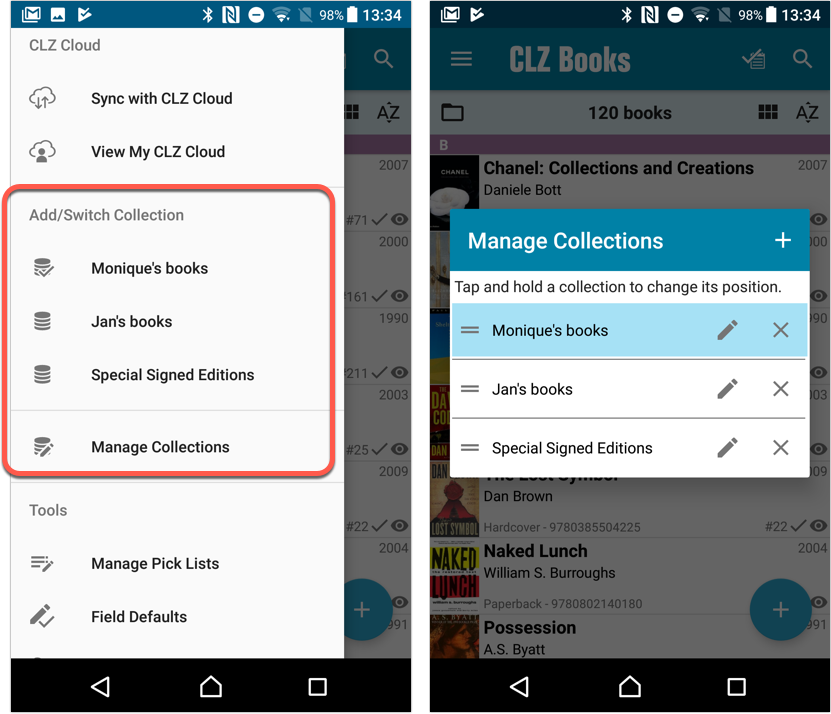
Now supports and syncs multiple collections !
It is now possible to manage multiple “collections” within your app. The collections you create will be listed in the main menu, so you can easily switch between them.
Use the menu to add new collections, edit their names, change the order, etc…
Multiple collections now also sync through the CLZ Cloud, e.g. to/from the Book Connect cloud-based software or the Book Collector desktop software. So if you have created multiple collections on the desktop side, these will now finally be separated on the mobile app too!
Already have multiple collections in the CLZ Cloud?
If you already have multiple collections in the CLZ Cloud, here’s what to do to get your existing entries split up into multiple collections on your mobile app too:
1. Tap the menu top left
2. Tap “Sync with CLZ Cloud” and make sure you’re in sync.
3. Tap the menu top left again and tap “Maintenance”
4. Tap “Update all from CLZ Cloud”
5. Now use “Sync with CLZ Cloud” from the menu again.
Automatic cloud-syncing of your own “custom” images
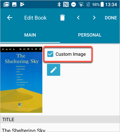
Before v5, if you replaced the automatic Core front cover with your own image (e.g. from Camera Roll), it would not automatically sync to the CLZ Cloud. You had to “force” the upload by using Upload to CLZ Cloud in the Edit screen.
For version 5 we made this more automatic. We introduced a new toggle “Custom Image” in the Edit screen. This toggle will be automatically set when you replace the Core image. Once the Custom Image toggle is set, that cover will automatically sync to and from the CLZ Cloud.
Re-designed top-bar
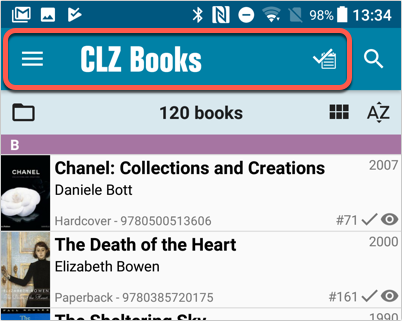
- The menu icon now includes the “CLZ Books” mark (bigger tap area)
- The “Collection Status” filter button has been moved to the right
Re-designed main menu
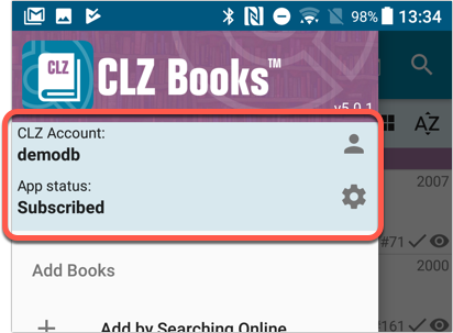
- The menu now clearly shows your Account and Subscription Status at the top. Tap either of those to manage them.
- New “Maintenance” screen that now contains:
- the “Clear Database” option
- the “old Import from Book Collector” option
- the new “Update from CLZ Cloud” option (only use when instructed by support staff)
How to update your CLZ Books app to version 5:
- On your device, open the Play Store app.
- Tap the menu button on the top left, then tap “My apps & games”.
- Find the CLZ Books entry and tap “UPDATE” on the right.
v5: Multiple collections, automatic syncing of your own images, and: now a subscription app!
It’s finally here: CLZ Books 5.0 for iOS! With support for multiple collections, automatic syncing of your own images, plus a re-designed top bar and menu.
On top of that, (and the main reason why it took so long):
* Starting with v5, CLZ Books is now a subscription app!
Read on below to find out how that affects you (hint: it doesn’t!).
What’s new in CLZ Books 5.0 ?
CLZ Books is now a subscription app, costing $1.49/month
To allow us to keep delivering our CLZ online services (CLZ Cloud and CLZ Core) and our continuous updates to the app, the app has now become a subscription app. For new users, this subscription gives them access to the CLZ online services:
- CLZ Core: for adding books by ISBN or author/title
- CLZ Cloud: for online backups and syncing between devices.
IMPORTANT: Of course, since you have purchased the app earlier, you have automatically received a life-time “Basic”-level subscription, which gives you access to your existing CLZ Core and CLZ Cloud services. You do not need to pay for a subscription!
In other words, the app now being a subscription app has no effect on you whatsoever!
If you still see any “unlock” problems with your app, please CONTACT US here and we’ll get it resolved ASAP.
Please note: We may introduce new “premium” CLZ services to the CLZ Books app later, which are not part of your free life-time “Basic” subscription. At that time, if you want to use the new services, you will be able to optionally upgrade to a “Premium” subscription.
Now supports and syncs multiple collections !
It is now possible to manage multiple “collections” within your app. The collections you create will be listed in the main menu, so you can easily switch between them.
Use the menu to add new collections, edit their names, change the order, etc…
Multiple collections now also sync through the CLZ Cloud, e.g. to/from the Book Connect cloud-based software or the Book Collector desktop software. So if you have created multiple collections on the desktop side, these will now finally be separated on the mobile app too!
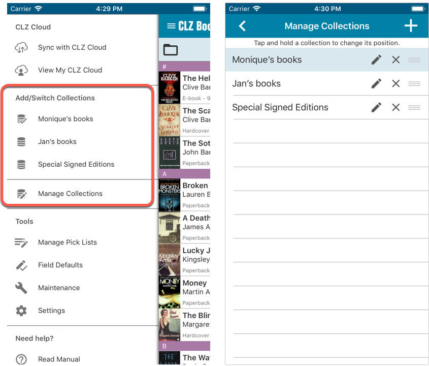
Already have multiple collections in the CLZ Cloud?
If you already have multiple collections in the CLZ Cloud, here’s what to do to get your existing entries split up into multiple collections on your mobile app too:
1. Tap the menu top left
2. Tap “Sync with CLZ Cloud” and make sure you’re in sync.
3. Tap the menu top left again and tap “Maintenance”
4. Tap “Update all from CLZ Cloud”
5. Now use “Sync with CLZ Cloud” from the menu again.
Automatic cloud-syncing of your own “custom” images
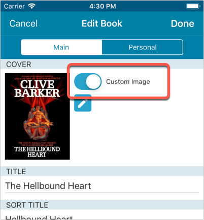
Before v5, if you replaced the automatic Core front cover with your own image (e.g. from Camera Roll), it would not automatically sync to the CLZ Cloud. You had to “force” the upload by using Upload to CLZ Cloud in the Edit screen.
For version 5 we made this more automatic. We introduced a new toggle “Custom Image” in the Edit screen. This toggle will be automatically set when you replace the Core image. Once the Custom Image toggle is set, that cover will automatically sync to and from the CLZ Cloud.
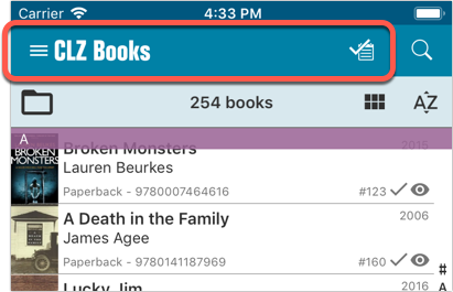
Re-designed top-bar
- The menu icon now includes the “CLZ Books” mark (bigger tap area)
- The “Collection Status” filter button has been moved to the right
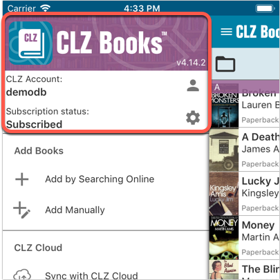
Re-designed main menu
- The menu now clearly shows your Account and Subscription Status at the top. Tap either of those to manage them.
- New “Maintenance” screen that now contains:
- the “Clear Database” option
- the “old Import from Book Collector” option
- the new “Update from CLZ Cloud” option (only use when instructed by support staff)
How to update your CLZ Books app to version 5:
- On your device, open the App Store app.
- On the bottom, switch to the Updates tab.
- Find the CLZ Book entry and tap “UPDATE” on the right.
TIP: if you don’t see the CLZ Books update yet, pull down to refresh!
Based on user feedback we found out users were looking for and expecting a tool to find duplicate entries in their collection. Some way to find out if you’ve accidentally added multiple versions of the same book, but perhaps with a different format or ISBN.
After quite a few requests and discussions with users about this, to find out how they got duplicates and what they would expect from such a Duplicate Finder tool, it’s here today: Find Duplicate entries in your collection!
New: Find Duplicate Books
Open the menu top left and select Find Duplicates to begin.
Then select which field to find duplicates on. You can find duplicates based on:
- Title
- Title & Author
- ISBN
- Index
Click “Find Duplicates” and see what it comes up with. Use the blue “Keep” button to keep a group of duplicates, or use the red “Remove” button to remove a duplicate!
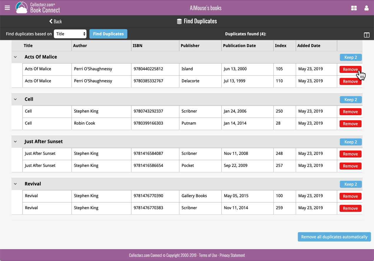
If you click “Remove all duplicates automatically”, it will remove all duplicate entries and will only keep 1 single entry (the oldest one) in your collection.
Tip: use the columns button, top right, to set up the columns you’d like to see!
Another big step forward for our cloud-based Connect software, making it even more customizable:
The columns in List View are now resizable. That is, you can now change the width of the columns by simply dragging the dividers between the column headers. Hover your mouse over the divider and it will turn blue, then drag it make the column wider or narrower.
TIP: double click the divider to make the column auto-size to its’ current content!
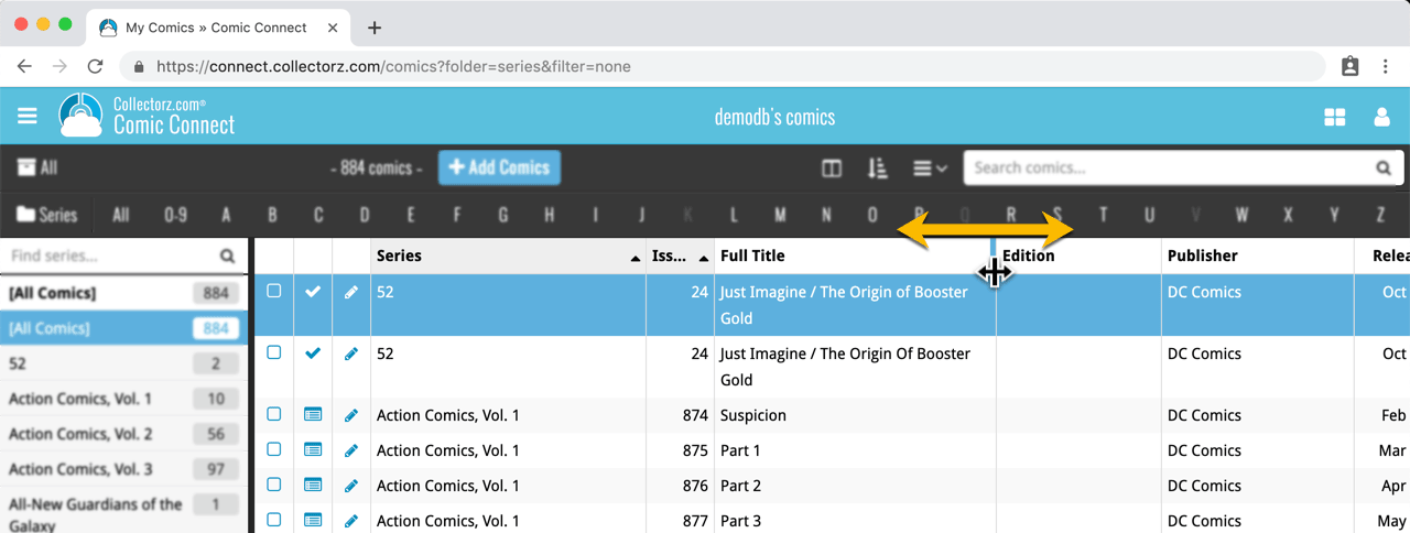
See it in action:
Do you prefer the automatic column widths, the way it was before? No problem, just go to the Settings screen and enable the “Size columns automatically” settings.
You can now manage multiple sub-collections within one account. The collections will appear as little tabs at the bottom (e.g. like in Excel), so that you can easily switch between them.
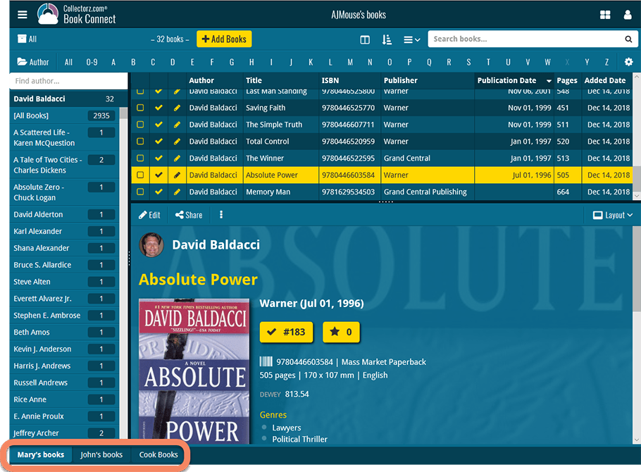
Create and manage collections
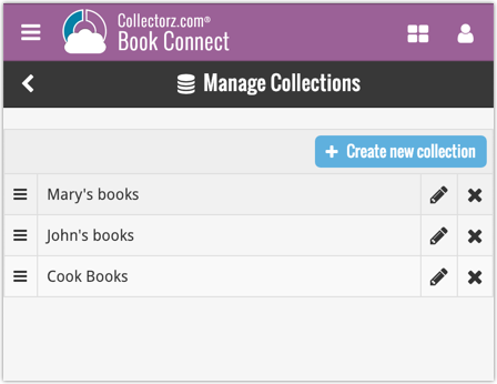
Open the menu top left and click “Manage Collections” to:
- Create new collections
- Rename existing collections
- Remove collections
- Change their order (drag and drop)
Note: the CLZ mobile app currently does not support multiple collections yet (coming soon!). For now, you CAN sync multiple collections to the mobile app, but they will appear mixed together, as ONE database.
New: Notes as a column
The Notes field can now be added as a column in List View:

(example screenshot from Movie Connect)
New:
- The resizable panels in the add screen now have the same design as the ones in the main screen.
Fixed:
- iPad: Wrong initial panel layout in the main screen when the app is started in landscape mode.
A useful update of your app today, that is, if you are using the app on an iPad:
All panels in the main screen (folders, list and details) are now resizable using draggable separators between the panels, so that you can customize the layout to your own liking.
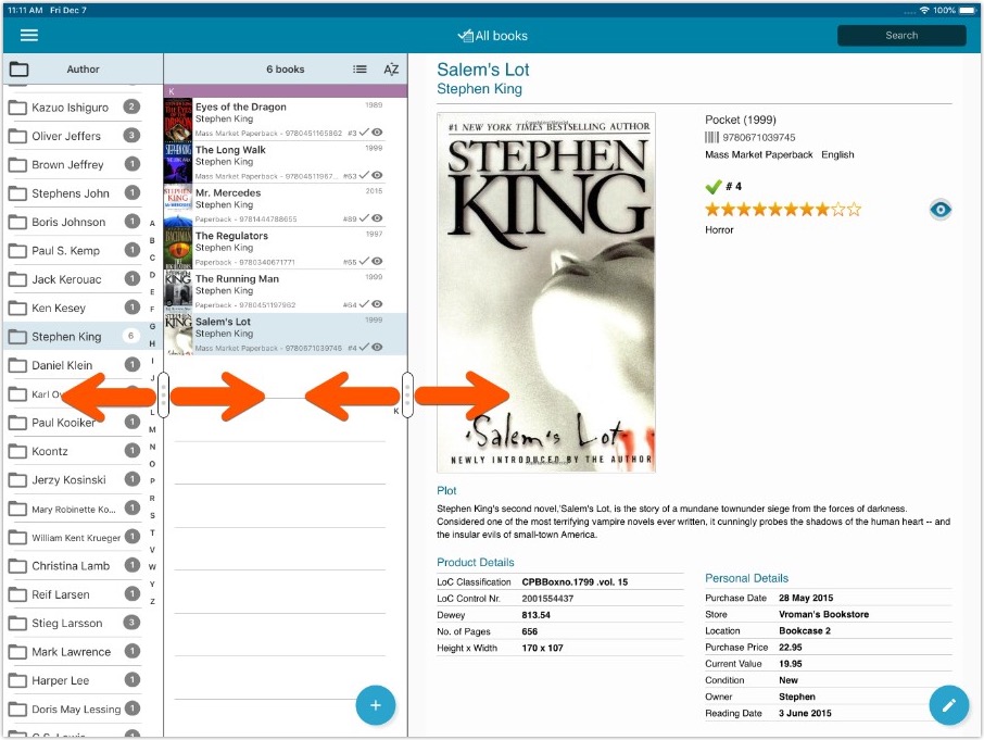
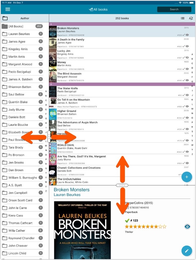
- All panels in the main screen (folders, list and details) are now resizable using draggable separators between the panels, so that you can customize the layout to your own liking.
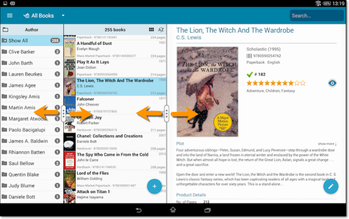
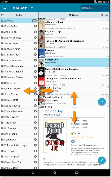
- The resizable panels in the Add screen have been updated to use the nicer look of the draggable separators.
Another useful addition to your software today, as we added a Quick Search box in your folder panel.
Especially useful for those long folder lists, e.g. when using Author as the folder field. Just type a few letters of the author’s name and the folder list will instantly “filter down” to the matching authors, while you type!
See it in action:
A nice time-saving feature was added to your Book Connect software today:
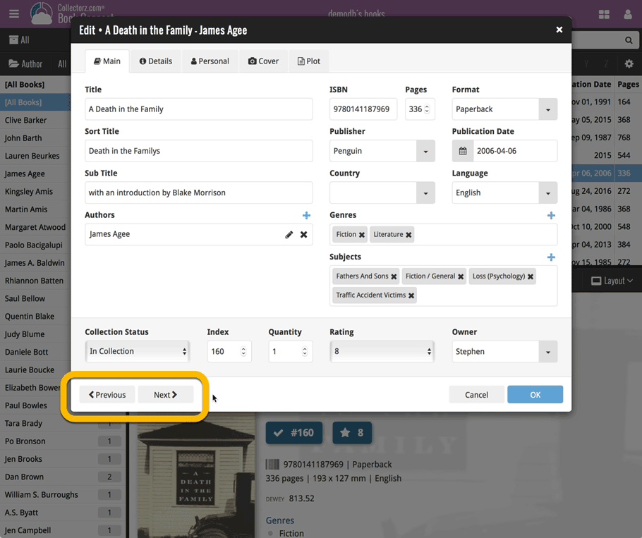
Next / Previous buttons in the Edit Book screen
These buttons let you go through your book list to make changes, while staying in the Edit Book screen. Just use the Next or Previous button on the bottom left.
While doing so, the screen will keep you on the same tab and same field, making it super-easy to make changes to same field(s) for multiple books.
![]()
New: Redesigned app icon
We designed new icons that give new users a better indication of what the app actually does (as opposed to just a different color CLZ logo), but still obviously belong together, when shown together.
Fixed:
- List did not scroll to top when the status bar was tapped
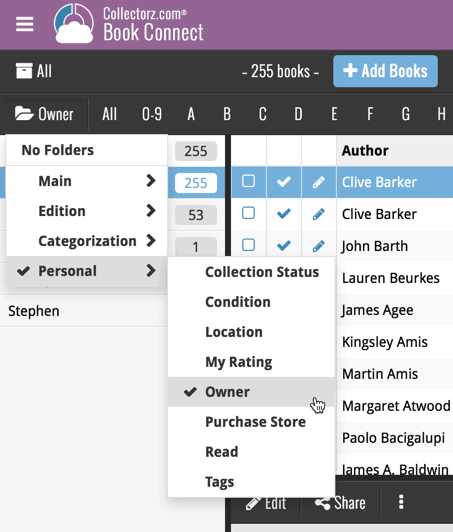
A small UI tweak today, made necessary because of the growing number of field options for the folder panel: the folder field menu is now grouped into 4 categories.
This should make it easier to find the field you are looking for.
![]()
New: Redesigned app icon
We designed new icons that give new users a better indication of what the app actually does (as opposed to just a different color CLZ logo), but still obviously belong together, when shown together.
And if you have Android 8.0 or higher, we’re also including an “adaptive app icon” as of today which are in line with all your other app icons!
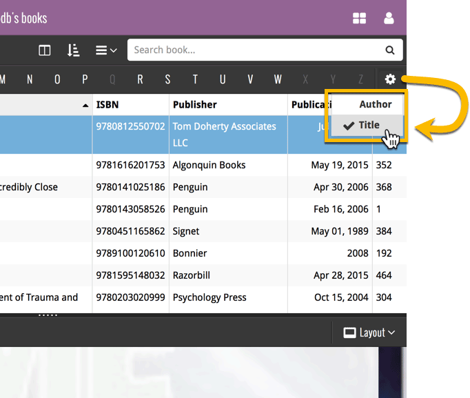
By default, the Alphabet Bars for Book Connect uses the first letter of the Author. You can now switch it to use the first letter of the book title, just click the little “gears icon” on the right of the Alphabet Bar:
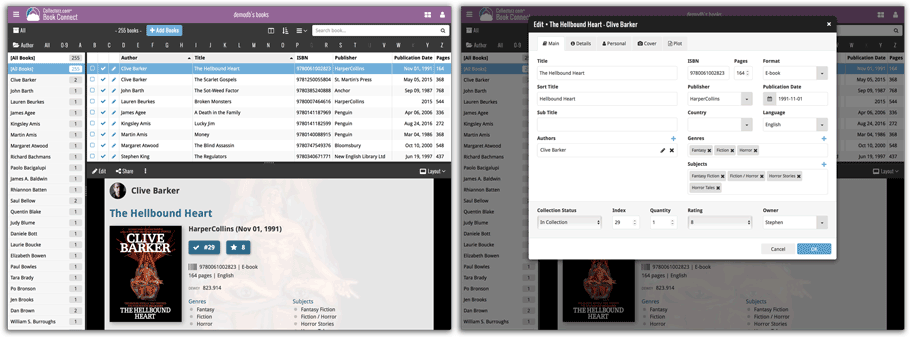
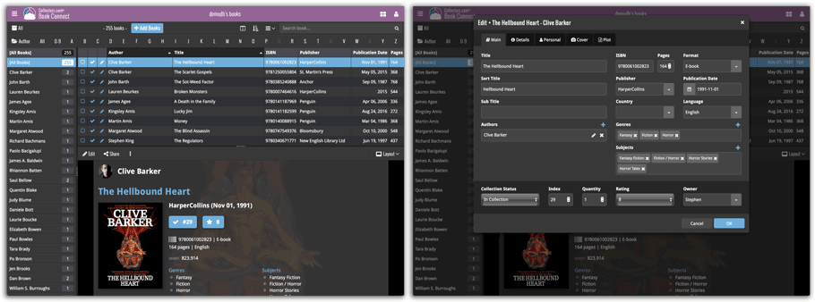
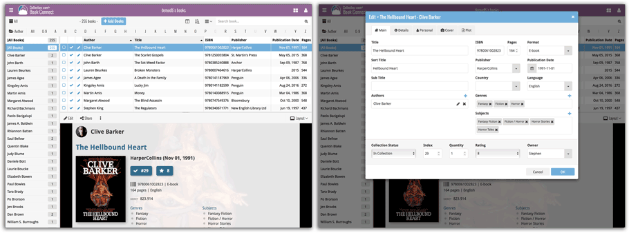
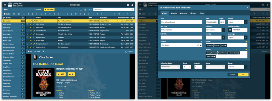
Do you like to customize your software to suit your needs or just your personal taste? Then we have big news for you today, as we have just introduced four “Skin” choices in your Book Connect software:
- Default (the standard look, as it was before, so dark toolbars, light content)
- Dark (dark toolbars, dark content)
- Light (light toolbars, light content)
- Blue (shades of blue, with yellow highlights)
On top of that, we have given you 3 template style choices for the Book Details area: Dark, Light and Blue. Either to match your Skin choice, or to mix to up, it’s up to you.
Both the Skin and Template selectors can be found in the Settings screen, under Customization.
Screen shots:
Default Skin:
Dark Skin:
Light Skin:
Blue Skin:
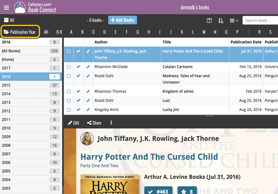
A new grouping option is now available in your Connect!
Click the folder icon top left and select Release / Publication Year to see all your items neatly grouped in a year folder. Click on a year to see all items that were released/published in that year!
This week, we added several new settings and improvements, all based on your feedback:
New setting for the List View: Wrap column content
This new “Wrap column content” setting can be found in the Settings screen. It lets you choose if text in the List View columns should wrap to multiple lines or not.
The default is YES / Checked. Uncheck this setting to keep your List View row as single rows, resulting in a cleaner list and more rows in view.
New Date Format setting
Also found in the Settings screen, this new selector lets you choose how dates are displayed, anywhere in the program where date are shown.
Choose from:
- 7 January 2018
- 07 Jan 2018
- 7 Jan 2018
- January 07, 2018
- January 7, 2018
- Jan 07, 2018
- Jan 7, 2018
- 07/01/2018
- 7/1/2018
- 07/01/18
- 7/1/18
- 01/07/2018
- 1/7/2018
- 01/07/18
- 1/7/18
- 2018-01-07
Core IDs can now be added as columns in the List View
Now available in the Column Selection screen for the List View: The Core ID fields.
E.g. for movies, add the Core Movie ID and Core Media ID fields to your lists, to quickly find movies that are not linked to our Core entry yet.
Secure HTTPS connections, for your security and privacy
As indicated in our GDPR email from a couple of weeks ago, we are updating our software and services, to be more secure and to better protect your privacy.

Starting with version 4.10.4, CLZ Books now uses secure HTTPS connections for all communications with our servers:
- for logging in with your username and password
- for syncing your data with CLZ Cloud
- for sending your searches to Core.
To make this possible, we have created new secure “entry points” on our servers, that are only allowing secure HTTPS connections. The new CLZ Books app only communicates with those secure entry points.
For your privacy and security, we strongly recommend updating your app to v4.10.4
Changes
- The buttons to switch folders, sorting and view options have been moved to more logical places to make them more accessible.
- The skins and templates options are now only available from the settings screen.
- The selection mode button has been removed, just tap and hold on an item to start selecting items.
Fixed:
- Update from Core could (in some cases) overwrite manually entered information for the Authors, Publisher, ISBN, Series, Edition, Sub title, Dewey, Loc, Width and Height fields.
- Re-added index field to book information cell
Previously, setting up for the usage of the CLZ Barry as a barcode scanner required going to your Connect Profile page and back. Not anymore.
You can now get started with CLZ Barry straight from the By Barcode/ISBN tab of your Add screen. Just click the blue text “Set your Barry ID” on the far right of the barcode box and all the setting up can be done right then and there:

Secure HTTPS connections, for your security and privacy
As indicated in our recent GDPR email, we are updating our software and services, to be more secure and to better protect your privacy.

Starting with version 4.11, CLZ Books now uses secure HTTPS connections for all communications with our servers:
- for logging in with your username and password
- for syncing your data with CLZ Cloud
- for sending your searches to Core.
To make this possible, we have created new secure “entry points” on our servers, that are only allowing secure HTTPS connections. The new CLZ Books app only communicates with those secure entry points.
For your privacy and security, we strongly recommend updating your app to v4.11.
Changes:
- The buttons to switch folders, sorting and view options have been moved to more logical places to make them more accessible.
- The skins and templates options have been moved to the settings screen.
- The selection mode button has been removed, just tap and hold on an item to start selecting items.
Fixed:
- Last update made some settings disappear in the settings screen. They are back now.
- Added bottom margin to the add auto screen on iPhone X to make the add button more reachable
- The sync screen wasn’t logging local deletes.