Sharper images in Cover View and Card View
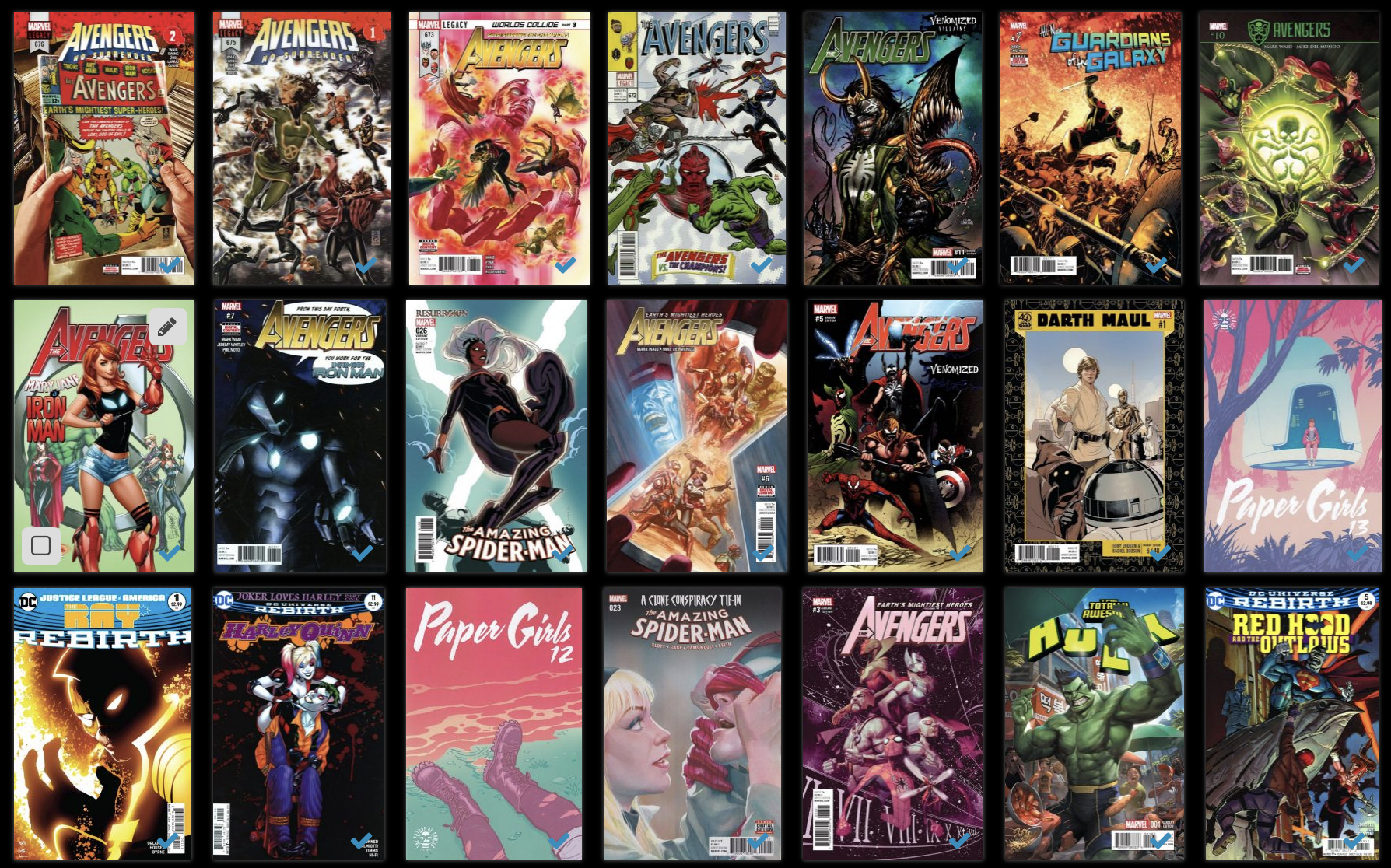
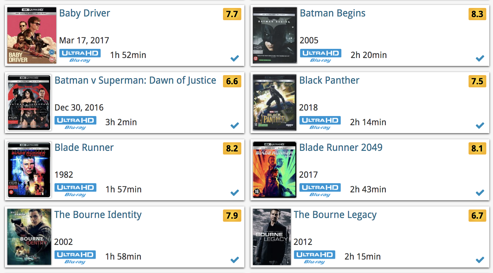
This week, we have implemented several changes to the cover images that are shown in Cover View and Card View, making them much sharper/crisper, less blurry.
Also, on computers with a 4k / Ultra HD screen, both the Cover View and the Card will automatically switch to even higher quality images, with twice the resolution!
The difference is huge, check out the screen shots below. But the best way to experience the sharper images is to log in to your own account and look at your own collection!


Other improvements to Cover and Card View
At the same time, we made other improvements to the Cover and Card views, to make them look nicer and to make the scrolling experience smoother and faster:
- While scrolling, the images now load faster.
- Scrolling the view while images are loading is now smoother, less “choppy”.
- The Images view now has black background for a more classy look.
- In both Images and Card View, while scrolling, it does not first load a placeholder image anymore, it just show the background color until the actual image is loaded, also resulting in a less choppy scrolling experience.
Recent changes
Create your own Custom Fields!
Feb 23, 2026
New setting to disable book values
Jan 09, 2026
New: track your Reading History, plus other new data fields
Dec 17, 2025
Further tweaks to eBay links
Jul 24, 2025
Automatic eBay search links
Jul 08, 2025
Book details panel: improved design, layout and performance
Jun 20, 2025
More compact design and layout: fit more books on screen
May 27, 2025
Automatic book values and retail prices
Apr 03, 2025
Improved Add Books screen
Dec 17, 2024
Improved search behaviour
May 24, 2024
Improved managing and editing of pick list fields
Apr 08, 2024
Connect is now available in Swedish!
Feb 21, 2024
Connect is now available in Danish!
Jan 30, 2024
Improvements to the Collections and Edit Multiple features
Nov 20, 2023
Complete re-design of Edit Multiple feature
Oct 30, 2023
Pre-fill screen: Orange highlights and a Clear button
Oct 30, 2023
Improved search results in the Link with Core screen
Oct 12, 2023
Connect is now available in French, Spanish and Hungarian!
Sep 29, 2023
Improved Import from CSV/TXT screen
Aug 16, 2023
Printing / Exporting a selection is now much easier
Aug 10, 2023
Connect is now available in German!
Jul 04, 2023
Re-designed collection tab-bar
May 04, 2023
Connect is now available in Dutch!
Apr 27, 2023
v8.0: 7 new data fields!
Jan 16, 2023
New collection view : Vertical Cards!
Jul 07, 2022