What's new in CLZ Books Web? (page 5)

Import any Text or .CSV file into your collection
You can now import any text file (.txt) or comma separated value file (.csv) into your collection on Connect using the new import page in your Connect account.
With this new import tool you are able to quickly import a list of books from for instance an existing collection you may have in a spreadsheet or different software. All you have to do is export those books from your other software to a text or CSV file and follow the steps on the new Import page in your Connect account.
![]() Do you already have a list of your movies, books, cds, comics or games? E.g. entered in a spread-sheet program, or created using a different cataloging tool, then exported to CSV?
Do you already have a list of your movies, books, cds, comics or games? E.g. entered in a spread-sheet program, or created using a different cataloging tool, then exported to CSV?
Cool, you can now easily get that list into your Collectorz.com program (desktop, mobile or Connect). Just use our new flexible import tool to import your existing list into the CLZ Cloud. This will make your list instantly available in Connect. Or sync to the mobile app or desktop software using the CLZ Cloud syncing.
As most of you know, at Collectorz.com we take Customer Support very seriously. We’re always here to answer your questions or to help with any problems you may have encountered with our cataloging tools.
To further streamline CLZ Support, Sven, one of our web-developers, has created a new Collectorz.com Help Center, at Help.CLZ.com
Big launch this week, our new Collectorz.com Shop is live at Shop.CLZ.com !
Bernard, Sven, AJ and I (Alwin) have been working on this for quite a while, doing many iterations, to make the new shop super-clear and easy to navigate, even on mobile devices.
This new shop replaces both the shop/buy pages of the collectorz.com website and the shop of the My.CLZ.com website. Both websites now link to the new Shop.CLZ.com.
“Export to Text”, a feature previously only available to Connect subscribers, has now also been added to the CLZ Cloud viewer.
We figured that exporting to a text file, e.g. a CSV for Excel, should be available to any user, whether they own Connect, the desktop software or a CLZ mobile app.
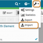
You can find the Export to Text feature by visiting your own collection in the CLZ Cloud viewer, clicking the little “wrench” icon top right, then selecting Export.
Enjoy!
Previously, the Connect free 30-day trial limited trial users to 100 items in their database.
To allow full evaluation of our Connect software during the trial, we have removed this database limit. The free 30-day trial now lets you add, import or sync as many items as you want.
Enjoy!
For better security, we have now moved both the Cloud and Connect websites to the HTTPS protocol, using so-called Extended Validation SSL certificates.
This SSL connection is indicated by the nice “green bar” in your address bar:

In the past 2 weeks, we have moved all 5 online media databases (movies, books, music, comics and games) to 5 new separate database servers.
This week, CLZ web developers Sven and Dion have further optimized these new servers to give you even better performance from Core, especially for title searches that have many results.
The fruits of their labour are now immediately noticeable in the ADD screens of your Connect software. Enjoy!
Today, we have completed the big project of moving our 5 Core and Cloud databases to a new server solution. Previously, everything was running on two high performance dedicated machines: one for all databases and websites, the second for all cover images.
For better performance, stability and scalability, we are now splitting up all services into multiple separate cloud-based solutions:
- 5 separate database servers for all 5 Core+Cloud databases
Status: completed today! - 5 separate storage servers / delivery networks for all cover images.
Status: preparing the switch now. ETA: several weeks. - 1 new fast web server for the Cloud, Core and Connect sites and services.
ETA: within 2 months.
Multiple new field options have been added for the folder panel (for both Connect and the free CLZ Cloud viewers). My favorite new folder option: The Year folder for movies:
The home / hub page of your CLZ Cloud or Connect account now loads a lot faster.
(the 5 separate collection lists are now “lazy-loaded”)

A few weeks ago, we introduced the new Sort Order screen. Today we’re taking the next step: allowing multi-field sorting.
For example, you can now sort your list first by Year, then within the years, by Title.
Just drag multiple fields from the Available panel to the Selected panel, one by one:

New in all five Connect editions: Export your list to a text file, e.g. to CSV format, for importing into spreadsheet programs like Excel, Numbers, etc…
You can either:
- Export your entire database, by choosing Export from the Tools menu.
- Export only a selection. To do this, go to Select Mode, select some items, then click the Export button at the top.


This week, we updated both our CLZ Cloud storage for books and the Book Connect software with 8 extra data fields:
- Plot
- Dewey Number
- Country
- Language
- LoC Control Number (LCCN)
- LoC Classification
- Width
- Height
All these fields are now synchronized to and from the Book Collector and CLZ Books programs AND are now editable in your Book Connect software.
Just over a week ago, we introduced a new design for the Columns screen. Today, we moved the new design over to the Sort Order screen, so that both have a consistent user interface.
Just drag your desired Sort Field to the right, then select Ascending or Descending using the toggle buttons below the field.

Next up: multi-field sorting!
Today, more sort field options have been added to the Sort Order screen of all five Connect and Cloud Viewer editions.
This basically means that from now on, ALL available cloud fields can also be sorted on.
The first version of Connect had a nice A to Z “alphabet bar” at the top, for quickly filtering your list to show only the items starting with a specific letter.
However, in the Two-Point-Oh redesign the wise wizards at the CLZ HQ the alphabet bar was reduced to just a tiny button, with a drop down panel showing all letters. Which of course saves space on the toolbar, in an attempt to make it all fit on smaller tablet and phone screens.
Not a bad idea in itself, but the first letter filtering lost its’ easy of use and accessibility.
So we changed our minds and today we brought back the Alphabet Bar!

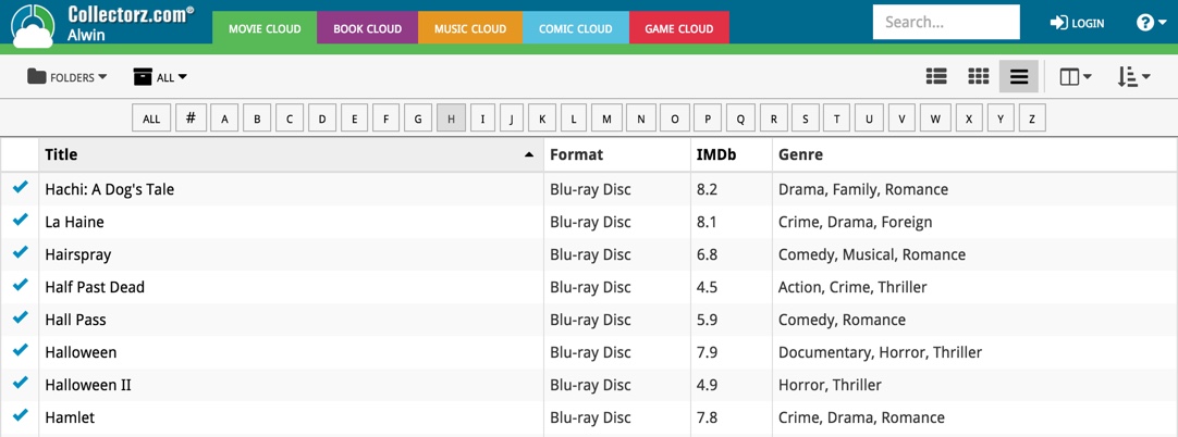
It is now available on both the free CLZ Cloud viewers and the Connect software. But: only on bigger screens where it actually fits. On smaller screens, the Alphabet Bar nicely reduces to the tiny button again 🙂
New today, in all Connect apps AND Cloud viewers: a new Column Selection screen for the List View.
This new Columns screen lets you:
- Easily select your preferred columns by dragging fields from the Available Columns area to the Selected Columns area.
- Drag and drop to re-order columns within the Selected area.

Several small fixes today:
- Editing multiple items with really many items selected (say over 1,000) didn’t work.
Now it does. But still, editing many items in one go may be slow. - On large desktop screen, with the browser window set full screen, the infinite scrolling system didn’t work.
It immediately stopped loading after the first set of items was shown. Happened only in Images and Card Views though, in List View all was well. Fixed now. - When changing the sorting by clicking a column header, the sort direction of the previous sort column was used. Now it correctly resets to ascending sorting when changing to a different sort field.
Until recently, the public Cloud Viewer always followed the Sort Order and Columns selection set by the owner of the specific cloud collection you were viewing.
But as of today, the Cloud Viewer also features the Sort Order and Columns buttons:

Now, everyone who views your collection in the cloud is able to select his own Sort Order and Columns. Of course these settings are saved only for them (in a local cookie on their device), so their choices will not affect your own settings.
After a short absence, the Share to Facebook feature is back.
We have now re-implemented this feature using Facebook “stories”.
– Select an item in your collection, click the Share button and select “Facebook”.
– Now enter a personal message and click the Share button.

Which will result in a post like this on your Facebook timeline:

About a month ago, we introduced a new “quick edit” pop-up screen, that is probably already saving you a lot of clicks and page refreshes.
Today we’re taking the next step: Batch editing!
- Click the Select button top right
- Now click entries in your list to select them. They will highlight in light blue.
- Now click Edit on the top right to open the Batch Edit screen.
- Check the checkbox of the fields you want to change, then enter the new value.
- Click Save to apply the changes to all selected items.
This is a very powerful feature that will save you lots of time.
But beware, as Uncle Ben once said: “With great power comes great responsibility”!

BTW: the same selecting system can now be used to remove multiple items in one go.
Super-handy but even scarier if you make a mistake. So be careful!
Are you also using our desktop or mobile cataloging solutions to sync to and from the CLZ Cloud or Connect?
Then this is a big day, as we have completely rewritten the CLZ Cloud syncing mechanism, to make it easier to use, faster and capable of syncing very large databases.

Today’s update is a Connect-only update, not available in the CLZ Cloud viewer. After all, editing items is a privilege of the paid Connect subscriptions 🙂
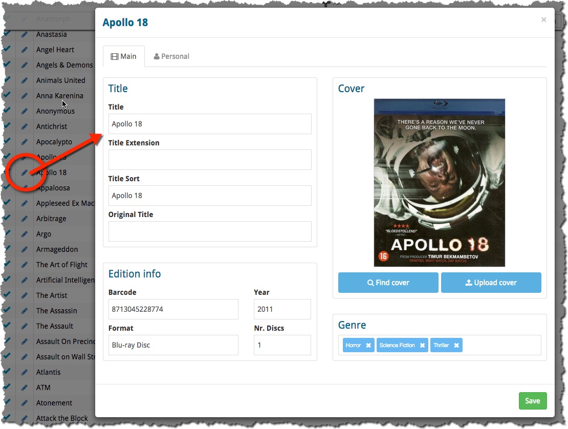
The Edit screen is now a pop-up window, similar to the desktop software, that can be opened from anywhere: from the List View, Cover View, Card View or from an item’s detail page. Opening the edit pop-up from the main list will save you a lot of clicks and page refreshes.
(Previously, editing could only be done on the Edit page, which was only accessible from the Details page of an item.)

Since Connect 2.0, your collection lists use a “Facebook-like” infinite scroll system: just scroll down to the bottom of the page and the next batch of items is loaded. No more needed to Browse through separate pages with Next and Previous buttons.
Today we have made this infinite scrolling a lot smoother, by optimizing the loading process of the pages. In most cases, you won’t even notice a delay when you scroll down.
Happy scrolling!