News & updates
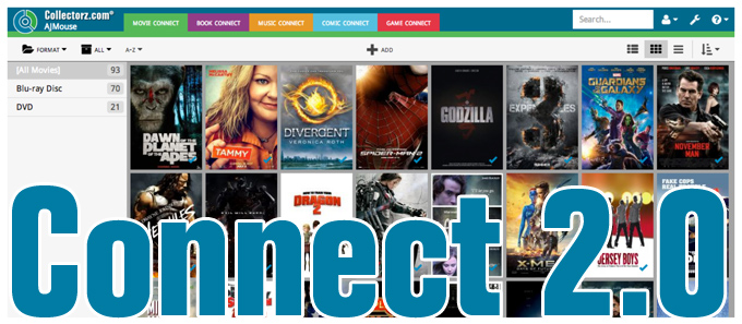
It’s been an ongoing project at our CLZ HQ for a long time, but now it is finally live, Connect 2.0!
Connect 2.0 is a completely revamped version of our web-based collection cataloging solutions.
The goal of this new version:
- Introduce a more modern look and feel.
- Support all screen sizes (desktop and mobile) with one app.
- Re-think the user interface to make it more logical and intuitive.
Here’s an overview of what’s new:
A more modern look and feel
For the new look, we aimed for a cleaner feel, in a more modern “flat design:

Flexible layout for all screen sizes
(desktop, tablet, phablet and phone)
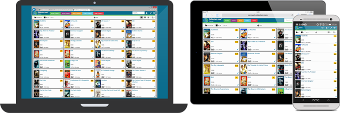
In the “old” Connect, we had a separate read-only site for mobile viewing, with the regular interface only usable on big screens (tablet and desktop). Not anymore.
Version 2.0 is one “responsive” app that automatically adapts to the size of the screen you’re using it on, whether that is a huge desktop screen, a laptop screen, a tablet, a phablet or a phone.
This also means that you can now add and edit items on your mobile phone!
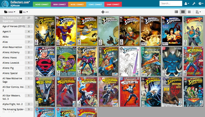
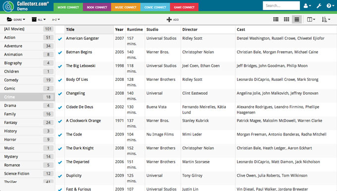
New Cards view, improved Images and List Views
To get a cleaner, simpler look we dropped the old “information overload” 1-column Panel View and replaced it with a nice and clean multi-column Cards View.
The small clickable cards automatically fill the width of your screen and show just the main information you need to identify your collection items:
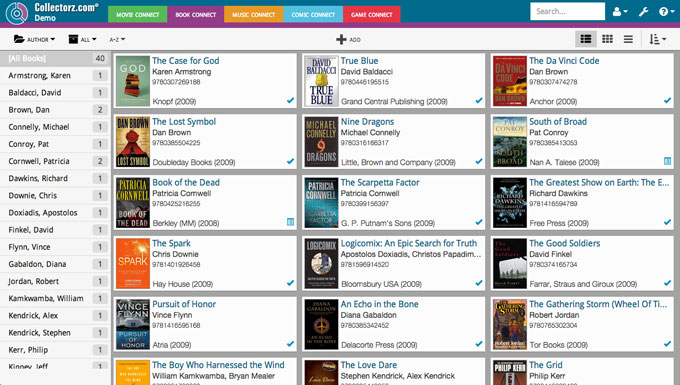
The look of the existing Images and List View have also been improved:
Infinite scrolling
All three views now use modern “infinite scrolling” techniques (e.g. like your Facebook time-line). No more browsing through pages each showing only 50 items. Just scroll down to see more items.
Simpler, more intuitive main screen
Browsing, searching and sorting your collection is now easier than ever:
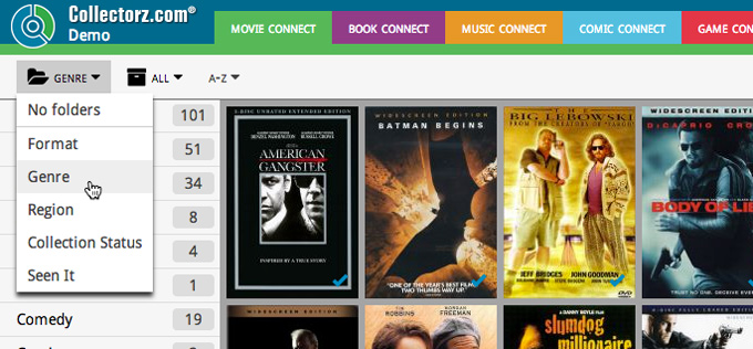
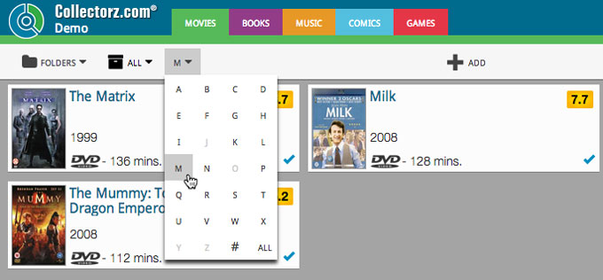
- All “filtering” options are now in the left part of the toolbar
- All filtering is now done using a simple folder panel. Choose the folder field using the leftmost button on the toolbar.
- Show All, Collection only or Wish List items using the Collection Status filter.
- Finally, add a first letter filter using the A-Z button.
- All “view” options are now in the right part of the toolbar:
- Switch between Cards, Images and List Views.
- Select the field you want to sort on and in which direction.
- Select the columns for the List View.
- The main “+ ADD” button in the center.
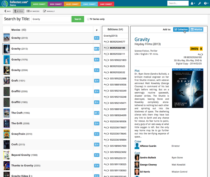
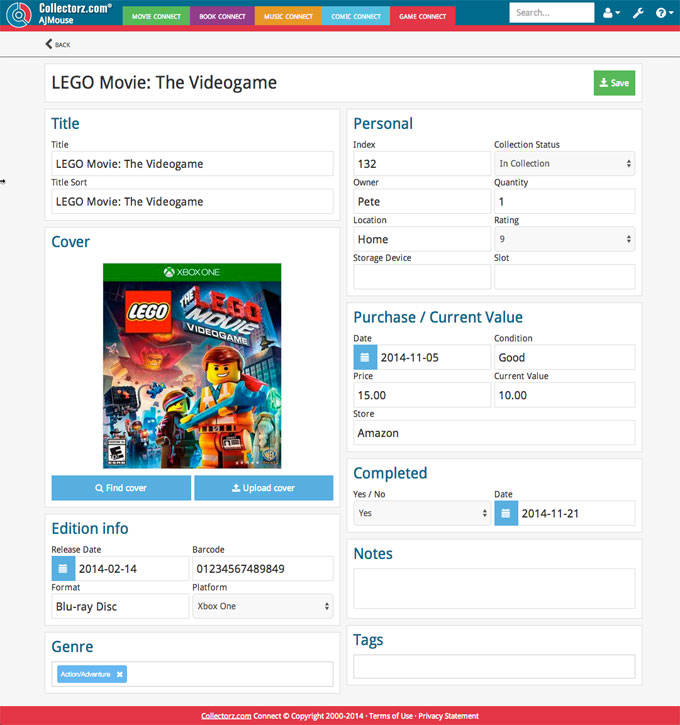
Redesigned Add en Edit pages
The two main screens where you manage your collection, the Add and Edit screens, have also received a make-over. The new versions are easier on the eye (bigger texts, bigger edit boxes) and are fully usable on any screen size, even on your phone.
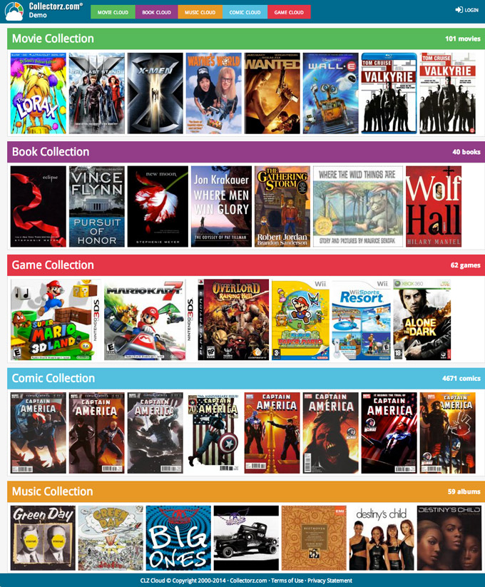
View or Share your collection list on Cloud.Collectorz.com
From now on, the connect.collectorz.com site is just for YOU, to login and manage your collection.
Sharing your public collection online is now done on the new cloud.collectorz.com site, just send your friends to “cloud.collectorz.com/[YourUserName]”.
( of course, this view-only site is also for your own use, to check your list while on the road)
