What's new in CLZ Books? (page 13)
Important: this is the FINAL iOS 7 compatible version.
Support for iOS 7 will be dropped for future versions.
Fixed:
- iOS 7: Crash in Add screen when opening the Add by Barcode tab.
Coming up: Fresh look and layout
Please look forward to the next build coming up in a couple weeks with a complete new fresh look and layout!

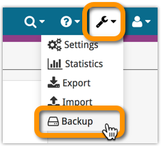
Whilst we make daily backups for you on our own servers, you can now create your own backup of your Connect database and download it to your computer!
If you ever make a big mistake and lose valuable data, you can upload a previously downloaded backup file and restore it to your current database.

Import any Text or .CSV file into your collection
You can now import any text file (.txt) or comma separated value file (.csv) into your collection on Connect using the new import page in your Connect account.
With this new import tool you are able to quickly import a list of books from for instance an existing collection you may have in a spreadsheet or different software. All you have to do is export those books from your other software to a text or CSV file and follow the steps on the new Import page in your Connect account.
v4.3.10: Fixed an issue where “deletion changes” sometimes didn’t sync
Fixed:
- Local book deletes sometimes not synchronized to the CLZ Cloud
New:
- Redesigned missing ISBN screen with additional fields
Fixed:
- Edit buttons missing for manage pick list fields in the edit screen
An important v4.3.9 update for your CLZ Books Android app is now available.
This update introduces an easier way to deal with “Unrecognized ISBNs”.
A new screen that not only helps you to add the book to your database anyway, but also helps your fellow CLZ Books users by instantly adding the missing ISBN to the CLZ Core central online book database.
(this feature was introduced for our Windows, Mac and iOS versions earlier, and in the meantime, people have used this new tool to add over 22 thousand new books to our Core!)
- In the Add screen, when a scanned ISBN is not recognized, a new “Unrecognized ISBN” screen will appear.
- In this screen, just enter the Author, Title, Publisher and Year, then click Add Book.
- This will:
- Add the book to your own database, with the information you filled in.
- Add the book to our Core central online book database.
The result: for the next user who searches for this particular ISBN, it will be recognized 🙂
New:
- Edit screen with tabs (main details/personal details)
- Added folder options: country, store
- Main list
- Scroll position now remembered after editing/removing a book
- Now updates live after editing a book
- Added a ‘show all’ folder item in empty folders on tablet devices
- Added collection status folders
Fixed:
- Fixed list view section headers stopping at X
- Crash in the in-app-purchase screen
- App freezing when entering a 20 character password in the login screen
- Manage Pick Lists:
- Wrong sorting of numeric values
- Crash when adding an empty item
- Issue renaming an item with 1 letter only
- Fixed database limit message appearing in the old desktop sync when the limit was between 100 and unlimited
Fixed:
- Fixed iTunes Store credentials pop up on startup of app
New:
- New: Add Manually button if nothing can be found.
Fixed:
- Add Auto Screen: Barcode search by voice
![]() Do you already have a list of your movies, books, cds, comics or games? E.g. entered in a spread-sheet program, or created using a different cataloging tool, then exported to CSV?
Do you already have a list of your movies, books, cds, comics or games? E.g. entered in a spread-sheet program, or created using a different cataloging tool, then exported to CSV?
Cool, you can now easily get that list into your Collectorz.com program (desktop, mobile or Connect). Just use our new flexible import tool to import your existing list into the CLZ Cloud. This will make your list instantly available in Connect. Or sync to the mobile app or desktop software using the CLZ Cloud syncing.
As most of you know, at Collectorz.com we take Customer Support very seriously. We’re always here to answer your questions or to help with any problems you may have encountered with our cataloging tools.
To further streamline CLZ Support, Sven, one of our web-developers, has created a new Collectorz.com Help Center, at Help.CLZ.com
New:
Fixed:
v4.3.1: Redesigned Add Automatically screen and new “Missing ISBN” screen
A huge v4.3 update for your CLZ Books mobile app for iOS is now available.
In this update, we completely re-designed the Add Book screen, to make it clearer, easier-to-use and to help you add books more efficiently.
New: Re-designed Add Books screen
- Switch between By Author/Title and By ISBN modes using tabs at the top
(Add Manually is now a separate screen, under Tools menu) - All panels are now resizable (list, details, camera)
- Add button is now at bottom right (blue circle with “+” icon)
- Adding By ISBN:
- Camera scanner is now integrated in Add screen, not a separate screen
- Tap the keyboard icon in the camera panel to enter an ISBN manually
- Delete ISBN from queue by swiping from right to left
- ISBN queue is now remembered between sessions
New: Easily add books that come up as “Unrecognized ISBN”:
- When an ISBN is not recognized, a new “Unrecognized ISBN” screen will appear.
- In this screen, just type the Author and the Title, then click Add Book.
- This will:
- Instantly add the ISBN/Author/Title entry to our Core online book database.
- Add the book to your own database with ISBN, Author and Title filled in AND linked to the new Core entry.
In other words, this new screen not only helps you in adding unrecognized books, but it also helps your fellow CLZ Books users by adding the missing ISBN to the CLZ Core.
Big launch this week, our new Collectorz.com Shop is live at Shop.CLZ.com !
Bernard, Sven, AJ and I (Alwin) have been working on this for quite a while, doing many iterations, to make the new shop super-clear and easy to navigate, even on mobile devices.
This new shop replaces both the shop/buy pages of the collectorz.com website and the shop of the My.CLZ.com website. Both websites now link to the new Shop.CLZ.com.
- Fixed app closing on CLZ Account registration
- Added Folder options for Country and store
- CLZ Cloud Sync button now indicates “out of sync” status using red exclamation mark
- App now automatically restores the Unlock Full App in-app purchase
- Fixed hardware keyboard enter not working in tablet search field
- Fixed screen rotation not working on phones
Fixed:
- Field Defaults were not immediately stored after closing the screen
- Syncing screen: Sometimes the sync button was wrongly disabled
New data entry interface for date fields:
- Allows manual entry of year/month/day
- Allow “partial dates”, e.g. just year and month
- Open the calendar tool with the calendar button.
- When using folders, a new [None] entry contains the items that have no value (yet) for the selected folder field.
- Tablets: New always available search box in top bar.
- Add screen: some performance improvements.
- Redesigned Selection Mode screen.
- New floating “+” button with in Add screens, with “Add to Collection” / “Add to Wish List” options.
- Fixed: empty menus on some devices.
“Export to Text”, a feature previously only available to Connect subscribers, has now also been added to the CLZ Cloud viewer.
We figured that exporting to a text file, e.g. a CSV for Excel, should be available to any user, whether they own Connect, the desktop software or a CLZ mobile app.
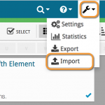
You can find the Export to Text feature by visiting your own collection in the CLZ Cloud viewer, clicking the little “wrench” icon top right, then selecting Export.
Enjoy!
- New: App now remembers the last opened tab in the add automatically screen
- Small details template adjustments
- Fixed local search not working on tablet devices
- Fixed auto selection in main list not working on tablet devices
- Fixed several crashes on smaller tablet devices
A huge v4.3 update for your CLZ Books app is now available.
And prepare to be shocked 🙂 (in a good way, don’t worry):
The app looks completely different now, with a cleaner brighter look and an improved user interface.
What’s new in CLZ Books 4.3 for Android?
- New “Material”-based interface, with two skins/themes: Light & Dark.
(The app now starts in the Light skin. If you prefer the Dark look, just use the View menu top right) - Big floating blue “+” button for adding books.
- Access all other features and tools from “hamburger” menu top left.
- Clear and easy switch between All / In Collection / Wish List at the top.
- Access all other view options from menu on top right.
- Add screen: tabs at the top to switch between Author/Title and ISBN modes.
- Add Manually is now a separate menu item in the menu on the left.
- Redesigned book list entries.
- Old Import from Book Collector has been moved to Settings screen!
Fixed:
- CLZ Cloud Sync: Notes were not down-synced.
- Edit Screen: Year picker: it was not possible to pick a year before “1888″.
- Manage Pick Lists screen: labels width was too short.
- Fixed losing changes when suspending the app while editing
- Fixed already in collection highlighting in the add auto screens