With the big feature updates behind us (multi-collections, image syncing, 64-bit support, Flex template, etc…), it is time for some smaller tweaks that were requested by our loyal users:
- More compact toolbar layout, to save screen space
- No more annoying Add to Collection / Wish List popup in Add Books screen
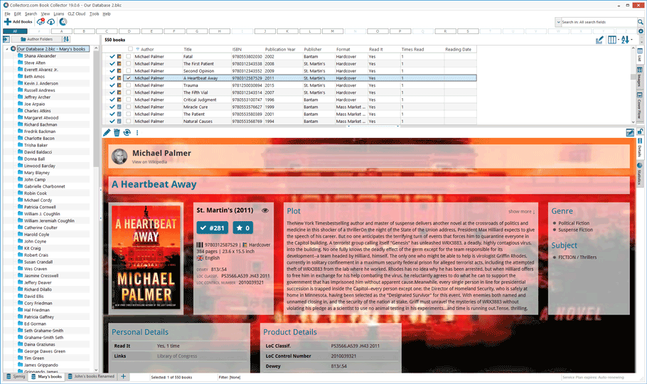
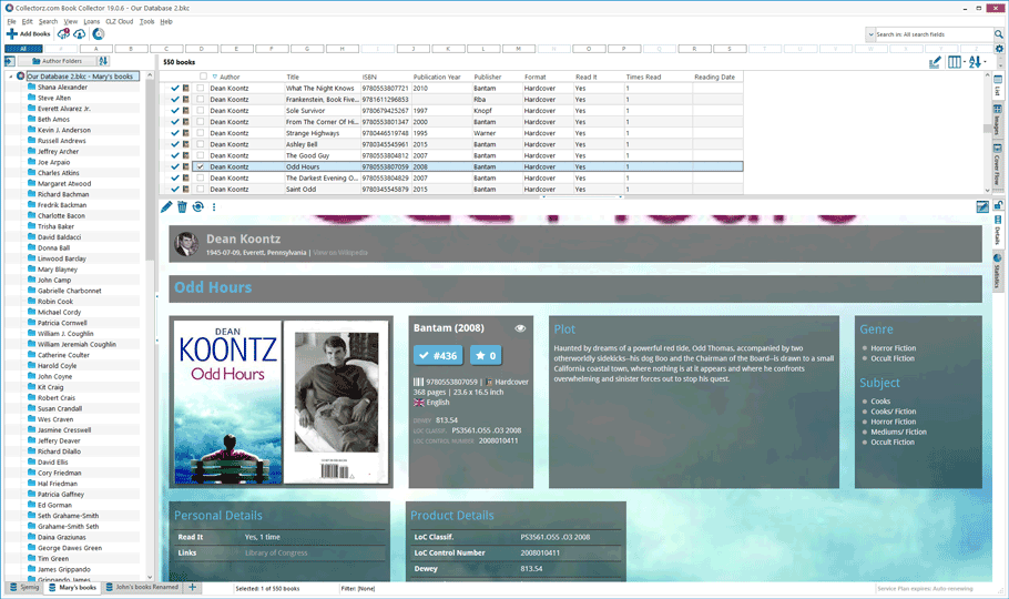
- New “Transparent” styles for the Flex template, to show off your backdrops
More compact toolbar layout, to save screen space
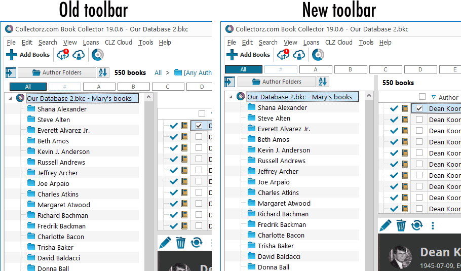
In version 18.2 we introduced the selection checkboxes and the extra Selection Action Toolbar above the list view. A big improvement by itself, but some users complained that now a lot of screen space was taken up by various toolbars.
In today’s update, we have redesigned the toolbar to reduce the toolbar height, and at the same time made it more logical:
- The “550 books” counter is now included inside the Selection Action Toolbar.
- The Quick Filter and Folder buttons are now integrated inside the folder panel.
- The Bread Crumb has been completely removed (wasn’t very useful anyway).

No more annoying Add to Collection / Wish List popup in Add Books screen
After the introduction of the new Add Books from Core screen, a common annoyance reported by users was the little “Add to Collection vs Add to Wish List” popup that appeared every time you used the Add button.
Of course, we never stop searching for the optimal solution, so today’s update to the Add Books screen resolves this annoyance:
- No more annoying popup menu when you click Add.
- Easily switch the button action between “Add to Collection” and “Add to Wish List” using the extra little arrow button on the right.
- The Add button now changes color between blue and orange to clearly indicate which mode it is. in.
See it in action:
New “Transparent” styles for the Flex template, to show off your backdrops
With most major updates we are introducing a new template for the Details Panel, each time improving on the old one. With v19’s Flex template, we took the book details to a new level, with the template fully adapting to the width and height of your panel, always making the best use of available space.
However, in our daily conversations with users, we encounter many users who are still using the 8 year old “Vee Eight Backdrop” template. When we started asking why, most of them replied something like “because I like how it clearly shows the backdrop between the data areas”.
So we figured, why not make some extra versions of the Flex template that do exactly the same?
Now available “Flex / Light Transparent” and “Flex / Dark Transparent”.


Fixed
- Fixed a DPI issue in the CLZ Login Screen.
- The “checkbox” column in the main screen could be replaced by a “True/False” text.
- Pressing SHIFT or Arrow Down in the Filter Screen could give an Access Violation error.
- In the template selection menu, the different styles for a template are now listed alphabetically.
- Main Screen: Disabled open/close animations for the Quick Filter panel (too slow).