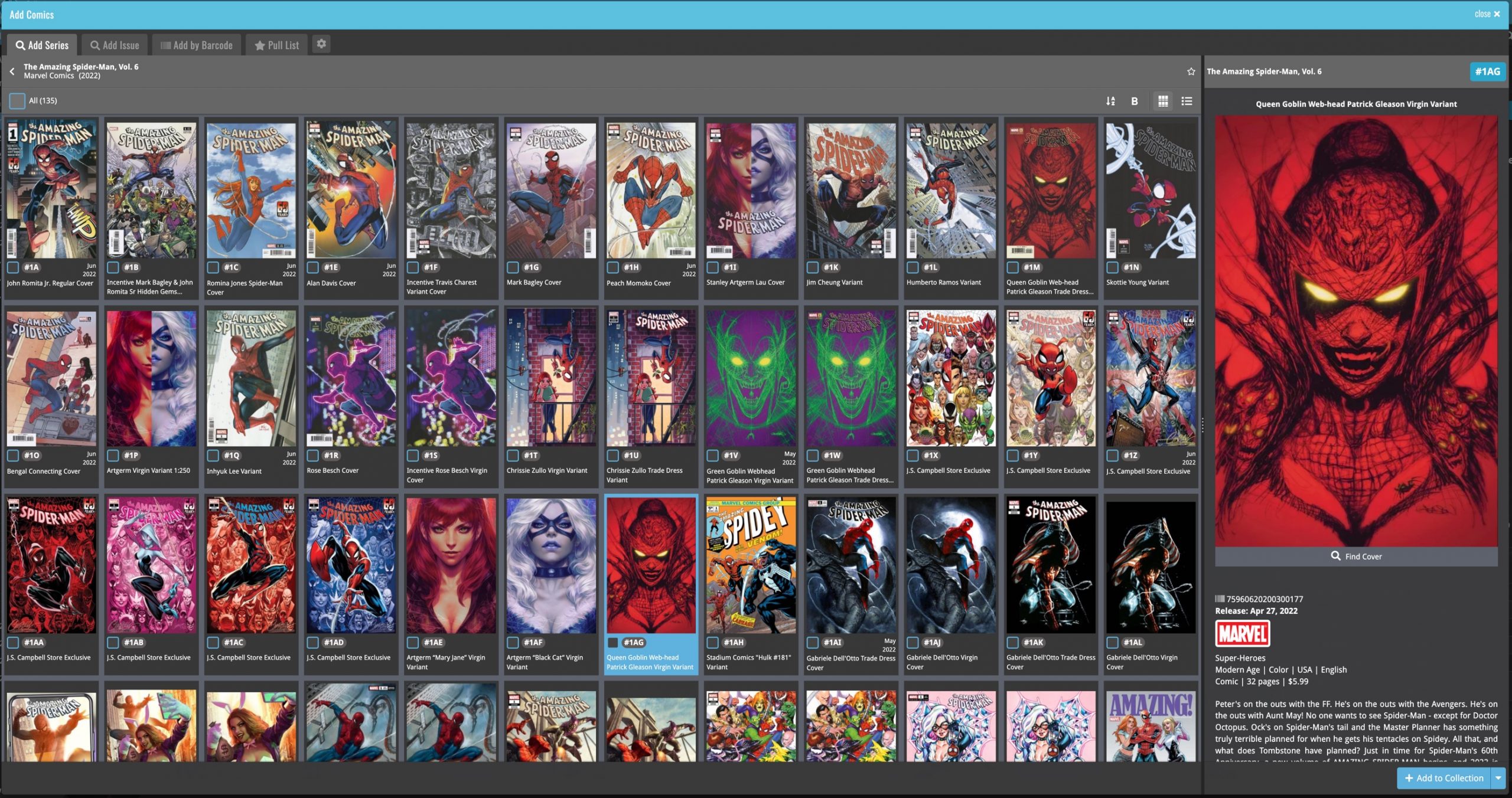
 For this update, the main goal was to make the cover images in the Add Comics screen bigger, to make it easier to find the issue or variant that you own.
However, while working on that, we ran into some other things that could be improved, so we figured why not? So in the end, it turned out be a serious overhaul of the Add Comics screen 🙂
Here’s an overview of all the improvements:
- Bigger cover images in the Issue List
- The Issue List for a series now opens in a separate page
- Preview Page now also shows a bigger cover image
- And finally: the Add Comics screen is now a lot bigger!
Card View: Bigger cover images in the Add screen Issue List
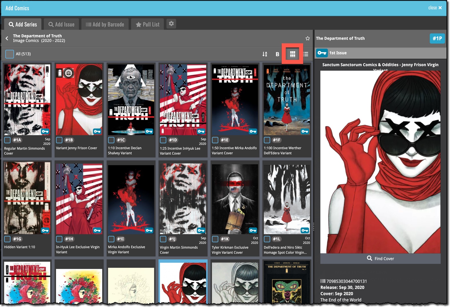
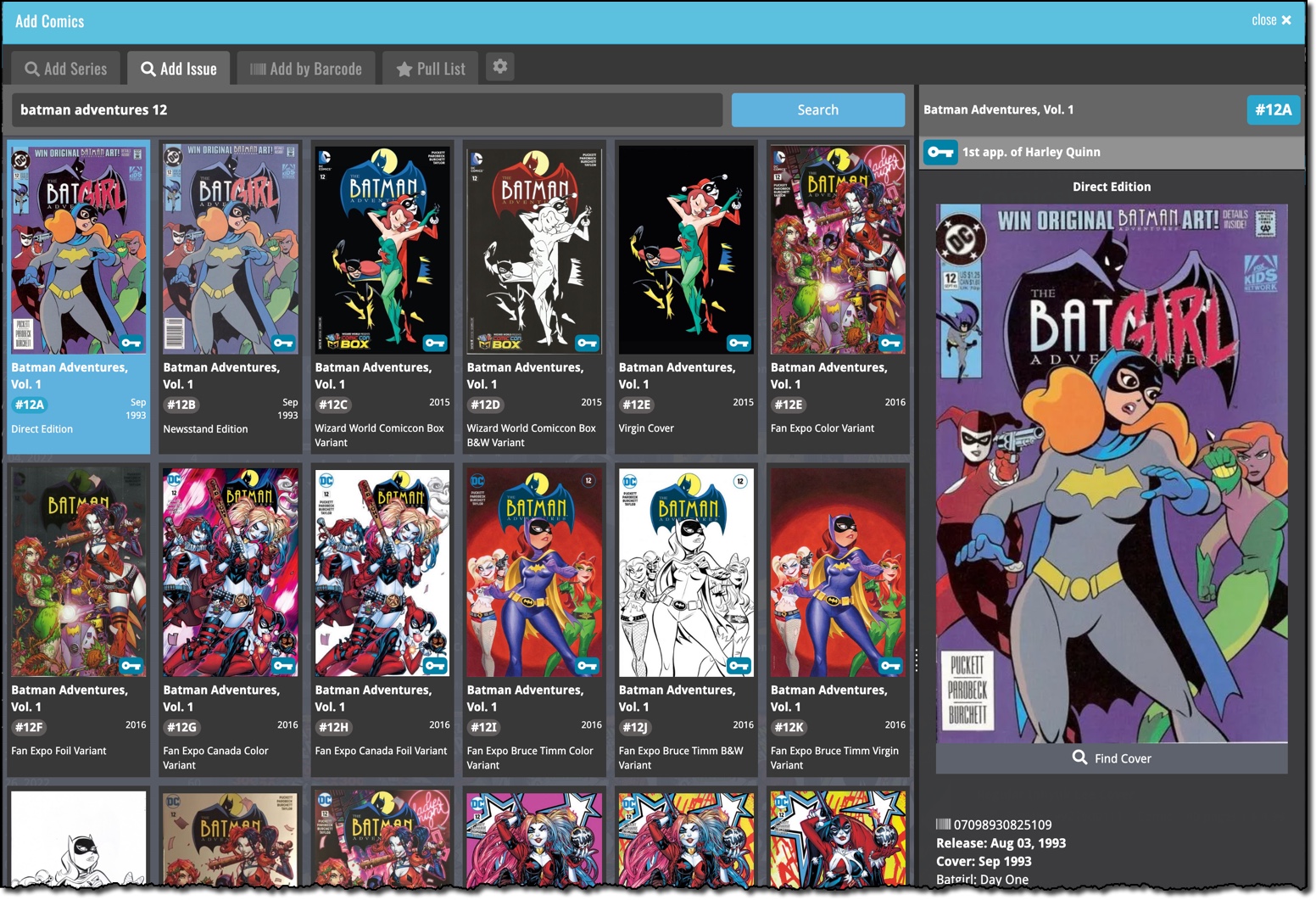
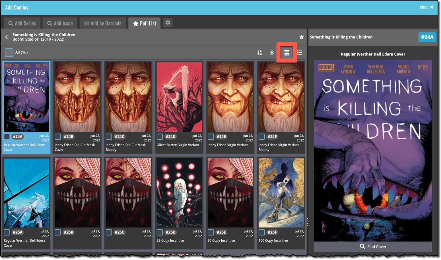
To make it easier to find and select the issue or variant that you own, we added a new “Card View” for the Add Comics screen, with bigger cover images in the Issue List. In the Card View, the issue list is shown as a grid, with multiple columns.
The new Card View is a available on the Add By Series tab, the Add by Issue Tab and the Pull List tab:
Add by Series
Add by Issue
Pull List
The Issue List for a series now opens in a separate page
Previously, on the Series and Pull List tabs, the issue list for a series expanded “in place”. But to give the issue list the full screen space, and to create a clearer user interface, the Issue List now opens on its own page. With a nice Series header and its own toolbar with the issue list settings. Use the back button top left to go back to the series list.
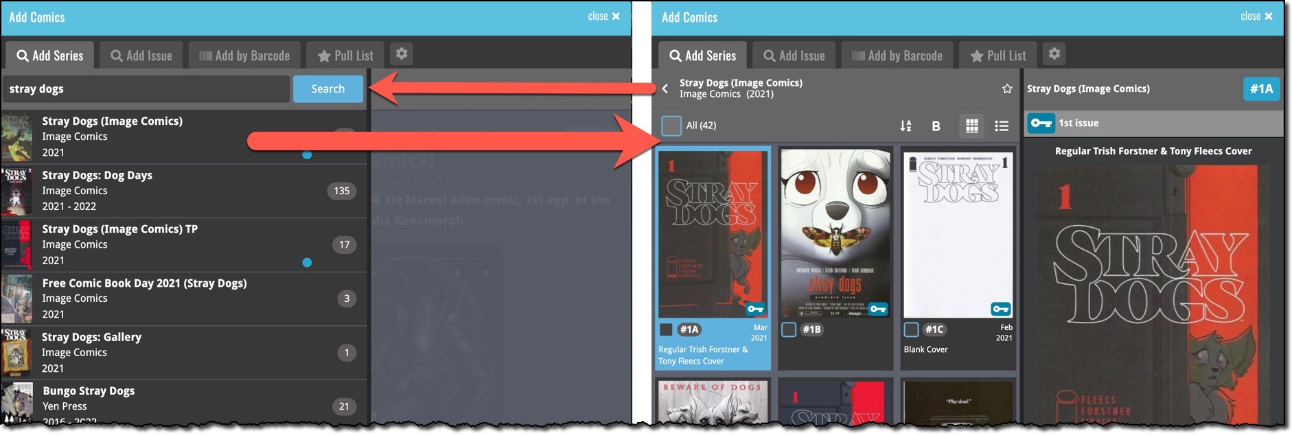
Preview Page now also shows a bigger cover image
Also new in this update, a new layout for the Preview Page, with a big cover image and the Key Info and Variant Description right at the top. Scroll down to see all the other details (plot, creators, characters).
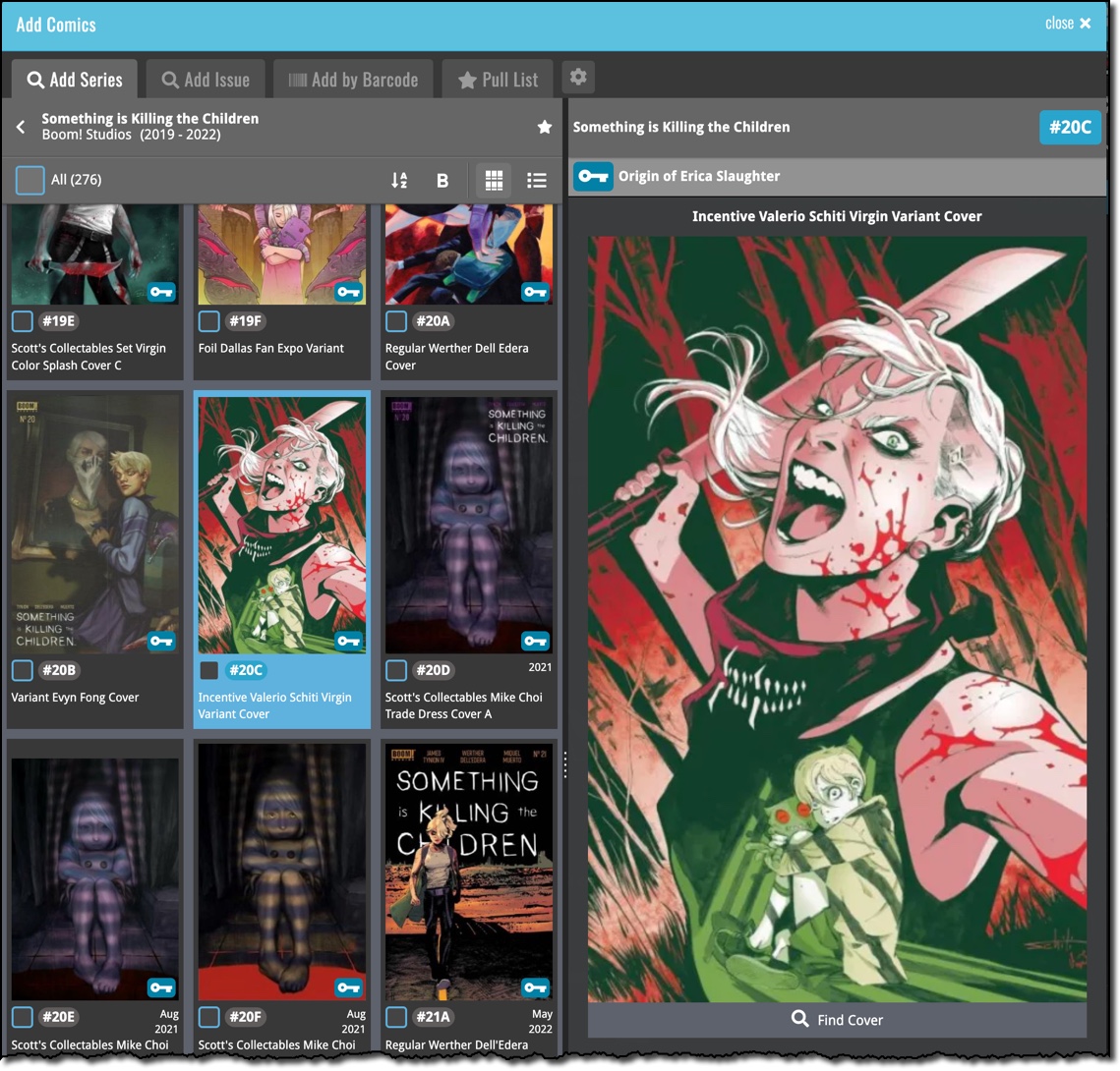
The Add Comics screen is now a lot bigger!
And finally, to accommodate MORE big images on screen for users with big computer screen, we made the Add Comics screen a lot bigger. It now automatically takes about 90% of your browser width.
How cool is this?
