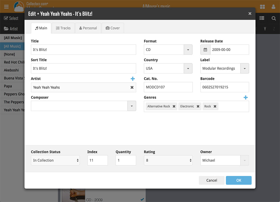
Live today in your Music Connect software: a completely re-designed Edit Album screen with an improved look, layout and usability!
New look and layout
We’ve moved some fields around and to have them grouped and placed more logically. You’ll notice that we’ve also updated the look of certain buttons so it’s all easier on the eye, and there’s only one big blue important “OK” button to save your changes.
Updated dropdown and pick list fields
The pick list fields have been updated so they’ll only show options from your own collection instead of all available options in our online database. This makes it a lot faster to quickly pick something from a pick list that you used before!
You can just start typing to filter to the pick list entry you want to use, or open up the dropdown to scroll and pick.
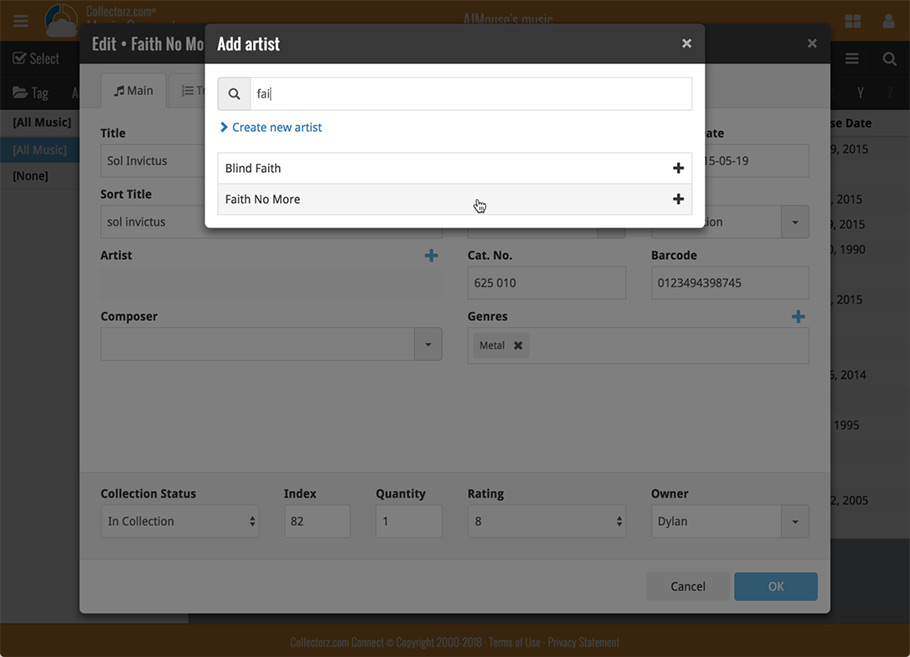
Multi value pick list fields such as the Artist field, have a blue plus button to pick an artist from your artist list. Click it, and either start typing or just pick an artist from the list.
New Pick List fields
We’ve updated the following fields from plain text fields to “pick list” fields. This means that those fields now have a dropdown which you can click to quickly pick an existing pick list entry for that field.
The following fields haven been updated from plain text to pick list fields:
- Purchase Store
- Location
- Condition
- Owner
These field now all have a dropdown to pick an entry. You can also type into them to search or create a new entry for that field.
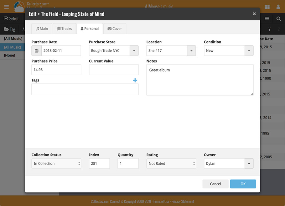
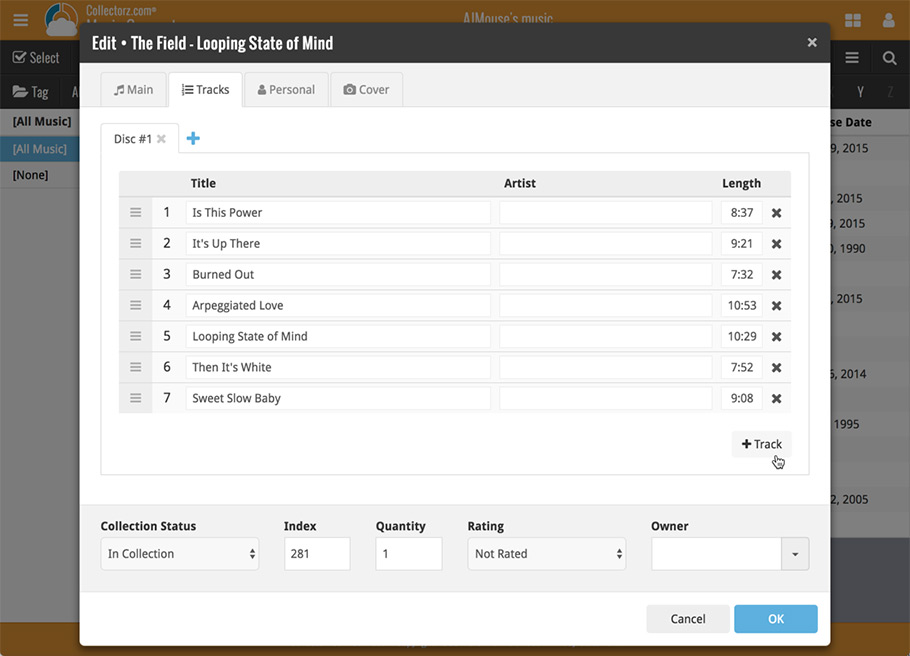
Panel with personal fields on all tabs
At the bottom of the edit screen we added a “sticky” panel that you can see on all edit tabs. This panel contains some of your most important personal fields so you can always edit them quickly.
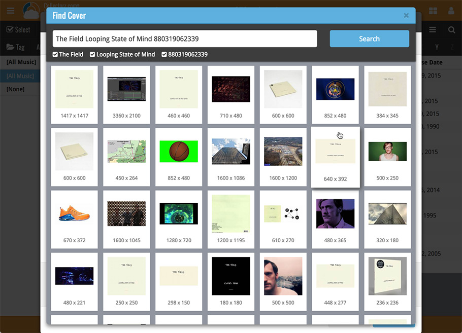
New Find Cover pop-up
The Find Cover pop-up has been updated to the latest version we introduced in the Add Screen. Check it out:
