 Another big update for your CLZ Comics app, in which we introduce a new view for your comic collection. But there’s more:
- Main screen:
- New “Card View”
- Selecting comics now also possible in Card View and Images View
- Floating “Add Comics” button (the big blue “+”) now auto-hides
- Add Comics screen:
- List View is back!
- “Add Manually” is back!
New “Card View”
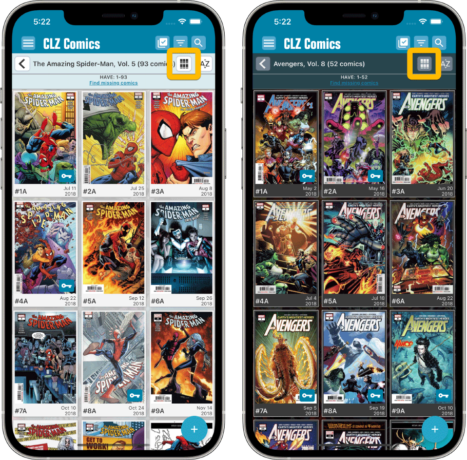
The main new feature of today’s update, a new “Card View” for the main screen of your app, next to the existing List View and Images View. The Card View shows big cover images (3 per row on most devices), with only the main comic info (just Series name (if needed), Issue Number, Release Date and Key icon).
Switch between the 3 views using the 2nd button from the right on the toolbar right above the issue list. Of course, the Card View is available in both Dark and Light Mode:
Selecting comics now also possible in Card View and Images View
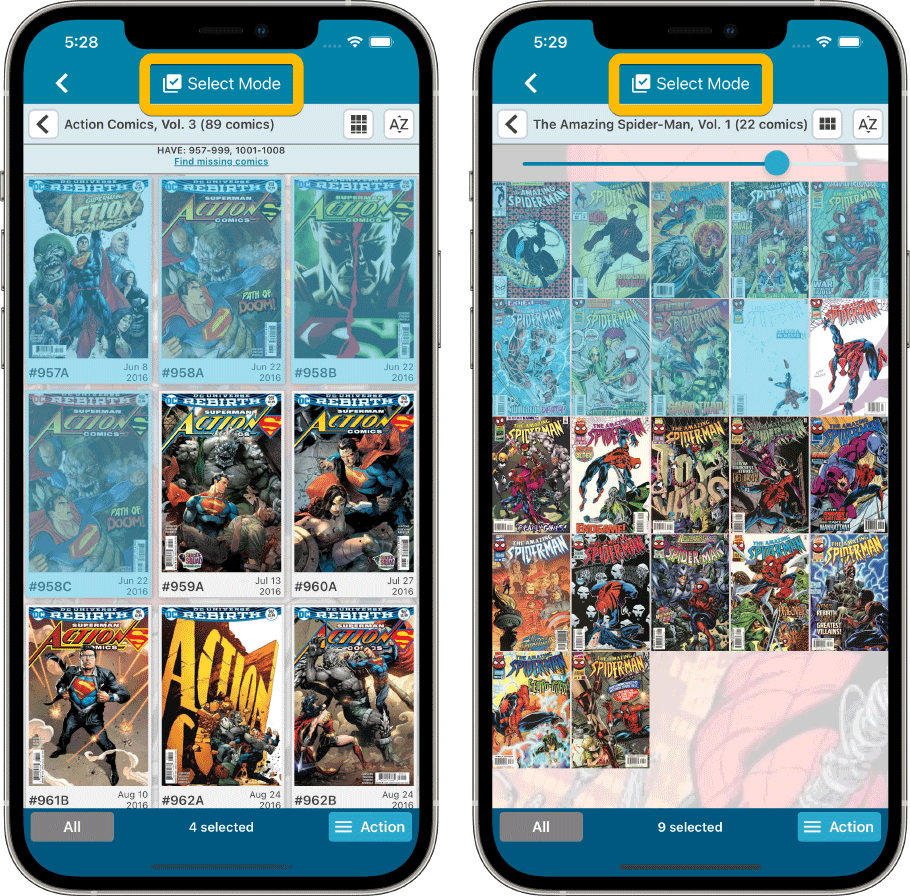
Previously, selecting comics (e.g. for editing, updating, etc…) was only possible in List View, often causing confusion. So we fixed that: you can now select comics in all views, List View, Images View and even the new Card View.
To enter selection mode, either tap the checkbox button at the top, or just tap and hold on a comic entry, then tap more comics to select them. Then use the Action button at the bottom to Edit, Update, Remove, etc…
Floating “Add Comics” button (the big blue “+”) now auto-hides
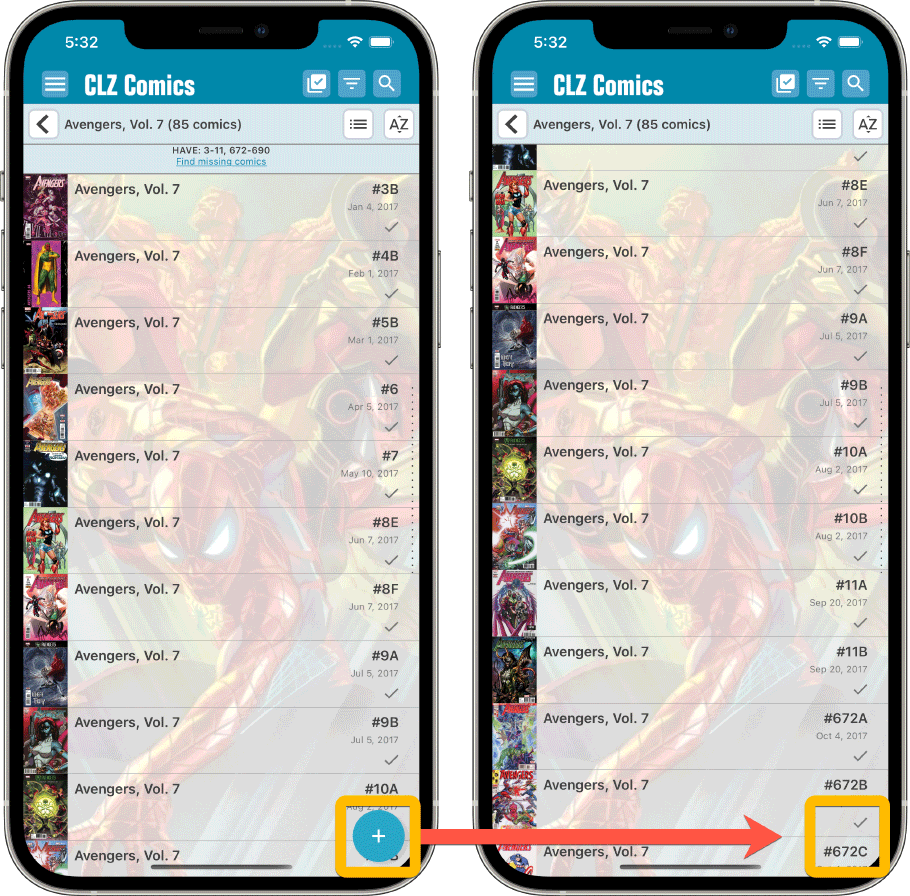
We recently learned that some users are annoyed about the big blue floating “+” button at the bottom left, because it can obscure some details of the bottom entry in your issue list. So let’s fix that, right here, right now.
The blue “+” button now automatically disappears when you scroll down. To make it appear again, just scroll up a tiny bit.
List View is back!
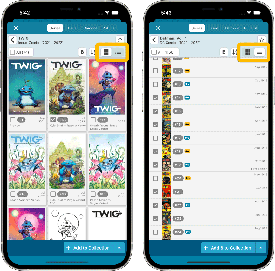
In version 7.6, we introduced a new look for the issue list in the add screen, with big cover images in a 3-column grid. And most users love this new looks. However, through feedback in the CLZ Comics group on Facebook, we found that quite a large group of users preferred the old list view. Mainly because a simple vertical list makes it easier to scroll through the list and because the list view showed more issues on screen.
So… we have decided to bring the List View back AND with a small redesign to fit even more issues on screen!
Switch between the Card View and the List View using the toggle on the top right.
TIP: the scroll position in the List View and Card View are now synced, so if you scroll down in List View and want to view big covers anyway, just toggle to Card View and it will be scrolled down to the same issue number range.
Add Manually” is back!
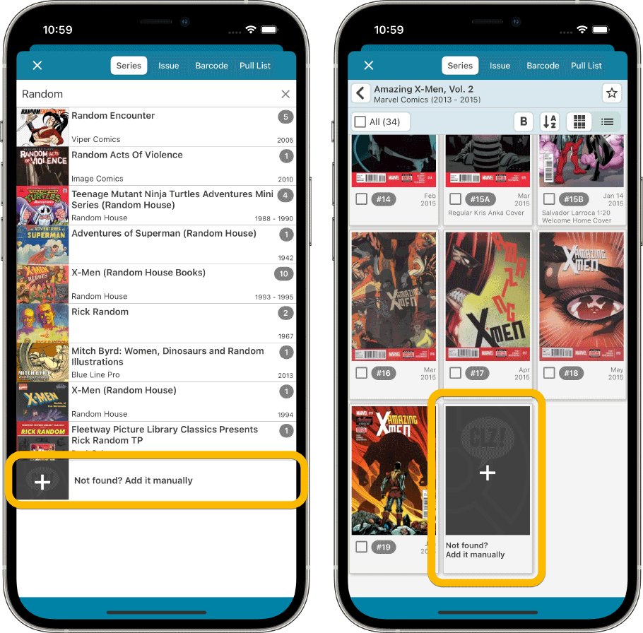
Removing the List View was not the only mistake we made in version 7.6 :-(.Another thing we removed was the “Not found? Add Manually!” options at the bottom of the series list and issue list.
Well, we quickly learned that was NOT a good idea either 🙂
So these are back today too!
Fixed for Android:
- Key information wasn’t downloaded for new comics if your Update Key settings were not set to Replace
- The add button wrongly kept stating “Add x comics” if the comics were already added