 Here’s my second “v9 feature hilite” email, about the next big feature of last week’s CLZ Comics v9 release.
(tip: if you missed feature hilite #1, you can read it here)
Today, we are going to discuss the new collections tab-bar.
Reminder: the why and how of multiple collections
The Manage Collections option in the menu of the app lets you create multiple sub-sections in your database, called “collections”. Many users use this feature, for all kinds of purposes:
- to keep separate collections for different people, e.g. your own and your kid’s collection.
- to separate their slabs from their raw comics
- to keep track of comics they have for sale or have already sold
- etc.. etc.. the possibilities are endless
Personally, I have 6 collections: Slabs, Raws, TPBs, At CGC, For Sale and Sold.

You are free to use collections for any sub-sets of your database, but keep in mind: collections are completely separate parts of your database! This means:
- Totals and Statistics are per collection. There are no “overall” stats.
- Searches are “within” the collection you are in. There is no “overall” search.
- The same holds for folders and sorting, all happens “within” the current collection.
As soon as you feel the need for totals or searches across all collections, that is a good sign you would be better off using ONE collection, then maybe use Tags or Series Groups to separate the sub-sections.
That said, feel free to experiment. It is very easy to move comics from your main collection to other collections. It is just as easy to move them back.
To move comics between collections, just select them (tap and hold), then use “Move to Other Collection” from the Action button menu.
New in CLZ Comics v9: a Collection Tab Bar at the bottom
The CLZ Cloud site and the Comic Connect web-based software have always showed the collection as nice tabs at the bottom of the screen, like a spreadsheet program has.
We never added those collection tabs to the mobile app, for fear of losing too much screen estate. Instead, switching between collections was done through the app menu.
However, the collection list in the menu was not ideal, especially when using many collections. Even for me, with just 6 collections, it was pushing the rest of the menu options way down.
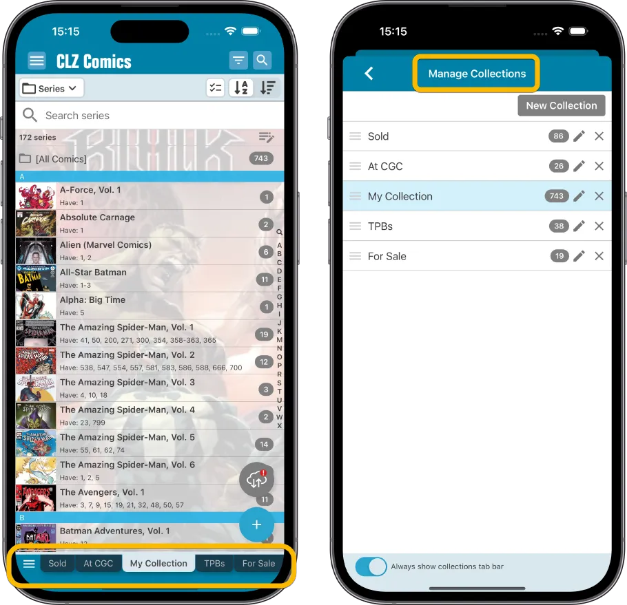
So… for the v9 release, we added a collection tab bar anyway! Using a smart “auto hide” to still give you the full screen height while scrolling. The tab bar makes it way easier to switch between collections. It can be slided left and right, to support high number of collections. Alternatively, tap the menu icon on the bottom left to switch collections using a menu, or to access the Manage Collections screen.
Of course, the tab bar will only show up if you have more than one collection.
Also, you can opt to remove it completely, just open the Manage Collection screen and disable it using the toggle at the bottom.
