What's new in Game Collector? 2018
New:
- Image Viewer popup: The option “Resize picture to window” now resizes the window when browsing through the images of that item.
- Added new tool to automatically check the checkbox of front covers when they are “custom covers” (found in Tools > Maintenance menu)
Fixed:
- “Search as you type” suggestions on your own collection did not always work.
v19.0: multiple collections, auto-sync images, 64-bit and a new Flex template!
Game Collector version 19 has arrived! Here’s what’s new:
- Manage multiple “collections” within one database file
- Automatic Cloud-syncing of your own “custom” images
- A new super-adaptive “Flex” template for the Details Panel
- 64-bit version for 64-bit Windows versions
Read on for the full details:
A BIG update for your Game Collector software today, with an important change:
Secure HTTPS connections, for your security and privacy
As indicated in our GDPR email from a couple of weeks ago, we are updating our software and services, to be more secure and to better protect your privacy.

Starting with version 18.3, Game Collector now uses secure HTTPS connections for all communications with our servers:
- for logging in with your username and password
- for syncing your data with CLZ Cloud
- for sending your searches to Core.
To make this possible, we have created new secure “entry points” on our servers, that are only allowing secure HTTPS connections. The new Game Collector software only communicates with those secure entry points.
For your privacy and security, we strongly recommend updating to version 18.3.
Game Collector offers powerful batch commands, for performing actions on multiple games in one go, e.g. editing, removing or updating from Core.
However, we are finding that many users have never use these these batch actions, either because they are not aware of their existence or because they don’t know how to actually select multiple games (by Shift or Ctrl-clicking).
In today’s update we addressed these issues:
New Selection Checkboxes in the List View, for easy selection of multiple games
The List View now features checkboxes on the left. Use the checkboxes to easily select multiple games, no Shift or Ctrl-clicking needed. Of course the classic Shift/Ctrl-clicking still works too, this is just an extra method.
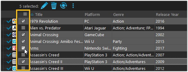
Don’t need the checkboxes? You can hide them using Tools / Options / Customization.
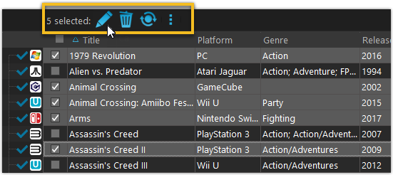
A new Action Bar with batch actions
As soon as multiple games are selected (that is, more than 1), a new Action Bar appears above the list. It shows how many are selected, plus offers buttons for the most popular batch actions.
Also new: Action Bar above Details Panel
At the same time, we also added a new Action Bar above the details panel, for quick access to commands operating on the selected game.
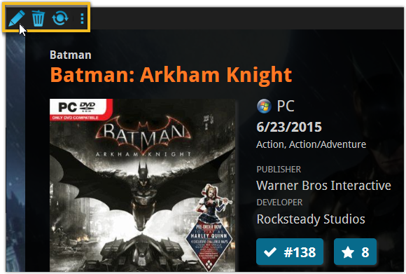
TIP: The commands in this new Action Bar have been removed from the main toolbar, to make that one a bit cleaner. However, if you are upgrading from an older version, it will remember your toolbar. To get the new clean main toolbar, choose View / Toolbars / Reset.
Don’t need or want this new bar? You can hide it using Tools / Options / Customization.
With super hi-res 4K (or even 5K) screens becoming quite common, more and more people are running Windows with the Font Size (DPI scaling) set to 125% or 150%, to keep text readable. So earlier this year, we released maintenance builds for all Windows editions to fix various layout problems when running Windows with “large fonts”.
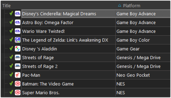
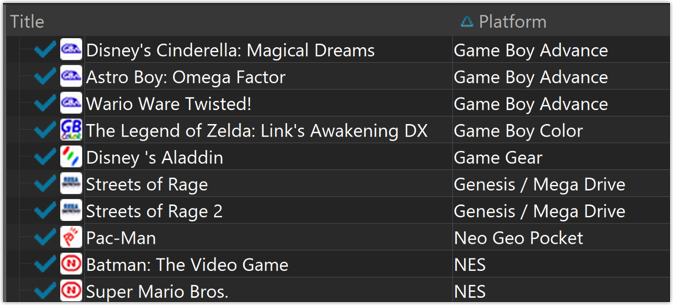
Today, with version 18.1 we’re taking the next step: Game Collector is now fully “DPI Aware”. Starting with this version, if you have increased your font size in Windows, all screen texts will look sharper, less fuzzy, making full use of your hi-res screen.
To give you an idea, here are 2 close-up screenshots of what it looked like in the old version versus the new version:
Old version:
New version:
New collection status icons
We added new collection status icons to the main screen’s list view and card view to make the screen less clogged up and easier on the eye.
Fixed:
- Edit Game:
- Index field didn’t have localized or custom caption
- Clicking next or previous could create a second + button in the User Defined Fields tab
- Templates:
- Fixed an issue where the template could become “white” if arrow keys were used on the keyboard.
- Clicking an image would show a drag/drop menu. The image now opens properly.
- Quick Search: Fixed normalization for quick searches so words with umlauts/accents etc. are now easier to be found.
- Fixed a problem with folder paths for users that have their Documents folder rooted to an external drive (program wouldn’t install properly).
- Link Screen could show “Link Selected” button even if there were no matches.
- Manage Column presets:
- Clicking in certain parts of the screen could cause Access Violations.
- Clicking the Edit menu could break the focus in the screen.
- Light Skin: Better visibility for selected items in your lists.
- User Defined Fields: It was possible to create invisible User Defined Fields which would then never show up in the edit screen.
- Add Screen: Scrollbar position wouldn’t update sometimes.